Relevant Overviews
www.nngroup.com

A content inventory and audit are two important activities to complete before developing a strategy to improve your digital content. Conduct them together to set your content up for success.
www.nngroup.com

Footers can be found at the bottom of almost every web page, and often take many forms, depending on the type of content on a website. Regardless of the form they take, their presence is critical (and highly underrated).
josuevalles.substack.com

90% of that content is just digital noise. It's complex, confusing, and ultimately valueless to the audience. True content innovation requires the opposite approach. It's about simplifying and focusing on delivering maximum value. This is the content innovation paradox: Less complexity creates more value.
www.nngroup.com

Research repositories organize user research in a central place, making research-related documentation easy to access and consume.
www.nngroup.com
Premature error messages, aggressively styled fields, and unnecessarily disruptive system-status messages feel bad-mannered and increase cognitive load for users during otherwise simple tasks.
www.nngroup.com

Checkboxes allow users to select one, some, or none of items from a list. They can be used standalone, in checkbox lists, or nested checkbox lists.
contentdesign.london

Why inclusive language matters Words hold power. Using inclusive language means you're thinking about: the impact of language, the origins of phrases and idioms before you use them, how you talk about people, characteristics and identities, how your own identity or experiences could create bias in your content.
www.smashingmagazine.com
Gaining buy-in for accessibility can be challenging due to common myths and misunderstandings. For many, accessibility remains a big mystery. Here are some practical techniques for winning stakeholder support.
www.nngroup.com

Tabs and accordions organize and layer content on the same page. Tabs suit a few long sections, while accordions fit many short ones. Choose based on your content structure and user needs for optimal layout.
www.linkedin.com
✅ Level 1: “What we tell others”, unreliable, opinions, hearsay. ✅ Level 2: “What we tell ourselves”, interviews, debrief, surveys. ✅ Level 3: “What we actually do”, task analysis, observation. ✅ Level 4: “Why we do it”, task walkthroughs, context, interviews.
www.linkedin.com
Read About My Lightweight Approach to User Research and TestingFirst, I have written this post on their blog, sharing some key insights from the workshop that's definitely worth a read.The TLDR is that usability testing needn't be slow or costly. There are many great tools for testing that can make it easy.Of course I did kind of touch …
www.nngroup.com
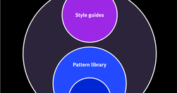
Design systems are a set of standards (like Google’s Material Design or IBM’s Carbon Design System) needed to manage design at scale. Style guides (like content or visual style guides) are just one piece in a design system.
www.linkedin.com
UX Writing Top 20 practical tips to boost your designs 👇🔶 Be concise❌ You must log in to comment✅ Log in to comment🔶 Use active voice❌ The button should be clicked✅ Click the button🔶 Avoid jargon❌ System error (code 2234)✅ Log in error🔶 Be consistent❌ Add to cart vs. My bag✅ Add to bag vs. My bag🔶 Avoid double negatives❌ Unsubscribe not to receiv…
www.nngroup.com

Labels in a card sorting study must be neutral to prevent keyword matching and encourage careful, conceptual groupings from users.
www.smashingmagazine.com

Tables frequently appear on the web but aren’t easy to design and code. People will expect tables. Not those fancy ones from design inspiration sites but Excel-looking monsters with hundreds of cells and complex interaction. In this case, a designer faces many challenges. With this illustrated guide, Slava Shestopalov explains the table anatomy and
intersol.ca
We tend to do things the way we’re told they’ve always been done without questioning or revisiting the reason behind it, even long after that reason ceases to exist.
medium.com

Understanding the 5 Monkeys Experiment The Power of Peer Pressure: A Look at the Asch Experiment in the 21st Century Duty and Discernment: The Delicate Equilibrium of Obedience and Critical Thinking
uxdesign.cc

If I want your newsletter, I’ll find it on the page myself!
medium.com
If you’d like to improve user experience, content design can help. But how? We have a few tricks up our sleeve, so I’d like to share with you a reference list of ways we can give users an experience which feels more intuitive and caters better to their needs.
www.linkedin.com
useful guidelines to rethink, rewrite and redesign error messages to help users recover and succeed. Shared on LinkedIn by Vitaly Friedman
www.smashingmagazine.com
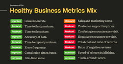
Consider establishing design KPIs alongside business KPIs and create a more holistic and healthy mix of metrics that capture user experience and business goals.
www.nngroup.com

Visual design requires knowledge and understanding of many jargon terms. Use this glossary as a reference as you delve into visual and user interface design. Use this glossary to quickly clarify key terms and concepts related to visual design.
www.nngroup.com

Typography is a key component in almost every digital experience. However, its complexity and jargon make it a common source of misunderstanding. Use this glossary to clarify key definitions related to typography.
uxdesign.cc

Opening links, whether they are to the same website or another, in a new tab can pose a variety of issues for users, especially as web traffic from mobile devices continues to increase.
www.nngroup.com

Carefully examine the user’s context, task at hand, and next steps when deciding whether to open links to documents and external sites in the same or a new browser tab.
www.economist.com

Bad writing can be avoided by following Orwell’s 6 little rules. The problem is the absolute nature of Orwell’s rules. The first five all include either a “never” or an “always”. That's why Orwell himself doesn’t always obey them and The Economist's Johnson revised them.
www.interaction-design.org

As a designer, designing for trust in Artificial Intelligence (AI) products is paramount. AI presents unique challenges that require transparent interfaces, clear feedback, and ethical considerations to build user confidence.
uxmag.com

Share Post Share Email Print They can be paper or click-through, but designing successful digital experiences involves making prototypes of your interfaces.
uxmag.com
Understanding cognitive biases are not only important for UX Research and UX design, but also for navigating everyday life. Bias seeps into our judgment and thinking which can warp the reality of experience based on our subjective views.