Overview: Writing content
Relevant resources
Could this statement apply to other products or services?A value proposition should be specific enough that it only makes sense in your context. “Help you and your users succeed” could work just as well on a SaaS website or on the site of a user researcher. If it can work on a different kind of website, it isn’t a proposition at all. It’s just a s…
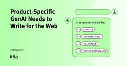
Generative-AI outputs need to be concise, scannable, follow the inverted pyramid, and use plain language.

B2B sites and other sites with specialized content that target professionals or enthusiasts should use their audiences’ jargon to communicate more precisely and professionally.

Specialised language Designing for people with autism, using specialised language, not 'owning' the words, and some AI label testing.

How minimizing reader decisions makes writing more powerful 💪

Text makes up the entire web. How you write and format your text can make it more readable for everyone and more accessible for people with disabilities. Some text accessibility issues include underlined text, justified text, and very small text. Each of these is easy to avoid and fix.
Content should be written and structured to help them understand and take the most important actions.
Golden Rules For UX Writing. With practical guidelines on how to avoid confusion and help people understand better (LinkedIn post by Vitaly Friedman)
Web users generally prefer writing that is concise, easy to scan, and objective (rather than promotional) in style. We incorporated these and other attributes into a redesign of Web content. The rewritten website scored 159% higher than the original in measured usability.

Create engaging stories by synchronizing with the readers’ brains.

Whether you identify as a content designer, strategist or UX writer, it’s likely you’ve thought about where you go from here.

Readability in user experience (UX) design refers to how easily users can read and understand textual content. It is crucial for a positive user experience as it directly impacts how effectively users can consume information on a website or application. Designers aim to enhance readability via appropriate presentation and language to make sure user
What grade level should you be writing at? How do you determine your copy’s grade level?
Verbs of Creation and ConstructionAssembleBuildConcoctCraftCultivateDesignEngineerFabricateForgeFormulateGenerateMoldProduceSculptSynthesizeWeaveVerbs of Sound and VoiceBellowBoomChirpCrackleGrowlHissHowlMurmurRoarRumbleScreamShriekSizzleSnapSqueakThunderTrillWarbleWhisperVerbs of Light and DarkBeamBlazeDazzleFlickerGlimmerGleamGlowIlluminateRadi…
Premature error messages, aggressively styled fields, and unnecessarily disruptive system-status messages feel bad-mannered and increase cognitive load for users during otherwise simple tasks.
UX Writing Top 20 practical tips to boost your designs 👇🔶 Be concise❌ You must log in to comment✅ Log in to comment🔶 Use active voice❌ The button should be clicked✅ Click the button🔶 Avoid jargon❌ System error (code 2234)✅ Log in error🔶 Be consistent❌ Add to cart vs. My bag✅ Add to bag vs. My bag🔶 Avoid double negatives❌ Unsubscribe not to receiv…

Bad writing can be avoided by following Orwell’s 6 little rules. The problem is the absolute nature of Orwell’s rules. The first five all include either a “never” or an “always”. That's why Orwell himself doesn’t always obey them and The Economist's Johnson revised them.

Websites and apps are our modern equivalent of phones. You create them so that people can serve themselves. Make your site or app a good conversational partner.
A UI/UX designer focuses on the appearance of an interface and how users will use said interface. A content-first designer, a.k.a., a content designer or UX writer, will focus on the content users will interact with.
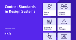
Content standards in design systems support a holistically consistent user experience and efficient collaboration between writers, content, and UI designers.

What does it mean to design for neurodiversity? We look at steps we can take to make content more accessible to more people.
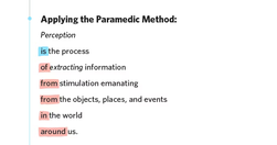
The root of the problem lies in our desire to impress. Thesaurus carpet-bombings and long-winded sentences are commonly mistaken for fine writing because they feel authoritative and intellectual. But they’re just masks; effective writing is lean, clean, and easy to read.
From providing accurate context to creating a cohesive structure, each of these key principles can elevate your content designs and ensure you’re communicating effectively with your audience
How to communicate effectively when users fail and succeed (shared on LinkedIn by Vitaly Friedman)

If you're a marketer, manager, developer, designer or writer wanting to up your UX writing game, then these guides are right up your alley.
Techniques like summaries, bullet points, callouts, bolding, and helpful visuals improve comprehension and engagement with content exceeding 1,000 words.

People Don’t Read Online—They Scan. This Is How to Write for Them Scanning is searching. Reader’s behavior when scanning may seem pure laziness, but it’s not. It’s an efficient strategy to seek out and filter information. Scanning also allows readers to avoid informational overload.

How writing reframes our knowledge and drives our decisions. Our message is effectively drowning in a sea of organizational and semantic noise that is part and parcel of the product itself. how do we make this easier on the user? Nope… not empathy. Writing. Writing about anything presupposes some degree of understanding of the context.
This blog post was submitted to online course "Professional Communication: Business Writing and Storytelling" (Economist Education) . It was then adapted and used on an intranet. "Easy writing makes hard reading" - Ernest Hemingway "The discipline of the written word punishes both stupidity and dishonesty" - John Steinbeck

Five texts that explain how to write simply and well: 1 Politics and the English Language - 2 Style: Lessons in Clarity and Grace - 3 On Writing Well: The Classic Guide to Writing Nonfiction - 4 The Sense of Style: The Thinking Person’s Guide to Writing in the 21st Century - 5 Merriam-Webster’s Dictionary of English Usage.