Relevant Overviews
www.cst.cam.ac.uk

ChatGPT is a bullshit generator. To understand AI, we should think harder about bullshit
www.linkedin.com
We spent over 60 hours analyzing 150+ companies to find the best user onboarding examples. From home page copy and sign-up pages to onboarding emails and product tours, you can find plenty of examples to take inspiration from.
www.linkedin.com
Helpful guides and starter kits to design effective journey maps that generate insights - shared by Vitaly Friedman on LinkedIn
www.linkedin.com
300 million people have some kind of colorweakness or are colorblind. As designers, we know that it’s always a bad choice to combine red and green, but if we want to be truly inclusive for colorblind people, we need to go beyond that. "never rely on colors alone to communicate"
jakobnielsenphd.substack.com

AI can already perform many UX tasks, ranging from design and research ideation to analyzing qualitative user data at scale. It’s the perfect assistant that quickly produces the first drafts of any UX method plan or deliverable. It will do more in the future,... possibly complete UI designs. But AI will not eliminate the need to watch human users.
Like
ux,
ai,
user experience,
ux design,
ux research,
user experience research,
artificial intelligence
www.smashingmagazine.com

Scoping, estimating, and running digital projects can often feel like an exercise in futility. In this article, Paul Boag explains why you need to start breaking your projects down into manageable phases and why that’s the best way to achieve significant benefits.
www.linkedin.com
Today, one billion people are 60 years or older. That’s 12% of the entire world population, and the age group is growing faster than any other group. Yet online the needs of older adults are rarely often overlooked or omitted. What do we need to consider to make our designs more inclusive for older adults? (shared via LinkedIn by Vitaly Friedman)
www.niemanlab.org

Traffic to news sites through social media has dropped in recent years, and over half of adults over 65 don’t use social media at all. We wanted to build a way to get The City’s service journalism to New Yorkers who wouldn’t otherwise see it.
jakobnielsenphd.substack.com

UX unfolds over time, with a factor of 31 billion from the shortest time period of interest (0.1 seconds for the illusion of instantaneous response time) to the longest time span we can realistically consider (a century for major social channels).
www.interaction-design.org

Jakob Nielsen and Rolf Molich’s Ten User Interface Guidelines. These heuristics have been reflected in many of the products designed by Apple, Google, and Adobe. This article will teach you how to follow the ten rules of thumb in your design work so you can further improve the usability, utility, and desirability of your designs.
www.nngroup.com
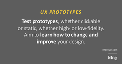
Clickable or static? Axure or paper? No matter which prototyping tools you use, the same tips apply to preparing a user interface prototype for the most effective user research.
www.nngroup.com

Choosing the right prototyping tool can be difficult among the many options available. There are 5 key factors to consider when selecting the best fit for your project or team: project type and goals, cost, tool capabilities, learnability and ease of use, and stakeholder buy-in.
www.nngroup.com
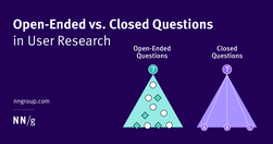
Open-ended questions result in deeper insights. Closed questions provide clarification and detail, but no unexpected insights.
theuxrsannotations.substack.com

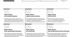
Frameworks and principles for improving UX Research report writing. By following the frameworks and principles outlined in this article, UX researchers can improve their reports through logical structure and organization of ideas, clear and concise writing, and effective use of visuals and graphs.
adplist.substack.com

How did he overcome the stranger-danger bias? Through good design.
www.nngroup.com
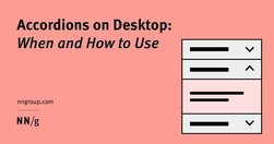
While accordions can simplify long content pages and minimize scrolling, they diminish content visibility and increase interaction cost. On desktop, use accordions for content-heavy pages where users will not need to access content under several accordions.
www.nngroup.com

Avoid using accordions when: 1. Users need access to most content; 2. There's little visible content on the page; 3. Content is complex with multiple levels; 4. Content can't be effectively chunked; 5. An uninterrupted reading flow is prioritized.
www.nngroup.com

Updated intranet guidelines feature enhanced content practices by teams, refined search design to meet elevated expectations, task-oriented navigation, and standardized design elements for visual consistency.
www.nngroup.com
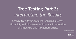
Analyze tree-testing results including success, first click, and directness to improve information architecture and navigation labels.
www.nngroup.com

Follow these tips to effectively evaluate a site’s navigation hierarchy and to avoid common design mistakes.
www.cs.umd.edu
ite “Golden Rules,” that are applicable in most interactive systems. These principles, derived from experience and refined over three decades, require validation and tuning for specific design domains. No list such as this can be complete, but even the original list from 1985, has been well received as a useful guide to students and designers.
www.linkedin.com
Link collection (LinkedIn post by Vitaly Friedman): Free Storytelling Masterclass (+ PDFs) (https://lnkd.in/eiFscUtf), a comprehensive guide with 9 modules on storytelling, PDF worksheets, 1-pager sketchnotes, reading lists, free lectures, video courses, etc. Kindly shared by Jeremy Connell-Wait
jakobnielsenphd.substack.com
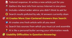
Content creators face reduced search traffic due to AI's prowess in delivering tailored answers, challenging traditional SEO strategies. Social will also drive less traffic. Permission marketing will be the main way to survive on the Internet.
jakobnielsenphd.substack.com

To maximize the benefits to humanity, decisions to deploy AI solutions must be based on comparing AI with the average performance of unaided humans, not an unrealistic comparison with the single best human or with unachievable perfection.
jakobnielsenphd.substack.com

In a case study of ChatGPT evaluating 12 e-commerce screenshots, most of the AI-driven redesign suggestions were inconsistent and untrustworthy. Human UX expertise must be employed to judge UX advice from AI.
www.nngroup.com
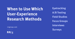
Modern day UX research methods answer a wide range of questions. To help you know when to use which user research method, each of 20 methods is mapped across 3 dimensions and over time within a typical product-development process.
www.nngroup.com

A bottom sheet is a user-interface pattern used commonly in mobile apps for providing contextual details or controls in the lower area of the screen. Definition: A bottom sheet is an overlay that is anchored to the bottom edge of a mobile device’s screen and that displays additional details or actions.
www.nngroup.com
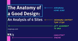
Visually pleasing designs use consistent type styles and spacing, create a visual hierarchy, and utilize an underlying grid structure.
www.nngroup.com

Design effective error messages by ensuring they are highly visible, provide constructive communication, and respect user effort.
www.nngroup.com

AI is introducing the third user-interface paradigm in computing history, shifting to a new interaction mechanism where users tell the computer what they want, not how to do it — thus reversing the locus of control.