Why Designers Aren’t Understood (3 mins)

my notes ( ? )
As designers, especially in large enterprises, we often might feel misunderstood and underappreciated. It might feel like every single day you have to fight for your users, explain yourself and defend your work. It’s unfair, exhausting, painful and frustrating.
Let’s explore how to present design work, explain design decisions and get stakeholders on your side — and speak the language that other departments understand.
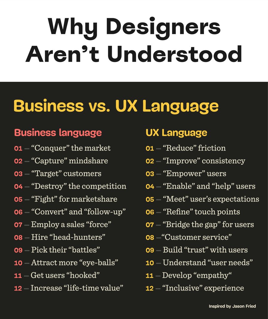
Business language and design language are often misaligned. That’s why designers are often not understood. Large view.
Key Takeaways
🤔 Businesses rarely understand the impact of UX.
🤔 UX language is overloaded with ambiguous terms.
🤔 Business can’t support confusing initiatives.
✅ Leave UX language and UX jargon at the door.
✅ Explain UX work through the lens of business goals.
🚫 Avoid “consistency”, “empathy”, “simplicity”.
🚫 Avoid “cognitive load”, “universal design”.
🚫 Avoid “lean UX”, “agile”, “archetypes”, “JTBD”.
🚫 Avoid “stakeholder management”, “UX validation”.
🚫 Avoid abbreviations: HMW, IxD, PDP, PLP, WCAG.
✅ Explain how you’ll measure success of your work.
✅ Speak of business value, loyalty, abandonment.
✅ Show risk management, compliance, governance.
✅ Refer to cost reduction, efficiency, growth.
✅ Present accessibility as industry-wide best practice.
Speaking The Right Language
As designers, we often use design-specific terms, such as consistency, friction and empathy. Yet to many managers, these attributes don’t map to any business objectives at all, often leaving them utterly confused about the actual real-life impact of our UX work.
One way out that changed everything for me is to leave UX vocabulary at the door when entering a business meeting. Instead, I try to explain design work through the lens of the business, often rehearsing and testing the script ahead of time.
When presenting design work in a big meeting, I try to be very deliberate and strategic in the choice of the words I’m using. I won’t be speaking about attracting “eye-balls” or getting users “hooked”. It’s just not me. But I won’t be speaking about reducing “friction” or improving “consistency” either.
Instead, I tell a story.
A story that visualizes how our work helps the business. How design team has translated business goals into specific design initiatives. How UX can reduce costs. Increase revenue. Grow business. Open new opportunities. New markets. Increase efficiency. Extend reach. Mitigate risk. Amplify word of mouth.
And how we’ll measure all that huge impact of our work.
Typically, it’s broken down into 8 sections:
🎯 Goals ← Business targets, KRs we aim to achieve.
💥 Translation ← Design initiatives, iterations, tests.
🕵️ Evidence ← Data from UX research, pain points.
🧠 Ideas ← Prioritized by an impact/effort-matrix.
🕹 Design work ← Flows, features, user journeys.
📈 Design KPIs ← How we’ll measure/report success.
🐑 Shepherding ← Risk management, governance.
🔮 Future ← What we believe are good next steps.
Wrapping Up
Next time you walk in a meeting, pay attention to your words. Translate UX terms in a language that other departments understand. It might not take long until you’ll see support coming from everywhere — just because everyone can now clearly see how your work helps them do their work better.
Useful Resources
- Business Thinking For Designers, by Ryan Rumsey
- Business For Designers (d.mba), by Alen Faljic
- Corporate Language Metaphors, by Jason Fried
- Five Things That Business Cares About, by Jared Spool
- Direct Impact Of Design Work, by 👨🏻💻 Andy Budd
- It’s Time To End The Tyranny Of UX Terminology, by Joe Natoli
- How To Use Storytelling In UX Research, by Allison Grayce Marshall
- How To Defend Your Design Decisions, by Vitaly Friedman
A little friendly note: Smart Interface Design Patterns 🍣, with practical UX guidelines and UX certification.
Sending a lot of optimism, hope and good energy your way!
Happy designing, and thank you for reading! ❤️
Read the Full Post
The above notes were curated from the full post mailchi.mp/smashingmagazine.com/business-vs-ux-language?e=eaf6a42f86.Related reading
More Stuff I Like
More Stuff tagged design