Relevant Overviews
www.nngroup.com

Research spanning 20 years proves PDFs are problematic for online reading. Yet they’re still prevalent and users continue to get lost in them. They’re unpleasant to read and navigate and remain unfit for digital-content display.

uxdesign.cc

When it comes to data visualization, are you playing world domination? There are too many data visualizations that use maps, losing our audience in irrelevant, distracting information. Most of the map visualizations I see could be better shown in alternative, simpler, more informative layouts like tables or graphs. Let’s take a look.
www.economist.com

The reasons behind management gobbledygook
freewritingtips.wyliecomm.com

“If you are not calling out sections of your web pages or prose on those pages with subheads, you are making a big mistake!” write Pernice et al. “If you take nothing else [away], please take this: Use subheads and subsubheads.”
dribbble.com

principles of design every graphic designer should be familiar with:HierarchyBalanceAlignmentEmphasisProportionMovementNegative SpaceContrastRepetitionVarietyUnity
www.nngroup.com

Unsure where to start? Use this collection of links to our articles and videos to learn about design thinking.
www.nngroup.com

Fitts's Law describes how long time it takes to click a target, based on the distance to the target and its size. Use this information to make buttons and links faster to click.
hbr.org
".. for those of us who want to maintain a reasonable balance between our life and our work..."
www.nngroup.com
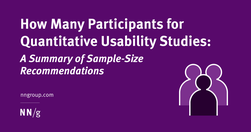
40 participants is an appropriate number for most quantitative studies, but there are cases where you can recruit fewer users.
boagworld.com
usability testing is not your only option. If I am honest, I am doing less and less usability testing, but instead focusing more on lightweight testing that can be done often and brings more value in getting projects out of the door.
boagworld.com

Wherever you work, we all have stakeholders that we need to win over, and the language we use to communicate with them will have a significant impact on whether we succeed or not.
baymard.com

The homepage remains the “front door” for the many users who still begin their browsing experience here. Avoiding the 8 common UX issues discussed in this article is the first step toward improving users’ Homepage experience
www.nngroup.com
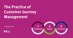
User journeys should be managed like products — by people and teams with specialized, journey-dedicated roles who continually research, measure, optimize, and orchestrate the experience.
www.nngroup.com

Jakob Nielsen’s 10 usability heuristics can improve the user experience of VR applications.
www.nngroup.com
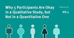
Qualitative usability testing aims to identify issues in an interface, while quantitative usability testing is meant to provide metrics that capture the behavior of your whole user population.
livesession.io
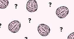
We’re not as rational as we think. The human brain is designed to make quick and effective decisions rather than stick to facts at all times. Instead of acting rationally, we prefer to act fast. This may lead to better outcomes indeed, but it might also lead you astray. Cognitive biases can be both a blessing and a curse.
uxdesign.cc

We can’t “fix” our minds and stop making errors in judgment, but we can become more aware of biases that influence our decision making.
growth.design
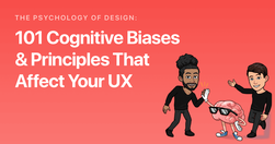
Below is a list of cognitive biases and design principles (with examples and tips) for each category. Let’s dive right in.
www.nngroup.com
A good design relies on a thorough task analysis of the steps required to complete a task, as well as determining what information users need at each step.
Like
web design,
web development,
user experience,
task based approach,
task completion,
ux design,
features
www.nngroup.com
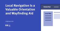
Local navigation indicates to users where they are and what other content is nearby in an information hierarchy.
www.cam.ac.uk

Study of almost 3 million Facebook and Twitter posts from US media and politicians shows divisive posts dunking on opponents drive engagement on social media.
medium.com

Online disinformation and propaganda have evolved into one of the greatest challenges to the safety of the internet. ... One of the first approaches we investigated was psychological inoculation, also called attitudinal inoculation, a technique to help people resist manipulative messages.
www.nngroup.com

Forcing users to browse PDF files causes frustration and slow task completion, compared to standard webpages. Use PDF only for documents that users will print. In those cases, following 10 basic guidelines will minimize usability problems.
www.nngroup.com

Even people with limited drawing abilities can learn to sketch a wireframe if they learn a few common conventions used to represent various design elements.
blog.prototypr.io

Tried and true principles for the past, present, and future of good design
tannerchristensen.com

there are many straightforward methods and strategies for measuring design impact. Two areas I recently combined while exploring the design impact at Gem—where we're building the source of truth for top-of-funnel recruiting—are top tasks and PURE (Pragmatic Usability Ratings by Experts). Here's how I did it.
uxplanet.org
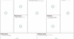
One of these roles is a UX Strategist, which aligns user experience design with the business goals and strategy of the company.
odannyboy.medium.com

100. When we design products and services, it’s not about what we want them to be — it’s what we want the people using them to be: generous, helpful, thoughtful, useful, beautiful, respectful, kind.
uxdesign.cc
It isn’t a mystery that a large part of delivering a highly successful user experience is understanding what the customer wants/needs along with the cognition that consequently gets customers thinking about what they want/need.