Relevant Overviews
Use this glossary to quickly clarify key terms and concepts related to artificial intelligence.
Psychology plays such a huge role in user interface and user experience design. Nowhere is this more obvious than in the arena of charity web design.
The collection contains: 197 Examples, 1457 Design Principles, 169 Creators
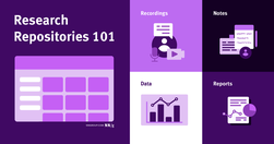
Research repositories organize user research in a central place, making research-related documentation easy to access and consume.
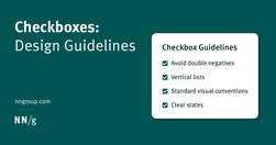
Checkboxes allow users to select one, some, or none of items from a list. They can be used standalone, in checkbox lists, or nested checkbox lists.

Tabs and accordions organize and layer content on the same page. Tabs suit a few long sections, while accordions fit many short ones. Choose based on your content structure and user needs for optimal layout.
✅ Level 1: “What we tell others”, unreliable, opinions, hearsay. ✅ Level 2: “What we tell ourselves”, interviews, debrief, surveys. ✅ Level 3: “What we actually do”, task analysis, observation. ✅ Level 4: “Why we do it”, task walkthroughs, context, interviews.
Read About My Lightweight Approach to User Research and TestingFirst, I have written this post on their blog, sharing some key insights from the workshop that's definitely worth a read.The TLDR is that usability testing needn't be slow or costly. There are many great tools for testing that can make it easy.Of course I did kind of touch on this su…
Tables frequently appear on the web but aren’t easy to design and code. People will expect tables. Not those fancy ones from design inspiration sites but Excel-looking monsters with hundreds of cells and complex interaction. In this case, a designer faces many challenges. With this illustrated guide, Slava Shestopalov explains the table anatomy and

We tend to do things the way we’re told they’ve always been done without questioning or revisiting the reason behind it, even long after that reason ceases to exist.

Understanding the 5 Monkeys Experiment The Power of Peer Pressure: A Look at the Asch Experiment in the 21st Century Duty and Discernment: The Delicate Equilibrium of Obedience and Critical Thinking
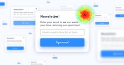
If I want your newsletter, I’ll find it on the page myself!
useful guidelines to rethink, rewrite and redesign error messages to help users recover and succeed. Shared on LinkedIn by Vitaly Friedman
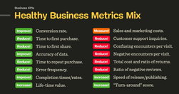
Consider establishing design KPIs alongside business KPIs and create a more holistic and healthy mix of metrics that capture user experience and business goals.
Visual design requires knowledge and understanding of many jargon terms. Use this glossary as a reference as you delve into visual and user interface design. Use this glossary to quickly clarify key terms and concepts related to visual design.
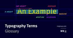
Typography is a key component in almost every digital experience. However, its complexity and jargon make it a common source of misunderstanding. Use this glossary to clarify key definitions related to typography.

As a designer, designing for trust in Artificial Intelligence (AI) products is paramount. AI presents unique challenges that require transparent interfaces, clear feedback, and ethical considerations to build user confidence.

Understanding cognitive biases are not only important for UX Research and UX design, but also for navigating everyday life. Bias seeps into our judgment and thinking which can warp the reality of experience based on our subjective views.
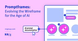
Promptframes complement traditional wireframes by integrating prompt writing and generative AI to increase content fidelity and accelerate the path to user testing. Never use lorem ipsum again.
Our research and evaluation show that there are currently few design-specific AI tools that meaningfully enhance UX design workflows. As of Spring 2024, AI isn’t ready for designers to take advantage of them. AI tools won’t be replacing UX designers any time soon. Currently available LLM-based tools are not shortcutting steps in the design process

User experience is about understanding people, their wants, needs, expectations, and predicting them. But, as a UX designer, you have the power to manage user experience and create a product in a way that will guide a consumer to the result you expect. That’s exactly what we are going to focus on today.

Related ArticleBuilding Interactive UX MapsInteractions can be applied to high-fidelity UX maps to showcase user research and further engage with stakeholders.
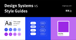
Design systems are a set of standards (like Google’s Material Design or IBM’s Carbon Design System) needed to manage design at scale. Style guides (like content or visual style guides) are just one piece in a design system.
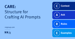
To get better results from generative-AI chatbots, write CAREful prompts. Include context, what you’re asking the system to do, rules for how to do it, and examples of what you want.
Be skeptical of the marketing claims being made by AI tools designed for UX researchers. Many of these systems are not able to do everything they claim.

There’s a powerful force that flows through every user interface (UI): psychology. But like a certain force from a galaxy far, far away, psychology can be used for good or evil. On the light side we have behavioural nudges; on the dark side we have, well, dark patterns.

The Dunning-Kruger effect is a cognitive bias that impacts individuals' perception of their own abilities. For designers and clients, this bias can have significant implications for the overall quality of the user experience. If designers recognize the risks associated with the Dunning-Kruger effect and implement strategies to minimize its impact,
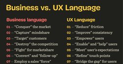
As designers, especially in large enterprises, we often might feel misunderstood and underappreciated. It might feel like every single day you have to fight for your users, explain yourself and defend your work. It’s unfair, exhausting, painful and frustrating.
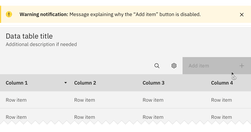
Both hiding and disabling features can be utterly confusing to users. And for both, we need very, very good reasons. Let’s take a closer look at what we need to consider when it comes to hiding and disabling — and possible alternatives that help enhance the UX.

Traditional usability tests are great, but they are not always the most appropriate tool for the job.