Relevant Overviews
These are the official guidelines for the Plain Writing Act of 2010. We developed these guidelines to help you and your agency write clearly, so your users can: Find what they need Understand what they find Use what they find to meet their needs
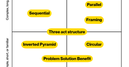
10 patterns to structure your content for understanding, engagement, and effectiveness - and a matrix to help you choose the right one.

Each product has a unique user base with distinct behaviors and preferences. Applying generic strategies without understanding the specific user base is like trying to solve a puzzle while blindfolded.
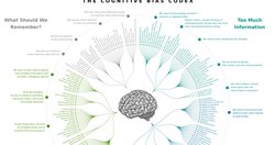
UX & Psychology: Guides and Cheatsheets. With useful resources on how people think, decide, remember and focus attention — guides, glossaries, Miro/Figjam boards and cheat sheets (LinkedIn post by Vitaly Friedman)
Golden Rules For UX Writing. With practical guidelines on how to avoid confusion and help people understand better (LinkedIn post by Vitaly Friedman)
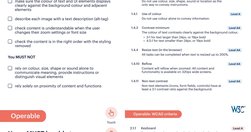
Free Practical Guides To Web Accessibility. With useful guidelines and books to designing with accessibility and run accessibility testing (LinkedIn post by Vitaly Friedman)
Hi and welcome to User Inyerface, a challenging exploration of user interactions and design patterns. To play the game, simply fill in the form as fast and accurate as possible.
Inspired by Reddit r/badUIbattles (a joke subreddit for intentionally bad UI designs), I created BadUI as an open repository for BadUI's made by me and others. This repository contains all best (or worst?) bad-UI I've seen.

A simpler approach to a complicated topic.

So, the “content research beyond competitor analysis” approach helps us bring unique and fresh perspectives to our content research, creating incredible value for our audience and clients and scaling our SEO results extensively.
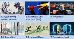
UX has come a long way since its early beginnings at Bell Labs in the 1940s. As we enter Year 2 of the AI revolution, it’s clear that the core principles of UX design are not being replaced but are evolving with AI integration.
Effective icons depend on recognizability and interpretation. Evaluate them with methods appropriate for your specific research questions
Use this curated set of free NN/g templates and guides for inspiration and to accelerate your product development activities and UX career.
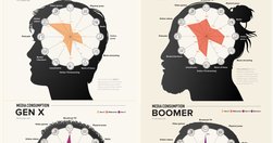
With frequent myths and actual behavior patterns that go beyond heavy use of social media

Artificial intelligence has revolutionized everything from customer service to content creation, giving us tools like ChatGPT and Google Gemini, which can generate human-like text or images with remarkable accuracy. But there’s a growing problem on the horizon that could undermine all of AI’s achievements—a phenomenon known as "model collapse."
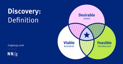
Although many different instigators, roles, and activities are involved in a discovery, all discoveries strive to achieve consensus on a problem to be solved and its desired outcomes.

Stakeholders deem UX work to be “obvious” | Rubric for scoring insightful use of AI | Make it easy to see all user-contributed photos | New image-generation model from Black Forest Labs

Naming is in our nature. It’s a way to express ourselves and signal an object’s significance. Naming products, features, and plans effectively is more about logic than imagination. Names signal a product’s purpose, benefit, or behavior and collectively align user expectations with functionality and value.
The ten most egregious offenses against users. Web design disasters and HTML horrors are legion, though many usability atrocities are less common than they used to be.
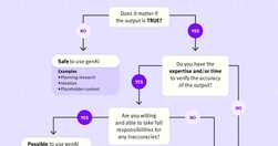
It’s easy to place too much trust in genAI tools. Use only information you can verify or recognize to be true.

Researchers often want to ask about sensitive topics in surveys and screeners. A sensitive question is one that respondents might find embarrassing or invasive. Handle them appropriately and delicately to avoid dropoffs and inaccurate data.
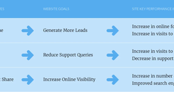
How do you know your site is succeeding? How do you know if that redesign was worth it? How can you justify your work to clients or management? You need a way of measuring success.

The prompt addition to make ChatGPT-written content not sound like ChatGPTHere’s the prompt addition, to use when giving ChatGPT a writing task. Add at the end of your prompt, after you’ve described the desired writing style of your generated content, and after you’ve set up the task and structure. Revisit your past conversations to see how much d…
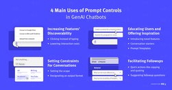
When following good practices, prompt controls can increase the discoverability of genAI chatbots’ features, offer inspiration, and minimize manual user input.

Unsure where to start? Use this collection of links to our articles and videos to learn how UX can build trust, influence, and partner with product managers to drive positive product outcomes.

There’s a classic proverb saying that “the nail that sticks out gets hammered down.” However, in a user interface, an item that looks out of place is more likely to be ignored than to be attended to. This is a tweak on the classic usability observation of banner blindness.

While Suno 3.5 is indeed faster than version 3, it took me a while to realize the trick they use to make users think that the service is much faster than it actually is.
Synthetic users are fake users generated by AI. While there may be a few use cases for them, user research needs real users.
