Relevant Overviews
- Communication Strategy
- Content Strategy
- Online Strategy
- Online Community Management
- Social Media Strategy
- Content Creation & Marketing
- Online Architecture
- Digital Transformation
- Change & Project Management
- Personal Productivity
- Innovation Strategy
- Communications Tactics
- Psychology
- Social Web
- Media
- Communications Strategy
- Science&Technology
- Business
Overview: Online Architecture
Probably the most common reason organisations contact me is to get help with their internal and external information architecture.
I usually find, however, that they first need to find a clear consensus on their communication strategy, content strategy and online strategy. Once that's done, I deliver a document which both you and your developers can understand, including some or all of the following:
- highly detailed sitemaps: internal intranets, external websites, knowledgebases, and the information flows between them
- mission statements for principal site chapters, features and content types
- business requirements for any revised or new features
- wireframes, allowing both you and your developers to envision how the result will look.
The aim is to deliver something detailed enough for professional developers and designers to give you a concrete quote, but not so technical that noone else understands what they're building.
I can then work with them to deliver it, or assemble a team and manage the site build for you.
Check out some of my firsts and best practices, or just get in touch.
More services: start with Communication strategy.
Relevant resources
Circa is indeed returning, but it won’t be the Circa its users remember.... “an independent digital news site aimed at the new generation,” building on the “intellectual property and technology of Circa News.”

the notion of functionality lifting itself out of app silos and being made available as services.... pieces of micro-content and micro-functionality surfacing as cards... a constellation of screens, regardless of whether it’s a desktop, laptop, tablet, phone, watch, or whatever ... an app-based channel for cards... your conversations and the f…

While the platform has long been a bastion of visual storytelling, it has also been historically lax with its limitations on gratuitous writing and hashtagging. That all changed today... An epidemic of hashtag fatigue is coming... The first step was de-prioritizing the hashtag in discovery feeds. The next step is burying it in yours... To e…

Imagine taking a team of highly creative people and sticking them in sterile, lowest-cost-per-square-foot spaces, and expecting them to achieve the best work of their lives?... we've been focussing heavily on the design of our work spaces... Chaining people to their desks (or cubicles) is a sure-fire way to kill great ideas and creativity. -…

The GDS was set up to improve online public services but disagreements with the top brass over its ambitions have seen four leaders abruptly resign - Why are senior staff fleeing the Government Digital Service? | Public Leaders Network | The Guardian

Making ‘a net positive contribution to people’s lives’ doesn’t necessarily satisfy investors... it’s possible to imagine regulation that actually expands users’ choices. It doesn’t need to be especially invasive or dramatic, and it would be designed to give users more control over their experiences online... Here are three things we could do…

Silver is a combination of an iOS app, a Mac app, and a Sketch Plugin that seamlessly communicate with each other to make your mobile design process as smooth as possible - Introducing Silver : Lightweight Mobile Prototyping in Sketch 3 — Startups, Wanderlust, and Life Hacking — Medium
In this week’s edition, a months’ reading - some 30 posts - on social media, digital transformation, content/system design and EuroPCom2015. But first some news from me

"The experience of users happens beyond the screen and in the gaps... between channels, devices and business silos." (and between government departments, and indeed governments) "You might be thinking this sounds more like customer service design than user experience design. You might be right." - User experience design is not what you th…

Blog posts take hours to write, those great images need to be found or created and those social networks need to be managed and nurtured. It is often not done or persisted with because there are no apparent quick rewards. This is where the tortoise can beat the hare by slow persistence. It is a marathon and a journey not a sprint... you are bui…
“Canva enables anyone to become a designer”

Keyword research is one of the most important, valuable, and high return activities in the search marketing field. By researching your market's keyword demand, you can not only learn which terms and phrases to target with SEO, but also learn more about your customers as a whole... you can predict shifts in demand, respond to changing market c…

information architecture has become ripe with myths... I want to take a few moments to dispel some of them.... People convince themselves that information architecture is about organising content in a logical way. It is not... people aren’t logical.... users need to be able to reach content in three clicks.... there is no evidence to support…

Where I think Circa took a step forward ... the idea that we could ... take ANY story and add a structured element to it — even if the only structure was “this item read, this item unread.”.. I do think there are a few concepts that Circa created and executed upon that were truly “inventions”... The concept of atomizing news ... allowing a r…
Think of an interaction as a conversation between your product and your user... if the conversation is boring, your user will eventually leave ... Without interactions, there wouldn’t be any delight in the experience. - The 5 Pillars of Interaction Design — Medium

Lifestream unified our digital life: Each new document, email, bookmark or video became a bead threaded onto a single wire in the Cloud, in order of arrival...Whenever you add a bead to the lifestream, you specify who may see it... Your future home page is a bouquet of your favorite streams ... News streams blended with shopping streams, blogs,…

as the internet of things surrounds us with devices that can hear our words, anticipate our needs, and sense our gestures, what does that mean for the future of design, especially as those screens go away?... It's all about getting away from the touchscreen, and interfacing with the devices around us in more natural ways: haptics, computer visi…

In trying to access the federal programs which will allow her to afford college, Joanne must navigate the websites of multiple agencies. She finds dozens of government websites which all seem relevant to what she’s looking for. Joanne is confused. Are these programs related to each other? Are they even all a part of the federal government? Are any…

You have nothing to fear but fear itself. Fear, and algorithms... It has never been easier for designers and non-designers to create great websites that even five years ago would have cost a fortune to build... design is dead. There is more to design than the pixel-pushing of visual design... The real designers, problem solvers... able to co…

The visuals team ... the product of merging two groups: the news applications team, who served as NPR’s graphics and data desks, and the multimedia team, who made and edited pictures and video... The multimedia crew wanted to make pictures and video that were truly web-native, which required web makers. And our news apps lacked empathy... Pictu…
This software is a clever mix between Sketch, Keynote, Flash and After Effect (plus some bonus features specifically for interactive prototypes)... Easily creating tap transitions from one screen to another is, to me, the core of the software. - Principle : the prototyping tool you’ve got to try — STARTUPS + WANDERLUST + LIFE HACKING — Medium
Masterclass time. From the Google Blog: we’ve taken the Google logo and branding, which were originally built for a single desktop browser page, and updated them for a world of seamless computing across an endless number of devices and different kinds of inputs (such as tap, type and talk).

"Innovation is exploding in every direction. With all of these “smart” things — smart cars, smart phones, smart watches, smart glasses — it’s a designer’s job to figure out the best way to deliver content in such a vastly connected world. The projects you’re working on at this very moment will be interacted with on devices that didn’t exist wh…

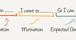
Job Stories are great because it makes you think about motivation and context and de-emphasizes adding any particular implementation. Often, because people are so focused on the who and how, they totally miss the why. When you start to understand the why, your mind is then open to think of creative and original ways to solve the problem. - Repl…

"This is not just about great user interface design but real end-to-end digital [services]... Some things have not been smooth, not all the exemplars have been a resounding success, however Mike took the challenge, dared to be measured and held accountable and the results have certainly been positive and to the betterment of the public purse." …
"Fresh powder beckoned 16 expert skiers and snowboarders into the backcountry. Then the snow gave way."Just an extraordinary online experience from NYT.Update: "The Pulitzer Prize-winning multimedia feature about an avalanche in Washington State changed the way The New York Times approaches storytelling" - ‘Snow Fall’ at 10: How It Changed Journal…
What separates Medium from everyone else is that responses create this amazing platform for discussion and stories breed their own little ecosystems. So why don't we treat responses and their result with as much respect as we currently do recommendations?... a story that inspires twenty responses is more "successful" in my opinion than one that…
So many memories…
Publishers may be able to get more value out of their tweets thanks to a new design change on Twitter... on the platform’s iOS or Android apps... stories will get some extra room, complete with lead art and the first few words of a story... part of the company’s plans for bringing more media into your home feed. - Twitter’s new article prev…

"Some people think design means how it looks. But of course, if you dig deeper, it’s really how it works." - Design terminology, demystified — Medium
Relevant Overviews
- Communication Strategy
- Content Strategy
- Online Strategy
- Online Community Management
- Social Media Strategy
- Content Creation & Marketing
- Online Architecture
- Digital Transformation
- Change & Project Management
- Personal Productivity
- Innovation Strategy
- Communications Tactics
- Psychology
- Social Web
- Media
- Communications Strategy
- Science&Technology
- Business