Relevant Overviews
- Bluesky and the ATmosphere
- Communication Strategy
- Content Strategy
- Knowledge4Policy
- Fediverse
- Online Strategy
- Online Community Management
- Social Media Strategy
- Content Creation & Marketing
- Online Architecture
- Digital Transformation
- Innovation Strategy
- Communications Tactics
- Psychology
- Social Web
- Media
- Politics
- Communications Strategy
- Science&Technology
- Business
Further progress by Bluesky on "improving the quality of replies and making conversations feel more personal, constructive, and in your control":identifying social neighbourhoods "the people you already interact with or would likely enjoy knowing" and prioritising conversations in thema dislike option to help personalise Discover & other feeds. "D…
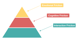
"User friction ... prevents a user from accomplishing a goal in your product... three levels: interaction friction, cognitive friction, and emotional friction"Interaction friction: do usability testing."When cognitive load is high ... there is significant cognitive friction ... encompasses all aspects of the experience that result in mental effor…

to investigate ... notion that websites are starting to look the same ... data mining ... scrutinized nearly 200,000 images across 10,000 websites... of the Russell 1000, the top U.S. businesses by market capitalization ... Alexa’s 500 most trafficked sites... sites nominated for Webby Awards ... how many pixel-by-pixel edits ... to transform colo…
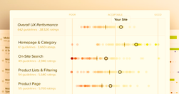
If you’re a User Researcher ... Baymard can probably provide you some value ... an “independent web usability research institute”... founded on the central thesis that design decisions are often made subjectively ... a more evidence-based approach is possible...Baymard sells research ... based on tens of thousands of hours of their own in-house us…

free online ratings are less trustworthy than those that have some cost to them... In ecology, costly signaling theory argues that displays that “cost” more — like elaborate peacock tails, or strenuous displays of hunger from baby birds — are more likely to reflect reality... making rating goods or services as easy as possible... is counterproduct…
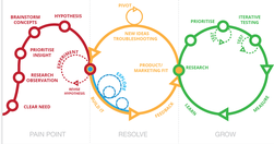
This article is not a UX Research manual, it ... provides a general idea of how and when UX Research is conducted ... why designers should care about it...~ Understanding brings us closer to what we are already so familiar with. And that is the inception of UX Research... user research tackles the demographical data about a product’s existing and…
The Australian Government Design System provides a framework and a set of tools to help designers and developers build government products and services more easily.

The curse of knowledge is a cognitive bias that occurs when an individual, communicating with other individuals, unknowingly assumes that the others have the background to understand... seen at all levels of a company... if you already know the answer... tend to underestimate the difficulty of the question or the problem... become so immersed in t…
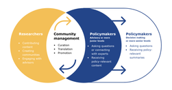
Latest on the K4P Medium Publication
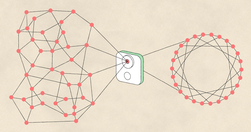
it’s leaps-and-bounds more useful to prototype your UX with a user’s real content than it is to test with real ML models... By re-orienting the conventional AI paradigm from finding ways to make the machine smarter, to exploring ways to augment human capability, we can unlock far greater potential in machine learning... we have a tremendous opp…

time to deliberately focus on design for interconnectedness and relationships ... customer (user) centric design created a narrative of isolation: the customer is ... someone that is provided with a solution ... to get the job done... [but] research ... explained that customers (users) may often look to engage more deeply with products... relat…
discovering a filtering algorithm's existence in a curated feed influences user experience, but it remains unclear how users reason about the operation of these algorithms.... Interviews revealed 10 "folk theories' of automated curation... Users who were given a probe into the algorithm's operation via an interface ... visible hints disclosing asp…
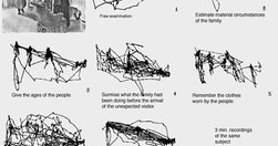
Be wary of using expert judgement as your only source of data... by all means apply your expertise to make judgments about a design, but be sure to validate these judgements with data... Hick’s Law ... states that the time taken to make a decision increases as the number of choices is expanded... Fitts’ law... the time required to rapidly move to…
thoughtfully designed user interfaces can make us a freer, more humane, and more just society, just as poorly designed ones seem to have made many of us less compassionate, less informed, and more antagonistic... for a case study, we only need to look ... online forum Nextdoor.com originally ... a way of fostering community through neighborhood-s…
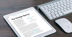
prototyping is a great tool for developing user interfaces. But that is just the tip of the iceberg... you can prototype pretty much anything. Anything from a customer service interaction to streamlining a factory line process. Here are just a few ways prototyping could improve the user experience... They are a great collaboration tool. Instead…

some examples of a blended interface, bringing the best of the command line and GUI paradigms together... — notifications and quick input from the conversational side, along with a rich and intuitive experience from the GUI side... Each message has the potential to be a ,,, bite size applications like a photo carousel, media players, mini games, i…

enterprise software helps the user answer one or more of the following questions:What’s important? (Surface relevant information)What do I do next? (Support decision making)How do I do it? (Facilitate action)... the conversational interface answers all three of the above questions better than the software tools we have today... Dashboards today …

"If you're too metrics-driven, you're only going to be focused on what moves a particular metric, and you will use any hack or any trick or any deceptive technique to get there.".. many of the worst dark patterns are pushed by businesses, not by designers
Here’s a quick overview on the four different primary forms of design to help you understand what they mean.

bandwagons are bad for your health, as illustrated by the impending death of content marketing and the gathering backlash against Slack (Slacklash? BackSlacksh?) and (already!?) chatbots.
The New York Times smartphone products now have redefined Page One for the digital era. Finally, we have a model. Mobile can be harnessed to share the day’s news, and works far better to keep us informed than newsprint ever could....engagement — more minutes, now especially in mobile — drives subscription sales, retention, and the ability to incre…

What’s the difference between customization and personalization? - Customization: The visitor deliberately chooses between options designed to make the user experience more personal.- Personalization: The visitor is automatically shown personalized pages based on anticipated needs / wants.

Asking humans to judge each other can be a surprisingly powerful thing... But invoking a sense of being watched isn’t the only way platforms subliminally encourage social behaviour... persuasive design: if you want people to do something, don’t explain why, just show them how... If extremists seek to spread fear and shock, counterspeech might aim…
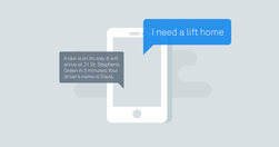
Bots are to modern messaging apps what APIs were to Web 2.0; a way to build on top of other services, experiment, and create a new way of interacting with existing services... what inspiration can we draw from the past that might help us to think about designing Conversational UIs?
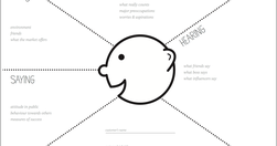
Empathy mapping is a way to characterise your target users in order to make effective design decisions. User journey mapping is a way to deconstruct a user’s experience with a product or service as a series of steps and themes. Put simply, these methods encourage your stakeholders to think about user needs effectively,

The news organisation has mostly been focusing on revamping its mobile apps, but the next step is bringing some of the learnings back to the homepage... third in a series looking at how news organisations are now approaching the homepage, after it was pronounced dead by many in 2014... our real challenge everyday is to come in and say 'ok, who…
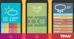
2015 is the Year of the Card. Screen-size cards are everywhere, from websites to native apps and are designed to look like their physical counterparts. It’s an easy way for you to shuffle through a series of digital containers with the flick of a thumb...cards are a style that seems just made for apps.

We have read a lot of awesome articles from the community this year. We picked up for you the best of what we came through in 2015.
for an actual brand, developer or publisher wondering if they should do an app or a website, I generally answer that the calculation is much simpler and less technical: Do people want to put your icon on their home screen? ... If you don't have that relationship, then all the clever things ... are irrelevant and your strategy should focus on the w…

we’ve developed mobile apps and online platforms for over half a decade... After working on over 300 such projects, we’ve learned a ton of lessons. Now we’d like to share 6 important insights to help you take your user experience to the next level.
Relevant Overviews
- Bluesky and the ATmosphere
- Communication Strategy
- Content Strategy
- Knowledge4Policy
- Fediverse
- Online Strategy
- Online Community Management
- Social Media Strategy
- Content Creation & Marketing
- Online Architecture
- Digital Transformation
- Innovation Strategy
- Communications Tactics
- Psychology
- Social Web
- Media
- Politics
- Communications Strategy
- Science&Technology
- Business