Relevant Overviews
- Communication Strategy
- Content Strategy
- Online Strategy
- Social Media Strategy
- Content Creation & Marketing
- Online Architecture
- Digital Transformation
- Change & Project Management
- Innovation Strategy
- Communications Tactics
- Psychology
- Social Web
- Media
- Communications Strategy
- Science&Technology
- Business
Overview: Online Architecture
Probably the most common reason organisations contact me is to get help with their internal and external information architecture.
I usually find, however, that they first need to find a clear consensus on their communication strategy, content strategy and online strategy. Once that's done, I deliver a document which both you and your developers can understand, including some or all of the following:
- highly detailed sitemaps: internal intranets, external websites, knowledgebases, and the information flows between them
- mission statements for principal site chapters, features and content types
- business requirements for any revised or new features
- wireframes, allowing both you and your developers to envision how the result will look.
The aim is to deliver something detailed enough for professional developers and designers to give you a concrete quote, but not so technical that noone else understands what they're building.
I can then work with them to deliver it, or assemble a team and manage the site build for you.
Check out some of my firsts and best practices, or just get in touch.
More services: start with Communication strategy.
Relevant resources
Design triumphs over content: The CAPS15 conference really looks interesting … if only I could read the programme!
This is a code generator, which adheres to latest web programming standards of HTML5 and CSS3. You don’t need to hand code the templates, just design them, and TemplateToaster will automatically generate the HTML 5 and CSS 3 for it. At the end of designing, export your projects and the zip of source code will in your hand. Doesn’t it seem too simp…

Clever. To build an app, Buzzfeed first built an enewsletter and tested that: "Designing and building an email newsletter takes a lot of work. But compared with launching a native app, a newsletter requires a much smaller investment of time and technology. As a lower-stakes product, we could launch it much more quickly than we could an app and …
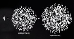
"A new interactive documentary, “The Fallen of World War II,” ... 18-minute film is styled like an infographic and that helps viewers fathom the scale of casualties in a way that simple numbers cannot.... The base elements it uses are simple human-shaped icons. Each of those represents one thousand deaths – and at some points in the video they …

Cards are bite-sized, self-contained, interactive units of graphical real estate presented within digital apps... cards are mostly used within apps to present information and provide interactive functions ... Things get a lot more fun, however, once cards can be shared between different apps.... The Guardian provides cards on Google Now ... [wh…
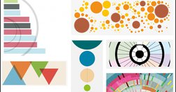
'add a bit of punch' to stories using data visualisation - Data visualisation tips from Information is Beautiful | Media news
"If you want to know where web design is heading, just look at where architecture has already gone." - The Future of Web Design is Hidden in the History of Architecture — Medium

If you ever wondered why meetings so often lead to the wrong decision ... "... we are wired in certain ways ... that can block groups from processing information effectively, which leads to bad decisions... Gilbert explains how to use diversity and inclusion to get better results from product ideation efforts... One of the most fundamental …

"nearly 67 percent of emails were opened on a mobile device... it’s not that hard to create responsive emails. ... Here are 10 quick design hacks" - 10 design hacks for responsive emails that don’t suck

"If you want to know where web design is heading, just look at where architecture has already gone." - The Future of Web Design is Hidden in the History of Architecture — Medium

Good analyses of where data visualisation is heading: "Today, a slew of new software has made it easier than ever to create data visualizations from scratch. The downside? It has led to more prescriptive design. Take D3. It's a JavaScript library that helps turn information into any number of visual frameworks...Beyond D3... Tableau is the crow…
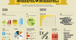
"... infographics are often taken at face value... And it is hard to fact check infographics... Fast Company republished 10 facts from Buffer. Fact checking one of the facts in that list went like this: The fact quoted an infographic -> that quoted a blog post at Huffington Post -> which in turn quoted another infographic -> which quoted a blog…
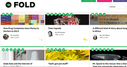
"Fold is a platform for telling stories. It makes it simple to add multimedia background information or create context... the main story reads as all stories do, straight down vertically. But contextual information is placed to the side of the main story, on a horizontal line. That information can be video, photos, or links to other sites..."…

To be rolled out next time someone wants to "skip the analyses and wireframes - just give us the mockups": "An interface's visual hierarchy relies on the same principles of aesthetics used by the Renaissance masters, but on top of that (or rather beneath it) there's the subtext of secondary goals - promoting specific content, encouraging user…

" Top tasks are the small set of tasks ... that matter most to your customers. Make these tasks work well, and you’ll be on the right track. Get them wrong, and chances are you’ll lose the customer. Top Tasks Management is a model that says: “Focus on what really matters (the top tasks) and defocus on what matters less (the tiny tasks).” Tiny ta…
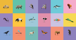
Stunning use of CSS & HTML5 to create an online exhibition exploring the stories of 30 endangered species. Best viewed in Chrome. - In Pieces - 30 Endangered Species, 30 Pieces.

"Most visitors to departmental and agency content want to see what the current position is, so there is a need to manage historical content. Users expect this to be available. In the past there have been different approaches to this. Having a single government website gives us an opportunity to make this consistent, manageable and effective for u…

"Images with text over them ... do make a post more enticing to your followers or friends... Buffer's Pablo, which creates these images, out of beta." - Buffer Officially Launches its Image Creation Tool Pablo
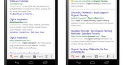
"Google is now clearly marking websites in mobile search results that it considers mobile friendly and if that tag isn’t getting displayed around your content, your website may see a drop in mobile traffic. Responsive design is definitely the way to go but will that be enough. How do you confirm if your web pages are considered mobile friendly by…

"the system ... counts the number of incorrect facts within a page ... by tapping into the Knowledge Vault, the vast store of facts that Google has pulled off the internet. Facts the web unanimously agrees on are considered a reasonable proxy for truth. Web pages that contain contradictory information are bumped down the rankings." - Google wan…

"From the responsive layouts to the improved APIs ... we’ve reimagined every aspect of the WIRED experience... I want to walk you through our thinking on the new site—to tell you about the technology and design innovations that make this iteration of WIRED possible. We settled on a card-based motif for both its flexibility and configurability..…

"some people have the sense that data somehow makes designers less powerful, that you’re basing decisions based purely on mechanical measures rather than designer intuition and genius... data is what ... turns designers from artists into the most important decision makers in a company... prototypes can really only get you to local maxima ... the…

"Newsrooms don't need large budgets for analyzing data--they can easily access basic data tools that are free or inexpensive." - Drilling Down: A Quick Guide to Free and Inexpensive Data Tools | Global Investigative Journalism Network
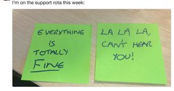
I freely admit: I've been a fanboy of the UK's Government Digital Service (GDS) since studying their design principles. Those principles are still good. Everything else, it turns out, was not.

"an engine to generate custom sets of tags for each Web site visitor.... the next step is to assemble the tag data into detailed individual profiles for personalization, testing, attribution, and other purposes... These features go beyond Web page tags to capture data from mobile apps, from ad pixels served on external Web sites, and from other s…

"Designers can create in-depth, documented case studies of their work. The best ones clarify the complex choices designers have to make and explain their thinking behind UX and visual decisions. They document and communicate that knowledge clearly, helping our design community to develop a more empathetic, human‐centered way of speaking about our …
Good overview of Circa's approach: "A new model for online journalism is emerging, focusing on the atomization of news stories into “bite-sized chunks” of information aimed at mobile audiences."
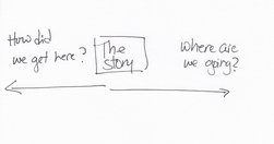
"By news homepage, I mean any way for a user to first encounter content. A push notification could very well be the new news homepage. ... An article or a newsletter ... Overcast or Soundcloud or iTunes may be your homepage.... Homepage, to me, is simply a shorthand version for any of these things. " Neat overview. Just remember, however you desi…

"There’s a common misconception out there that user centered design means being led by the user... In some instances, being user centered means ignoring or even going against explicit user wishes in order to better serve the user. Sound confusing? " Then read: - Be user centered, not user led - MindTheProduct
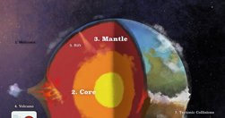
"an inspiring design experiment... Earth: A Primer, a new interactive book for the iPad... instead of simply telling you about geological processes, it actually lets you control them. Each topic’s page pairs text and a simulation... Like a deity in training, you can sculpt mountains, summon rain storms, and move tectonic plates with your fingertip…
Relevant Overviews
- Communication Strategy
- Content Strategy
- Online Strategy
- Social Media Strategy
- Content Creation & Marketing
- Online Architecture
- Digital Transformation
- Change & Project Management
- Innovation Strategy
- Communications Tactics
- Psychology
- Social Web
- Media
- Communications Strategy
- Science&Technology
- Business