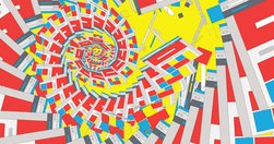
to investigate ... notion that websites are starting to look the same ... data mining ... scrutinized nearly 200,000 images across 10,000 websites... of the Russell 1000, the top U.S. businesses by market capitalization ... Alexa’s 500 most trafficked sites... sites nominated for Webby Awards ... how many pixel-by-pixel edits ... to transform colo…
The Jobs-to-be-done methodology helps you focus on the job that the user wants done rather than who and how... First, we take the Persona out of the picture and instead add context. Then we focus on the motivation (i.e, answering the why). It gives us clarity to the whole situation and helps us be more creative in designing a solution.

they’re not the game-changer he thought they’d be... We have to stop trying to find a single problem. It needs to be solved in a million different ways, every single day.

For the purposes of this post, let’s narrow landing pages down to those connected to content marketing or email marketing campaigns, and meant to generate conversions, bearing in mind those conversions may not necessarily be revenue-generating sales.
Here’s a quick overview on the four different primary forms of design to help you understand what they mean.

The feed is dying, and we feel shocked by its death — but we shouldn’t... imagine a library organized chronologically, or even the morning edition of a newspaper... the curated feed ... can, theoretically, eliminate posting anxiety, find the people you want to talk to (and the people you want to hear from) and make the experience of posting feel …

Conversational UIs will also force designers to cosy up to writers, or to become more linguistically literate themselves. Information architects will be trendy again, since syntax and labels are totally their turf.
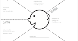
Empathy mapping is a way to characterise your target users in order to make effective design decisions. User journey mapping is a way to deconstruct a user’s experience with a product or service as a series of steps and themes. Put simply, these methods encourage your stakeholders to think about user needs effectively,

The news organisation has mostly been focusing on revamping its mobile apps, but the next step is bringing some of the learnings back to the homepage... third in a series looking at how news organisations are now approaching the homepage, after it was pronounced dead by many in 2014... our real challenge everyday is to come in and say 'ok, who…
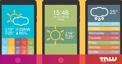
2015 is the Year of the Card. Screen-size cards are everywhere, from websites to native apps and are designed to look like their physical counterparts. It’s an easy way for you to shuffle through a series of digital containers with the flick of a thumb...cards are a style that seems just made for apps.
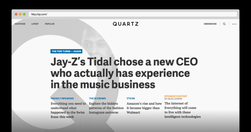
Our first attempt devoted much of the homepage to a continually updated news briefing. We are dispensing with that briefing today to try something else. Homepages, it turns out, aren’t dead so much as reborn.

information architecture has become ripe with myths... I want to take a few moments to dispel some of them.... People convince themselves that information architecture is about organising content in a logical way. It is not... people aren’t logical.... users need to be able to reach content in three clicks.... there is no evidence to support…
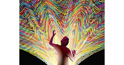
Lifestream unified our digital life: Each new document, email, bookmark or video became a bead threaded onto a single wire in the Cloud, in order of arrival...Whenever you add a bead to the lifestream, you specify who may see it... Your future home page is a bouquet of your favorite streams ... News streams blended with shopping streams, blogs,…
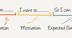
Job Stories are great because it makes you think about motivation and context and de-emphasizes adding any particular implementation. Often, because people are so focused on the who and how, they totally miss the why. When you start to understand the why, your mind is then open to think of creative and original ways to solve the problem. - Repl…
"Fresh powder beckoned 16 expert skiers and snowboarders into the backcountry. Then the snow gave way."Just an extraordinary online experience from NYT.Update: "The Pulitzer Prize-winning multimedia feature about an avalanche in Washington State changed the way The New York Times approaches storytelling" - ‘Snow Fall’ at 10: How It Changed Journal…

Cards are bite-sized, self-contained, interactive units of graphical real estate presented within digital apps... cards are mostly used within apps to present information and provide interactive functions ... Things get a lot more fun, however, once cards can be shared between different apps.... The Guardian provides cards on Google Now ... [wh…
"If you want to know where web design is heading, just look at where architecture has already gone." - The Future of Web Design is Hidden in the History of Architecture — Medium

"If you want to know where web design is heading, just look at where architecture has already gone." - The Future of Web Design is Hidden in the History of Architecture — Medium
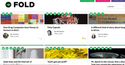
"Fold is a platform for telling stories. It makes it simple to add multimedia background information or create context... the main story reads as all stories do, straight down vertically. But contextual information is placed to the side of the main story, on a horizontal line. That information can be video, photos, or links to other sites..."…

To be rolled out next time someone wants to "skip the analyses and wireframes - just give us the mockups": "An interface's visual hierarchy relies on the same principles of aesthetics used by the Renaissance masters, but on top of that (or rather beneath it) there's the subtext of secondary goals - promoting specific content, encouraging user…
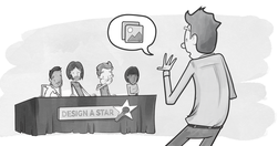
" Top tasks are the small set of tasks ... that matter most to your customers. Make these tasks work well, and you’ll be on the right track. Get them wrong, and chances are you’ll lose the customer. Top Tasks Management is a model that says: “Focus on what really matters (the top tasks) and defocus on what matters less (the tiny tasks).” Tiny ta…

"an engine to generate custom sets of tags for each Web site visitor.... the next step is to assemble the tag data into detailed individual profiles for personalization, testing, attribution, and other purposes... These features go beyond Web page tags to capture data from mobile apps, from ad pixels served on external Web sites, and from other s…
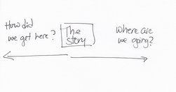
"By news homepage, I mean any way for a user to first encounter content. A push notification could very well be the new news homepage. ... An article or a newsletter ... Overcast or Soundcloud or iTunes may be your homepage.... Homepage, to me, is simply a shorthand version for any of these things. " Neat overview. Just remember, however you desi…
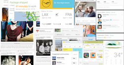
"We are currently witnessing a re-architecture of the web, away from pages and destinations, towards completely personalised experiences built on an aggregation of many individual pieces of content ... the result of the rise of mobile technologies... from many pages of content linked together, towards individual pieces of content aggregated togeth…
"With 95% confidence we conclude that an increase in ranking “the intranet search helps me find the information I need” results in a higher valuation of the respondents intranet as a whole. The impact for the same question related to menus was statistically insignificant." Not quite the deathknell for information architects and resellers of stic…

"It can actually have a tremendous impact on visitors perception of your website, whether they can easily find what they are looking for, and ultimately whether they purchase what you are selling." Pretty sell-focused, but there's no better force to refine an information architecture than assigning a value to each click ... and each bounce! - Ho…
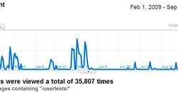
Great article on improving intranet UX, and useful inspiration for any website manager: "During the online cardsorting sessions I covered over 1000 content items and got nearly 36,000 individual responses. The first batch ... designed to elicit our main navigation labels. Subsequent tests then checked that the chosen names would suit all the intr…
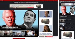
"Politico has redesigned its website for the first time in its seven year history, and The Guardian's U.S. recent refresh marks the first time it's redesigned almost entirely in public, with its readers' input. Here's a look at the thinking behind the redesigns, and what the publishers were able to pull off." - Politico, HBR, The Guardian: W…
"The Guardian has a new setup for its liveblogs that aims to fix some of their eternal problems — chief among them that they’re great for in-the-moment following along, but cryptic and unnavigable after the fact" - The Guardian has a new format for liveblogs to make them more readable » Nieman Journalism Lab
"The New York Times today introduced “Watching,” a major new feature on the NYTimes.com homepage on desktop and on the mobile website. Watching is a stream of developing and noteworthy news designed to amplify the scope and urgency of The Times’s digital report. Watching offers a tailored feed of the news of the moment, such as early outlines of …