Relevant Overviews
- Content Strategy
- Online Strategy
- Online Community Management
- Social Media Strategy
- Content Creation & Marketing
- Online Architecture
- Digital Transformation
- Change & Project Management
- Personal Productivity
- Innovation Strategy
- Surveillance Capitalism, Social media and Polarisation (Overview)
- Communications Tactics
- Social Web
- Media
- Politics
- Communications Strategy
- Science&Technology
- Business
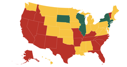
Tracking states as they make progress towards a new normal
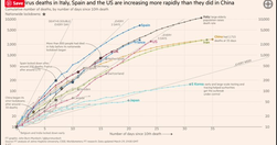
FT senior data-visualisation journalist ... explains the must-see daily graphs...See also Coronavirus tracked: the latest figures as the pandemic spreads | Free to read
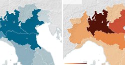
The map juxtaposed pollution in northern Italy with the European Union subsidies paid to farmers in the region. The overlap was undeniable... The map was expunged from the group’s final reports... an approximation confirms ... the most heavily subsidized areas had the worst pollution...the bloc’s $65-billion-a-year agricultural subsidy program ...…

open-sourcing the tools we created to do Documenting Hate... writing a guide that will let any newsroom do crowd-powered data investigations... Documenting Hate came shortly after Election Day 2016, in response to a widely reported uptick in hate incidents... we decided to ask people across the country to tell us their stories ... organized a col…

What is data journalism? What is it for? What might it do? What opportunities and limitations does it present? Who and what is involved in making and making sense of it?
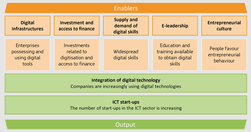
The data explorer provides an overview of the current state of play of European businesses as regards digital transformation.
every individual picks their idea, we vet it ourselves and make sure the data’s there, that it’s interesting, and we just go off and do it... We specifically seek out stories that aren’t news related, because we don’t want to compete in that space
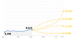
Brilliant piece of data journalism

BBC’s Reality Check team will focus on content that is clearly fabricated and attempting to mislead the public into thinking it has been produced by a reputable news organisation... part of the BBC’s attempt to do more “slow news”, using in-depth analysis and expertise in a bid to help the public understand an especially tumultuous period in the …

With its reliance on polling data over source cultivation and number crunching over narrative, FiveThirtyEight... is at the forefront of a shift in the way political journalism is practiced.... being an outsider, maybe you’re able to call B.S. a little easier. That’s a helpful role to have.... the site attracted nearly 10 million unique visitors …

well-known for its data-visualizations — half of the 60 daily articles published contain charts — and on May 10, it officially took the wrapper off Atlas, so anyone can sign up and create their own graphs.
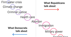
Democrats and Republicans sometimes seem to be living in two different Americas. We analyzed the past seven debates on each side to show which topics are most discussed within each party (nice, simple data visualisation here)

Our interactive graphic offers a real-time snapshot of the race, using media attention to track the fortunes of the presidential hopefuls... explore the graphic and view a running picture of how the candidates are faring on television during the election season, or drill into the numbers by network using the explorer dashboard. - Media Cover…

I developed a metric to identify gatekeepers, who increase your influence, and flak-catchers who reduce it. I tested the GREEDY FRAGILE algorithm developed by West Point for drone targeting decisions, which measures how much an individual participant in a network makes it more or less centralized. The results were fascinating. - An x-ray of Bru…
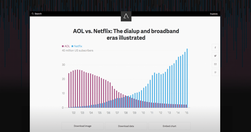
Atlas deepens our journalism by offering readers better access to the data and visualizations in so many of our stories. It also extends the reach of our journalism by letting you make use of our charts in new ways ... as we build out the platform, we are hoping to let anyone make charts in Atlas... Atlas gives each of our charts its own home, …

Visualise your data and embed interactive, annotated graphs in your stories for free... At Journalism.co.uk we've been regularly using Datawrapper, Infogram and Google Sheets to name a few, and we have highlighted many others in our pieces. Plotly is perhaps one of the more complex resources, but it's free to use and enables its users to cre…
The Journalist's Toolbox

A typically good piece of data journalism from Guardian's Datablog: "The number of people employed on zero-hours contracts reached 697,000 in the fourth quarter of 2014. See the characteristics of people employed on zero-hours contracts in four charts " - Zero-hours contracts in four charts | News | The Guardian

"While we've always loved a good chart and map at Vox, appreciating a chart or map does not data journalism make. Data journalism is not just data visualization... ... the explosion in data sources readily available on the web... can both aid in telling important and necessary stories, but can also be easily misunderstood and potentially manipula…
Good overview of Circa's approach: "A new model for online journalism is emerging, focusing on the atomization of news stories into “bite-sized chunks” of information aimed at mobile audiences."

"Swarmize enables journalists to tell new, collaborative stories by making use of real-time data collection and visualisation" Just the tests they've already done are awesome. The code's on GitHub. Think to use in surveys, real-time social media monitoring, live blogs ... anything where real-time is useful and/or you might want a second bite at t…

Th@e new Guardian Visuals team will bring together ... the graphics desk, picture desk, interactive team and parts of the digital design and multimedia teams... it's hard to assemble teams that are cross-disciplinary ... and have the right combination of designers, developers, graphic artists, photographers." - Guardian forms new editorial teams…
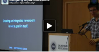
"A newsroom typically contains reporters, editors, data journalists, developers, designers … But traditionally they work in separate departments, unable to seamlessly collaborate together. That’s why silos don’t work. Instead, there should be a horizontal of these newsroom archetypes to truly integrate the journalism with the tech." - J-teams, le…

"So if you too are just starting out with scraping, here are five of the most useful tools I’ve encountered while learning and working on my project." - Five data scraping tools for would-be data journalists | Knight Lab | Northwestern University

The seminal launch 538 launch post: "... while the first two steps of the process (collecting and organizing information in the form of news stories) are thought to fall within the province of “objective” journalism, explanatory journalism is sometimes placed in the category of “opinion journalism.” ... [which] doesn’t seem to abide by the standa…

"Displaying data can be a tricky proposition, because different rules apply in different contexts. A sales director presenting financial projections to a group of field reps wouldn’t visualize her data the same way that a design consultant would in a written proposal to a potential client. So how do you make the right choices for your situation? …

A wonderful presentation from Jonathan Corum, science graphics editor at The New York Times, on creating infographics and data visualisations that truly add value: "Sometimes, I feel more like a translator than a designer. Trying to translate the point the scientist is trying to make to a wider audience, and removing all of the jargon. ... If I …
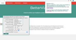
At least 1 year's reading right here: " ... the main projects, events, new sites, trends, personalities and general observations that have struck me as being important to help further the development of this field." A well-timed survey, given the recent publication of the UpShot's opus on the US economy and other daa visualisation ventures. But t…
"a new media startup aims to bring the ProPublica approach abroad, creating Germany’s first nonprofit investigative news organization... completely focused on data journalism... The team intends to compile and share large datasets that map people in power to the money behind them, collaborating with local open data organizations as well as other n…
Part 2 of my second weekly roundup, where the overriding theme is innovation.
Relevant Overviews
- Content Strategy
- Online Strategy
- Online Community Management
- Social Media Strategy
- Content Creation & Marketing
- Online Architecture
- Digital Transformation
- Change & Project Management
- Personal Productivity
- Innovation Strategy
- Surveillance Capitalism, Social media and Polarisation (Overview)
- Communications Tactics
- Social Web
- Media
- Politics
- Communications Strategy
- Science&Technology
- Business