Curated Resource ( ? )
Interactive documentary’s data visualization on WWII losses
Curated:
08/06/2015 from
rt.com/news/265603-ww2-losses-interactive-video/?utm_content=buffer89cf0&utm_medium=social&utm_source=twitter.com&utm_campaign=buffer
my notes ( ? )
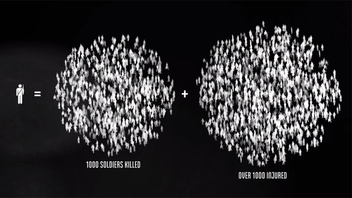
"A new interactive documentary, “The Fallen of World War II,” ... 18-minute film is styled like an infographic and that helps viewers fathom the scale of casualties in a way that simple numbers cannot....
The base elements it uses are simple human-shaped icons. Each of those represents one thousand deaths – and at some points in the video they pile up into staggering graphs."
- Interactive documentary’s data visualization brings staggering WWII losses to life — RT News
Read the Full Post
The above notes were curated from the full post rt.com/news/265603-ww2-losses-interactive-video/?utm_content=buffer89cf0&utm_medium=social&utm_source=twitter.com&utm_campaign=buffer.Related reading
More Stuff I Like
More Stuff tagged data visualisation , design , audiovisual
See also: Content Strategy , Online Strategy , Social Media Strategy , Online Architecture , Communications Tactics