Relevant Overviews
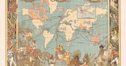
“persuasive” cartography: more than 800 maps intended primarily to influence opinions or beliefs... rather than to communicate geographic information... a variety of persuasive tools , including allegorical, satirical and pictorial mapping; selective inclusion; unusual use of projections, color, graphics and text; and intentional deception...…
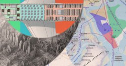
In addition to ... income inequality and the shrinking middle class, these 10 infographics... also explain our energy, financial, and shipping systems, the global population boom, our diets, and when your job will be taken by a robot. Couple those with a series of maps that will reframe how you think about geopolitics and you have the start of an …
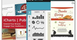
Readers aren't the only ones who want quick and easy access to information. You, the infographic creator, are also short on time. You need simple, quick ways to create beautiful infographics. Forget about Photoshop and other time-consuming image-creation methods. These tools make creating infographics simpler than ever: - 20 tools to help yo…

"... the “picture superiority effect,” whereby concepts presented with visuals or pictures are better learned and more easily and frequently recalled ... including an image with your social media posts delivers 180 percent more engagement or 150 percent more retweets,,, adding a visual element increases retention of the content to 65 percent" …
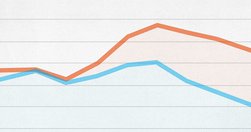
Good analyses of where data visualisation is heading: "Today, a slew of new software has made it easier than ever to create data visualizations from scratch. The downside? It has led to more prescriptive design. Take D3. It's a JavaScript library that helps turn information into any number of visual frameworks...Beyond D3... Tableau is the crow…
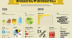
"... infographics are often taken at face value... And it is hard to fact check infographics... Fast Company republished 10 facts from Buffer. Fact checking one of the facts in that list went like this: The fact quoted an infographic -> that quoted a blog post at Huffington Post -> which in turn quoted another infographic -> which quoted a blog…
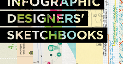
"The best infographics are clear, easy to digest, and eye-catching. But the process of distilling data into a neat little chart, bar graph, or venn diagram usually requires pages and pages of messy preparatory sketches, which are rarely seen by the public. Infographic Designers’ Sketchbooks ... take readers behind the scenes of the creative proce…

what it says in the box - How to Create Amazing Infographics - Design School

"Chartist is noteworthy because it doesn't just make existing charts smaller or bigger, it changes the the way the data is displayed so that it makes sense on whichever size screen it's being viewed on. A chart showing each of the 12 months along its x axis when displayed in a full-width browser window, for example, will change to show only six m…
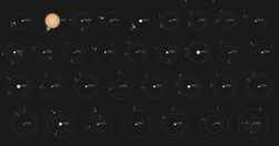
Kepler’s Tally of Planets is a wonderful NYTimes.com interactive feature: "NASA’s Kepler mission has discovered more than 950 confirmed planets orbiting distant stars. Planets with a known size and orbit are shown below" - Kepler’s Tally of Planets - Interactive Feature - NYTimes.com

A wonderful presentation from Jonathan Corum, science graphics editor at The New York Times, on creating infographics and data visualisations that truly add value: "Sometimes, I feel more like a translator than a designer. Trying to translate the point the scientist is trying to make to a wider audience, and removing all of the jargon. ... If I …

"In the end, meetings turn out to be a waste of time — just people sitting around, chatting, wasting hours of precious time (even preparing for it). Approximately 15 percent of your time working in any company is spent in meetings. That number is more than doubled for middle managers, while executives spend 50% of their time stuck in meetings."

"There's no such thing as "perfectly optimized", but I took a stab at drawing up the mythical beast anyway: "... I first saw the "perfectly optimised page" infographic on Twitter, but discovered a much richer, larger article on Moz. In itself, this is a great use of infographics and data visualisation - the infographic stands on its and has bee…

"we’ve created five fully customizable infographic templates that will give you the inspiration and foundation you need to build your own infographics right in PowerPoint. "

"The Databoard lets you explore insights from Google research studies, share them with others, and create your own custom infographics." via @chandlertwilson
