Curated Resource ( ? )

Intranet redesign, Phase 2: information architecture & content audit
Intranet redesign, Phase 2: information architecture & content audit

my notes ( ? )

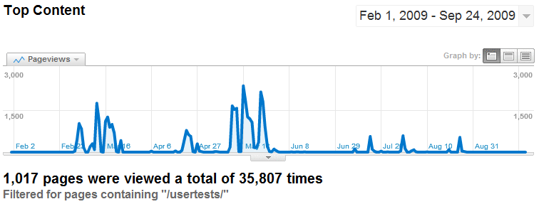
Great article on improving intranet UX, and useful inspiration for any website manager: "During the online cardsorting sessions I covered over 1000 content items and got nearly 36,000 individual responses. The first batch ... designed to elicit our main navigation labels. Subsequent tests then checked that the chosen names would suit all the intranet content...." - Intranet redesign, Phase 2: information architecture and content audit | Intranet Diary

Read the Full Post

The above notes were curated from the full post intranetdiary.co.uk/2010/09/intranet-redesign-phase-2-information-architecture-and-content-audit/.

Related reading

More Stuff I Like

More Stuff tagged ux , internal communications , content , online architecture , intranet , cardsort

See also: Content Strategy , Content Creation & Marketing , Online Architecture , Digital Transformation , Innovation Strategy , Communications Tactics , Communications Strategy , Business

Cookies disclaimer

MyHub.ai saves very few cookies onto your device: we need some to monitor site traffic using Google Analytics, while another protects you from a cross-site request forgeries. Nevertheless, you can disable the usage of cookies by changing the settings of your browser. By browsing our website without changing the browser settings, you grant us permission to store that information on your device. More details in our Privacy Policy.