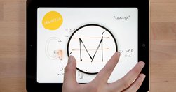
"Designers can create in-depth, documented case studies of their work. The best ones clarify the complex choices designers have to make and explain their thinking behind UX and visual decisions. They document and communicate that knowledge clearly, helping our design community to develop a more empathetic, human‐centered way of speaking about our …
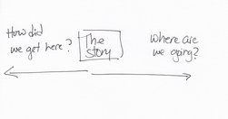
"By news homepage, I mean any way for a user to first encounter content. A push notification could very well be the new news homepage. ... An article or a newsletter ... Overcast or Soundcloud or iTunes may be your homepage.... Homepage, to me, is simply a shorthand version for any of these things. " Neat overview. Just remember, however you desi…

"There’s a common misconception out there that user centered design means being led by the user... In some instances, being user centered means ignoring or even going against explicit user wishes in order to better serve the user. Sound confusing? " Then read: - Be user centered, not user led - MindTheProduct
Sets out "... the five characteristics of an innovation that determine its use... how well an innovation addresses these characteristics will determine people's long-term adoption of an innovation." and, for good measure, sets out the implications for design teams of each characteristic, because "Design teams can address many components of thes…

With a very nice longform, multimedia html5 presentation to boot. "In this bustling environment, there is less news and more noise. ..." More news but even more noise, rather.
"Since Taylor launched an earlier version of the site at The Boston Globe in 2007, In Focus has known for longform photo storytelling, featuring huge, high-quality images.... If you’re pandering to social media, if you’re going for clickbait, it cuts away at any sort of storytelling." - Q&A: How Alan Taylor, online photography pioneer, is rethin…
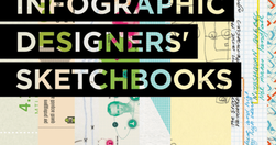
"The best infographics are clear, easy to digest, and eye-catching. But the process of distilling data into a neat little chart, bar graph, or venn diagram usually requires pages and pages of messy preparatory sketches, which are rarely seen by the public. Infographic Designers’ Sketchbooks ... take readers behind the scenes of the creative proce…

"But in our Information Architecture courses, we invariably get asked about a few persistent questions that many designers from a variety of backgrounds seem to struggle with. Like most design problems, these questions rarely have an absolute, black-and-white answer. But there are specific considerations that can help you answer these questions a…
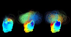
"In this gallery are our favorite graphics of the year. " The Best Science Visualizations of the Year | WIRED
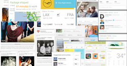
"We are currently witnessing a re-architecture of the web, away from pages and destinations, towards completely personalised experiences built on an aggregation of many individual pieces of content ... the result of the rise of mobile technologies... from many pages of content linked together, towards individual pieces of content aggregated togeth…
"With 95% confidence we conclude that an increase in ranking “the intranet search helps me find the information I need” results in a higher valuation of the respondents intranet as a whole. The impact for the same question related to menus was statistically insignificant." Not quite the deathknell for information architects and resellers of stic…

"An image is the gateway to your emotional memory... And on the visual web an image is the gateway to accessing almost all content and information... we are adapting to a different kind of a web, one that will be increasingly visual... [but] the only available methods to surface and categorize photos are beyond basic; we need something intuitive…

"There’s no learning without mistakes." Pin this one on the wall. Seriously! - The 5 Most Common Mistakes in Design — The Year of the Looking Glass — Medium

How much more could Google News be? See "... a presentation that a German designer came up with that involved a wholesale redesign and re-thinking of what Google News is and does." Lots of good stuff here. Particularly like how 'smart personalisation' is used to help penetrate the filter bubble: "automatically suggest related stories on a news t…
A fun interactive setting out the 'ideal team & process' required for building interactives. Rarely seen in real life, sadly. - One Approach Leading Interactive Expeditions: Eric Cade Schoenborn | Creative Director | Knight Foundation
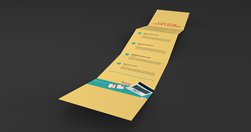
what it says in the box - How to Create Amazing Infographics - Design School

"Charted automatically visualizes data. Give it the link to a data file and Charted returns a beautiful, shareable visualization of that data... open-sourced and available for anyone to use at charted.co... it adjusts to any screen, automatically updates itself" - Introducing Charted - Data Lab - Medium
"AB Tasty, the French A/B testing specialist, has published this guide for the benefit of those who are implementing A/B testing and would like to know how to conduct truly effective tests."
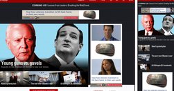
"Politico has redesigned its website for the first time in its seven year history, and The Guardian's U.S. recent refresh marks the first time it's redesigned almost entirely in public, with its readers' input. Here's a look at the thinking behind the redesigns, and what the publishers were able to pull off." - Politico, HBR, The Guardian: W…
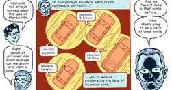
"How we made our first comics-journalism feature-and the tools for you to make one, too ... We thought we would walk through some of design process and also document some of the code tricks we learned along the way. The final products are a web viewer, Pulp, and the comic-maker interface, Pulp Press... released as a free and open source project…

Great overview of product design and development documentation in a world of agile development: "Documentation is instrumental for concepting, designing, creating and measuring the performance of products. But ... there’s nothing about a thick stack of paperwork which resembles the experience of your real product. ... thick deliverables created …
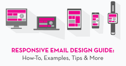
"when an email newsletter, which looks look superb on desktop, fails to render properly on a mobile device, respondents either hit delete or unsubscribe." - Responsive Email Design: Benefits, How-To, Examples + More | JUST™ Creative
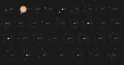
Kepler’s Tally of Planets is a wonderful NYTimes.com interactive feature: "NASA’s Kepler mission has discovered more than 950 confirmed planets orbiting distant stars. Planets with a known size and orbit are shown below" - Kepler’s Tally of Planets - Interactive Feature - NYTimes.com
You've probably seen "articles that seamlessly transition to new content, without requiring readers to click or tap headlines and then wait for new pages to load." Time seems to be using it to bait-and-switch - bring in users using social-optimised content, and then present the 'serious' news that they 'should' be reading: "World news typically …

"Creating a beautiful presentation requires a symphony of visual elements to work together for a “big picture.” Designers seek to make the entire vision work together in terms of how each part interacts. This includes layout, typography, and imagery, which all add up to a cohesive set of design elements. So, how can you orchestrate the chaos of de…

Good insights on combining editorial, programming and visual experts from NPR: "The multimedia crew wanted to make pictures and video that were truly web-native, which required web makers. And our news apps lacked empathy — something we’re so great at on the radio. It’s hard to make people care with a chart. Pictures were the obvious missing piec…

Nice approach to design work, as applied to Prismatic's homefeed: "Design is the process of creating a solution that balances the goals of both the user and the creator. User goals include both tasks people need to get done and psychological wants. Creator goals include qualitative and quantitative goals that we call “design” and “data” goals, re…
Excellent tool for explaining "the difference between Adaptive, Responsive, Static and Liquid sites ..." - Liquidapsive (Liqui-dap-sive)

"Here are seven great solutions to help you quickly and cost-effectively develop a mobile version of your site."

"whole new publishing and technology system ... continually iterate on the site and take advantage of new technology trends ... instead of seeing major redesigns in the future, users will see more incremental changes" Key question: are the native ads clearly ads? - New York Times redesign points to future of online publishing - Jan. 8, 2014