Relevant Overviews
- Bluesky and the ATmosphere
- Communication Strategy
- Content Strategy
- Fediverse
- Online Strategy
- Social Media Strategy
- Content Creation & Marketing
- Online Architecture
- Digital Transformation
- Personal Productivity
- Innovation Strategy
- Communications Tactics
- Social Web
- Media
- Communications Strategy
- Science&Technology
- Business
- Large language models
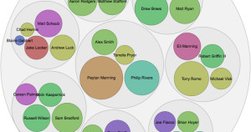
lassehjorthmadsen.github.io
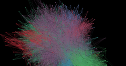
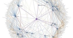
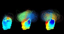
"We’ve built a network of scientists and researchers active on Bluesky. The goal is to better understand how this group of users interact on the platform... we arrived at a science-oriented network of 17,980", computed centrality measures to identify influential members, and created an interactive 3d visualisation.They also provide details of the …
towardsdatascience.com
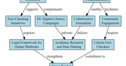
First in a series on "how AI tools can transform intricate concepts into clear, practical frameworks and diagrams", starting with Napkin AI, which "generates interesting diagrams automatically from text input".Plenty of crap circles follow (" Upon completing each document, I exported them as PDFs. Find them here"), but it looks worth kicking the t…
mathewlowry.myhub.ai
"If Charts lie, ChatGPT visualisations lie brilliantly". Exploring knowledge visualisations powered by ChatGPT, which can be particularly problematic because of the way the LLM's hallucinations - already hard to spot by their very nature - are also hidden behind the visualisation. But they have real potential as a creative muse.
medium.com
"Gantt Chart, Organization, Timelines, Entity Relationship, and Mind Maps Diagram all in less than 1 minute... instruct ChatGPT to come out with the required syntax to generate your diagram ... Generate a <diagram type> in mermaid.js syntax with the following details: <details of the diagram> "
medium.com
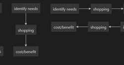
Mermaid lets you "creating diagrams using simple markup language... for quickly jotting down a sequence of steps or a set of interconnected relationships. The above diagrams are created with just a couple of lines of code. Other types include pie charts, sequences, gantt, etc.
www.sarman.work
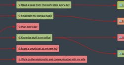
David's "journey trying to visualise relationships in my Obsidian notes" passed via various approaches, including d3, as he tried to create diagrams encapsulating relationships between nodes.He then stumbled upon the obsidian-excalidraw-plugin ... [which] automatically generate Excalidraw diagrams with its Excalidraw Automate feature... with Datav…
usefulcharts.com
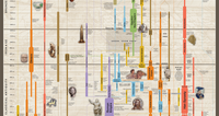
To everyone who's ever asked "what's that poster to your left of your desk?", I bring you UsefulCharts' Timeline of World History, which came embedded in their eponymous book, received last Christmas."covering 3300 BCE - present... displays all the major empires, kingdoms, and civilizations throughout history in a side-by-side format so that the v…
seealso.org
a collection of our favorite visualizations, infographics, and other projects built on open data from Wikipedia and other Wikimedia projects
www.chrisharrison.net
Approach to visualising Wikipedia category pages and their interconnections.
persuasivemaps.library.cornell.edu
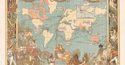
“persuasive” cartography: more than 800 maps intended primarily to influence opinions or beliefs... rather than to communicate geographic information... a variety of persuasive tools , including allegorical, satirical and pictorial mapping; selective inclusion; unusual use of projections, color, graphics and text; and intentional deception...…
datajournalismhandbook.org

What is data journalism? What is it for? What might it do? What opportunities and limitations does it present? Who and what is involved in making and making sense of it?
www.wired.com
"In this gallery are our favorite graphics of the year. " The Best Science Visualizations of the Year | WIRED
medium.com

"Charted automatically visualizes data. Give it the link to a data file and Charted returns a beautiful, shareable visualization of that data... open-sourced and available for anyone to use at charted.co... it adjusts to any screen, automatically updates itself" - Introducing Charted - Data Lab - Medium
knightlab.northwestern.edu

"So if you too are just starting out with scraping, here are five of the most useful tools I’ve encountered while learning and working on my project." - Five data scraping tools for would-be data journalists | Knight Lab | Northwestern University
sonar.bottlenose.com
Sonar Solo allows you to search any topic to find trends and influencers about any subject, in real time. Sonar Solo visualizes what’s on people's minds right now, by combining data mining, trend intelligence and advanced sentiment analysis on the world's social media chatter.
style.org

A wonderful presentation from Jonathan Corum, science graphics editor at The New York Times, on creating infographics and data visualisations that truly add value: "Sometimes, I feel more like a translator than a designer. Trying to translate the point the scientist is trying to make to a wider audience, and removing all of the jargon. ... If I …
visualisingdata.com
At least 1 year's reading right here: " ... the main projects, events, new sites, trends, personalities and general observations that have struck me as being important to help further the development of this field." A well-timed survey, given the recent publication of the UpShot's opus on the US economy and other daa visualisation ventures. But t…
www.niemanlab.org
"Two of the biggest trends in news today: the rise of mobile and the rise of data visualization. The unfortunate reality is that they’re often in conflict. ... If you want to do better, check out MobileVis ... Ros also pulls out a set of best practices for doing visualizations for mobile. Data visualization is good. Data visualization that works …
sunlightfoundation.com

"The parliamentary process is indeed so similar to a collaborative software development workflow that it is only natural to try and use a version control tool such as Git to track individual legislative changes." - OpenGov Voices: How GitLaw turns the French parliamentary process into open data - Sunlight Foundation Blog
www.vox.com
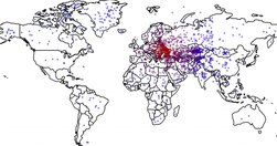
Neat visualisation - could be relevant for EEAS. "Political scientists Kyle Dropp, Joshua Kertzer, and Thomas Zeitzoff asked 2,066 Americans to find Ukraine on a map. Then they asked what the US should do in Ukraine. "We wanted to see where Americans think Ukraine is and to learn if this knowledge (or lack thereof) is related to their foreign pol…
www.fivethirtyeight.com

Looking forward to geeking out: Info architecture: Guessing some serious cardsorting went into this off the cuff remark: "the new FiveThirtyEight will provide coverage of five major subjects: politics, economics, sports, science, and lifestyle. By design, almost any topic in the news can potentially fit into one or more of these categories. " A…
knightlab.northwestern.edu
Not their star reporters. Not their politics coverage. An intern. Who never considered journalism as a career. But knew data visualisation. "On December 21 the quiz was posted and by the end of the year had become the site’s most popular piece of content for 2013." - Behind the dialect map interactive: How an intern created The New York Times’ m…
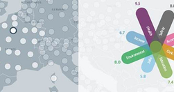
www.oecdbetterlifeindex.org
Nice data visualisation: " This Index allows you to compare well-being across countries, based on 11 topics the OECD has identified as essential, in the areas of material living conditions and quality of life."
www.niemanlab.org
Data-driven storytelling, sharable journalism in a British skunkworks. What's not to like? From NiemanLab: "Data-driven storytelling and web-native, sharable journalism are two of the biggest trends in media at the moment. If you locked the two together in a room, Ampp3d might walk out the door ... As a news site, Ampp3d keeps its output fairly …
www.google.com

Consider this your starting point to tap into Google’s suite of digital tools that can enhance newsgathering and exposure across television, radio, print and online. Whether it’s refining your advanced search capabilities, improving audience engagement through Google+, or learning how to visualize data using Google Maps, this website is intended …
www.theguardian.com

Snowden, Snowfalled: an awesome HTML5 interactive feature.
gigaom.com
"The way it works is pretty simple: You paste data from a table (this can be a spreadsheet or even a web page), choose from a handful of visualization types (Raw explains what each one is best for) and then drag the variables you want to analyze into the predefined mapping categories (as you can see below, it’s really self-explanatory). Then you d…
think.withgoogle.com

"The Databoard lets you explore insights from Google research studies, share them with others, and create your own custom infographics." via @chandlertwilson
Relevant Overviews
- Bluesky and the ATmosphere
- Communication Strategy
- Content Strategy
- Fediverse
- Online Strategy
- Social Media Strategy
- Content Creation & Marketing
- Online Architecture
- Digital Transformation
- Personal Productivity
- Innovation Strategy
- Communications Tactics
- Social Web
- Media
- Communications Strategy
- Science&Technology
- Business
- Large language models