Curated Resource ( ? )
How Designers Turn Data Into Beautiful Infographics
Curated:
08/01/2015 from
www.fastcodesign.com/3040415/how-designers-turn-data-into-beautiful-infographics
my notes ( ? )
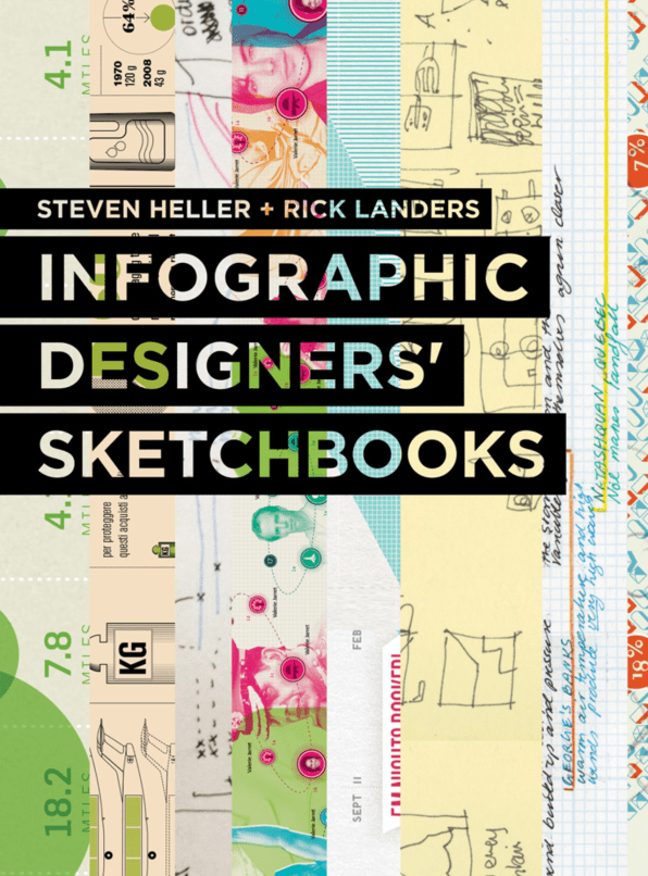
"The best infographics are clear, easy to digest, and eye-catching. But the process of distilling data into a neat little chart, bar graph, or venn diagram usually requires pages and pages of messy preparatory sketches, which are rarely seen by the public.
Infographic Designers’ Sketchbooks ... take readers behind the scenes of the creative processes of more than 50 information architects working today."
Surprised to see them described as information architects, but whatever it's a good post and looks like an interesting book.
- How Designers Turn Data Into Beautiful Infographics | Co.Design | business + design
Read the Full Post
The above notes were curated from the full post www.fastcodesign.com/3040415/how-designers-turn-data-into-beautiful-infographics.Related reading
More Stuff I Like
More Stuff tagged design , infographic
See also: Content Strategy , Online Architecture , Communications Tactics