Curated Resource ( ? )
Visualize anything in 5 minutes
Curated:
09/10/2013 from
gigaom.com/2013/10/08/new-tool-lets-you-visualize-just-about-anything-in-5-minutes-maybe-less/
my notes ( ? )
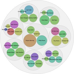
"The way it works is pretty simple: You paste data from a table (this can be a spreadsheet or even a web page), choose from a handful of visualization types (Raw explains what each one is best for) and then drag the variables you want to analyze into the predefined mapping categories (as you can see below, it’s really self-explanatory). Then you download it as a vector, PNG or JSON file and do with it what you will."
Read the Full Post
The above notes were curated from the full post gigaom.com/2013/10/08/new-tool-lets-you-visualize-just-about-anything-in-5-minutes-maybe-less/.Related reading
More Stuff I Like
More Stuff tagged data , tool , visualisation
See also: Content Strategy , Digital Transformation , Communications Tactics , Business