Curated Resource ( ? )

Designers are translators are science journalists.
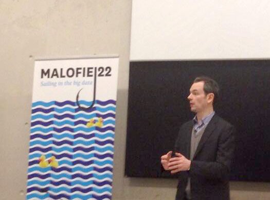
Designers are translators are science journalists.

my notes ( ? )

A wonderful presentation from Jonathan Corum, science graphics editor at The New York Times, on creating infographics and data visualisations that truly add value: "Sometimes, I feel more like a translator than a designer. Trying to translate the point the scientist is trying to make to a wider audience, and removing all of the jargon. ... If I visualize something and walk away without trying to explain it, then I haven’t done my job. My interest is in understanding something, trying to hone that understanding, and then sending that information out in the world in the hope that someone else will understand it. " - style.org > Two Little Ducks

Read the Full Post

The above notes were curated from the full post style.org/malofiej/.

Related reading

More Stuff I Like

More Stuff tagged infographic , visualisation , data journalism , data

See also: Content Strategy , Digital Transformation , Communications Tactics , Media , Business

Cookies disclaimer

MyHub.ai saves very few cookies onto your device: we need some to monitor site traffic using Google Analytics, while another protects you from a cross-site request forgeries. Nevertheless, you can disable the usage of cookies by changing the settings of your browser. By browsing our website without changing the browser settings, you grant us permission to store that information on your device. More details in our Privacy Policy.