Visualising knowledge with MyHub.ai and ChatGPT (newsletter 2)
If Charts lie, ChatGPT visualisations lie brilliantly. So how best to exploit their potential?
Since the previous edition I finished experiment 6, publishing "The Dual Faces of AI Chatbots in Social Media (according to my GPT)" as a result, and toyed with a very fun NetflixThis GPT on Twitter. But the main focus has been on visualisations, because if you know what you're doing you can ask ChatGPT to write code which can then be translated into mindmaps, concept maps and other knowledge visualisations using freely available online open source tools like mermaid (live) and graphviz.
Hence experiments 2, 3 & 4. The full analysis and all supporting content (conversations with chatgpt, several prompts, etc.) is available via the experiments wiki - this post gives a few examples of what I found, extracted from the full analysis. All summary posts like this, finally, are tagged #myhub and #ai and #experiments.
Mindmap this content (experiments 2 & 3)
These were early experiments, before I had really thought through what I was testing, and it shows in these first visualisations, which were supposed to present the themes and subthemes ChatGPT identified in a Collection of related resources:
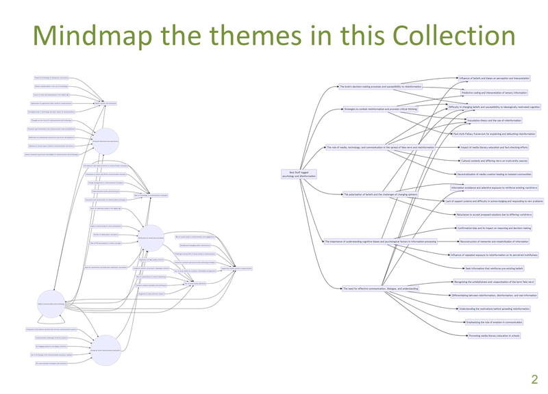
These mindmaps were drawn in mermaid.live using code written by ChatGPT after it had analysed the Collection of resources and identified common themes and subthemes. They could have been made more attractive, but as I noted in my analysis:
ChatGPT invented themes that were not there and ignored themes that were, and then misrepresented its (wrong) findings when visualising them.
If Charts lie, ChatGPT visualisations lie brilliantly
But the problem runs deeper than mere hallucinations. ChatGPT hallucinates credibly - while it makes stuff up, it's believable stuff.
This is particularly problematic when it comes to knowledge visualisations because:
- visualisations (almost) always generate a "Wow" factor, with the actual data hidden behind it. This "glamour effect" can blind the user to problems in the underlying data or the presentation method, so they're brilliant for disinformation.
- Even if ChatGPT's analysis was not hidden behind the glamour of a visualisation, the hallucinations in that analysis are hard to find: it took me ages to dig back into the original texts, compare them with ChatGPT's analyses, and spot where it made themes up, proposed two themes which completely overlapped, didn't link a reource to a related theme, or did the opposite.
So if Charts can lie, in other words, ChatGPT visualisations are magician-level misleading.
Provoke me (experiment 4)
Beyond that, as so often the case with knowledge visualisations, the initial Wow was followed by a "So What?".
What use are they, particularly when you have to double check everything for hallucinations? After all, these mindmaps' centralised focus shows a single node connecting to themes, in turn connected to subthemes. The resources are not actually shown. I was using the wrong sort of map.
"I didn't even try to get an accurate knowledge visualisation of a Collection, but a provocative one"
Hence in experiment 4 I didn't even try to get an accurate knowledge visualisation of a Collection, but instead tried to get a provocative one - something that will make me think and spark my curiosity with potential new connections, even if those connections are not actually present in the Collection.
Concept Map
Enter Graphviz and its neato visualisation, and an evolving set of prompts as I tried to get something at least readable:
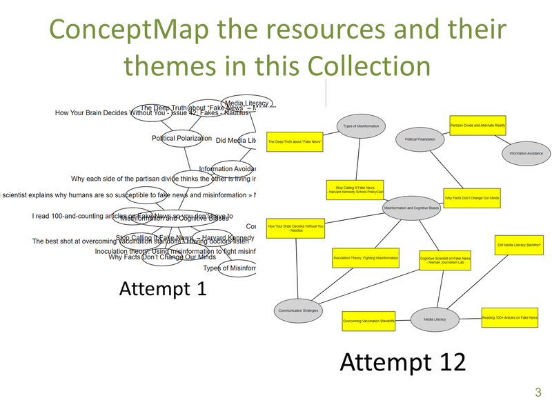
Once I had version 12 in front of me, the first questions it stimulated were along the lines of why is article X not connected to Theme Y, when article Z is? But these are not the best questions - better to ask "what does that make me think of?"
While you'd think the centrality of the Misinformation and Cognitive Biases theme (linked to 5 resources) would be my focus, I found myself using the above visualisation to explore the themes "orbiting" it. The full conversation is on the wiki (see c-3_allnotes-response-p-2c) and the full analysis is in the analysis, but some of the highlights included:
Exploring the "Media literacy" theme
The initial analysis of the 4 "Media literacy" resources evolved into "a strategy aimed at doctors to help them better communicate with their patients who ask them about vaccine misinformation".
This in turn led to some ideas for a poster for doctors' waiting rooms in support of the strategy, of which the most striking is probably this one, although there's no way I'd use any of them (this experiment is not focusing on image generation):
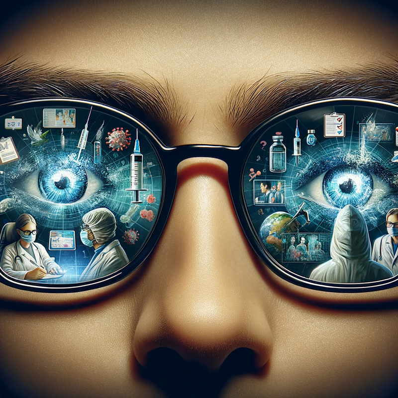
More: c-3_allnotes-response-p-2c-A-Visual_Posters_for_Vaccine_Strategy
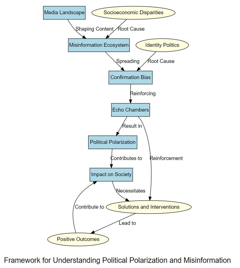
Give me a framework
Rearranging the concept map into "a framework for understanding political polarisation and misinformation" led to this:
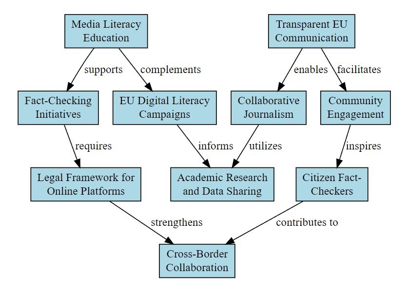
Combat misinformation about the EU
Asking it to suggest between 5 and 10 feasible ways to help combat misinformation about the European Union, and then passing that to another prompt (2e - framework), gave this:

Integrating visualisations into AI conversations
As you can see from the actual analysis, I do not consider these outputs particularly insightful or useful.
In the "Combat misinformation" concept map, for example, many of the ideas are pretty obvious, some are not possible because they're not EU competences, and others could be counterproductive by furnishing evidence of the sort of EU "Ministry of Truth" and "Propaganda in Schools/Media/Civil Society" initiatives so beloved of conspiracy theorists.
But, again, accuracy is not the point. The idea is to support human creativity by sparking ideas.
Because while this process is currently laborious - I have to copy the code from ChatGPT into graphviz, after all - it should be easy to integrate directly into the planned MyHub/ChatGPT interface.
That would make these visualisations as natural a part of a conversation with ChatGPT as any text response, giving you on-demand visualisations of how different concepts might relate to each other (according to ChatGPT).
And if you end up correcting ChatGPT, well that's the point: it makes you think about it.
Related reading
More Stuff I Do
More Stuff tagged llm , chatgpt , myhub , newsletter , ai , knowledge visualisation , visualisation , experiment
See also: Content Strategy , Digital Transformation , Innovation Strategy , Communications Tactics , Science&Technology , Large language models