Relevant Overviews
- Communication Strategy
- Content Strategy
- Online Strategy
- Social Media Strategy
- Content Creation & Marketing
- Online Architecture
- Digital Transformation
- Change & Project Management
- Innovation Strategy
- Communications Tactics
- Psychology
- Productivity
- Social Web
- Media
- Communications Strategy
- Science&Technology
- Business
18f.gsa.gov
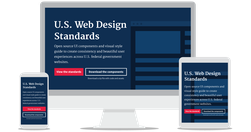
In trying to access the federal programs which will allow her to afford college, Joanne must navigate the websites of multiple agencies. She finds dozens of government websites which all seem relevant to what she’s looking for. Joanne is confused. Are these programs related to each other? Are they even all a part of the federal government? Are any…
deardesignstudent.com

You have nothing to fear but fear itself. Fear, and algorithms... It has never been easier for designers and non-designers to create great websites that even five years ago would have cost a fortune to build... design is dead. There is more to design than the pixel-pushing of visual design... The real designers, problem solvers... able to co…
blog.apps.npr.org
The visuals team ... the product of merging two groups: the news applications team, who served as NPR’s graphics and data desks, and the multimedia team, who made and edited pictures and video... The multimedia crew wanted to make pictures and video that were truly web-native, which required web makers. And our news apps lacked empathy... Pictu…
blog.growth.supply
This software is a clever mix between Sketch, Keynote, Flash and After Effect (plus some bonus features specifically for interactive prototypes)... Easily creating tap transitions from one screen to another is, to me, the core of the software. - Principle : the prototyping tool you’ve got to try — STARTUPS + WANDERLUST + LIFE HACKING — Medium
www.youtube.com
Masterclass time. From the Google Blog: we’ve taken the Google logo and branding, which were originally built for a single desktop browser page, and updated them for a world of seamless computing across an endless number of devices and different kinds of inputs (such as tap, type and talk).
medium.com

"Innovation is exploding in every direction. With all of these “smart” things — smart cars, smart phones, smart watches, smart glasses — it’s a designer’s job to figure out the best way to deliver content in such a vastly connected world. The projects you’re working on at this very moment will be interacted with on devices that didn’t exist wh…
www.evolutionoftheweb.com
So many memories…
medium.com

"Some people think design means how it looks. But of course, if you dig deeper, it’s really how it works." - Design terminology, demystified — Medium
www.youtube.com
Design triumphs over content: The CAPS15 conference really looks interesting … if only I could read the programme!
ultimatesoftwarereview.blogspot.de
This is a code generator, which adheres to latest web programming standards of HTML5 and CSS3. You don’t need to hand code the templates, just design them, and TemplateToaster will automatically generate the HTML 5 and CSS 3 for it. At the end of designing, export your projects and the zip of source code will in your hand. Doesn’t it seem too simp…
www.buzzfeed.com

Clever. To build an app, Buzzfeed first built an enewsletter and tested that: "Designing and building an email newsletter takes a lot of work. But compared with launching a native app, a newsletter requires a much smaller investment of time and technology. As a lower-stakes product, we could launch it much more quickly than we could an app and …
rt.com
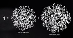
"A new interactive documentary, “The Fallen of World War II,” ... 18-minute film is styled like an infographic and that helps viewers fathom the scale of casualties in a way that simple numbers cannot.... The base elements it uses are simple human-shaped icons. Each of those represents one thousand deaths – and at some points in the video they …
www.journalism.co.uk
'add a bit of punch' to stories using data visualisation - Data visualisation tips from Information is Beautiful | Media news
medium.com
"If you want to know where web design is heading, just look at where architecture has already gone." - The Future of Web Design is Hidden in the History of Architecture — Medium
medium.com

If you ever wondered why meetings so often lead to the wrong decision ... "... we are wired in certain ways ... that can block groups from processing information effectively, which leads to bad decisions... Gilbert explains how to use diversity and inclusion to get better results from product ideation efforts... One of the most fundamental …
thenextweb.com

"nearly 67 percent of emails were opened on a mobile device... it’s not that hard to create responsive emails. ... Here are 10 quick design hacks" - 10 design hacks for responsive emails that don’t suck
medium.com

"If you want to know where web design is heading, just look at where architecture has already gone." - The Future of Web Design is Hidden in the History of Architecture — Medium
www.fastcodesign.com
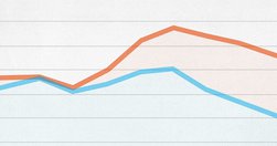
Good analyses of where data visualisation is heading: "Today, a slew of new software has made it easier than ever to create data visualizations from scratch. The downside? It has led to more prescriptive design. Take D3. It's a JavaScript library that helps turn information into any number of visual frameworks...Beyond D3... Tableau is the crow…
medium.com
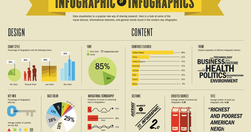
"... infographics are often taken at face value... And it is hard to fact check infographics... Fast Company republished 10 facts from Buffer. Fact checking one of the facts in that list went like this: The fact quoted an infographic -> that quoted a blog post at Huffington Post -> which in turn quoted another infographic -> which quoted a blog…
thenextweb.com

To be rolled out next time someone wants to "skip the analyses and wireframes - just give us the mockups": "An interface's visual hierarchy relies on the same principles of aesthetics used by the Renaissance masters, but on top of that (or rather beneath it) there's the subtext of secondary goals - promoting specific content, encouraging user…
alistapart.com
" Top tasks are the small set of tasks ... that matter most to your customers. Make these tasks work well, and you’ll be on the right track. Get them wrong, and chances are you’ll lose the customer. Top Tasks Management is a model that says: “Focus on what really matters (the top tasks) and defocus on what matters less (the tiny tasks).” Tiny ta…
species-in-pieces.com
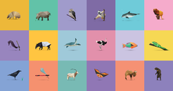
Stunning use of CSS & HTML5 to create an online exhibition exploring the stories of 30 endangered species. Best viewed in Chrome. - In Pieces - 30 Endangered Species, 30 Pieces.
thenextweb.com
"Images with text over them ... do make a post more enticing to your followers or friends... Buffer's Pablo, which creates these images, out of beta." - Buffer Officially Launches its Image Creation Tool Pablo
www.labnol.org
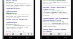
"Google is now clearly marking websites in mobile search results that it considers mobile friendly and if that tag isn’t getting displayed around your content, your website may see a drop in mobile traffic. Responsive design is definitely the way to go but will that be enough. How do you confirm if your web pages are considered mobile friendly by…
www.wired.com
"From the responsive layouts to the improved APIs ... we’ve reimagined every aspect of the WIRED experience... I want to walk you through our thinking on the new site—to tell you about the technology and design innovations that make this iteration of WIRED possible. We settled on a card-based motif for both its flexibility and configurability..…
medium.com

"some people have the sense that data somehow makes designers less powerful, that you’re basing decisions based purely on mechanical measures rather than designer intuition and genius... data is what ... turns designers from artists into the most important decision makers in a company... prototypes can really only get you to local maxima ... the…
gijn.org
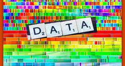
"Newsrooms don't need large budgets for analyzing data--they can easily access basic data tools that are free or inexpensive." - Drilling Down: A Quick Guide to Free and Inexpensive Data Tools | Global Investigative Journalism Network
www.smashingmagazine.com
"Designers can create in-depth, documented case studies of their work. The best ones clarify the complex choices designers have to make and explain their thinking behind UX and visual decisions. They document and communicate that knowledge clearly, helping our design community to develop a more empathetic, human‐centered way of speaking about our …
medium.com
"By news homepage, I mean any way for a user to first encounter content. A push notification could very well be the new news homepage. ... An article or a newsletter ... Overcast or Soundcloud or iTunes may be your homepage.... Homepage, to me, is simply a shorthand version for any of these things. " Neat overview. Just remember, however you desi…
www.mindtheproduct.com

"There’s a common misconception out there that user centered design means being led by the user... In some instances, being user centered means ignoring or even going against explicit user wishes in order to better serve the user. Sound confusing? " Then read: - Be user centered, not user led - MindTheProduct
Relevant Overviews
- Communication Strategy
- Content Strategy
- Online Strategy
- Social Media Strategy
- Content Creation & Marketing
- Online Architecture
- Digital Transformation
- Change & Project Management
- Innovation Strategy
- Communications Tactics
- Psychology
- Productivity
- Social Web
- Media
- Communications Strategy
- Science&Technology
- Business