www.youtube.com
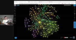
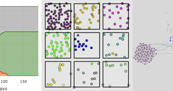
Video demonstration of using infranodus to visualize your thinking tool notes and explore connections between them, (hopefully) getting "a good overview of someone else's or of your own ideas, identify the potentially new interesting ideas... compare different notes to one another".I first came across these ideas in an earlier infra…
www.connectedpapers.com
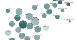
unique, visual tool to help researchers and applied scientists find and explore papers relevant to their ... work... analyze ... ~50,000 papers and select the few dozen with the strongest connections to the origin paper.... arranged according to their similarity... papers that do not directly cite each other can be strongly connected and very clo…
blog.thefactual.com
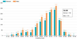
data on the U.S. media ecosystem suggests that women journalists make up a disproportionately high number of the most credible journalists... about Covid-19... dominate ... top 100 most credible journalists ... 19 of the top 25 journalists and 58 of the top 100algorithm analyzes individual articles for credibility based on the author’s topical exp…
ourworldindata.org
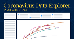
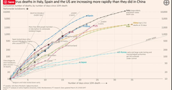
Raw data on confirmed cases and deaths for all countries is sourced from ... ECDC. Our complete COVID-19 dataset is ... maintained by Our World in Data... updated daily and includes data on confirmed cases, deaths, and testing... you can download all of our data.
www.covidexitstrategy.org
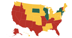
Tracking states as they make progress towards a new normal
medium.com
There are about 175 known cognitive biases to date. I will share some of the ones that I think are the most significant for designers... It is important that we not learn about biases to simply point out errors in others... we [need] to spot errors in our own thinking ...confirmation bias ... conservatism bias ... [influence us] to select and use …
www.fastcompany.com
Rather than being limited to policy wonks and first responders, simulations ... a critical way for individuals to understand complex concepts and examine the impact of their decisions... more than just inform ... help users build empathy for others..."Why Outbreaks like Coronavirus Spread Exponentially.” ... helped Americans understand how im…
Like
science communication,
gamification,
interactive,
data visualisation,
empathy,
covid19,
intuition
medium.com
eight charts that demonstrate the ability to bias the data towards your narrative... Tweaking the y-axis zero base line and the scale is the equivalent of changing the data itself
infectiousmatter.com
We don't have intuition for pandemics... What if you could watch virtual epidemics unfold directly in your web browser to build that intuition ... Imagine if new pandemic plans and policies came with an interactive simulation...hands-on learning is the best way to build intuition about complex topics ... an Agent Based version of a traditiona…
twitter.com
FT senior data-visualisation journalist ... explains the must-see daily graphs...See also Coronavirus tracked: the latest figures as the pandemic spreads | Free to read
www.fastcompany.com
not all graphics are created equal... well-intentioned designs can mislead the public ... we asked six experts to identify the graphics that do the best job of telling an important story about coronavirus... the simpler, the better...with data being so sparse, incomplete... traditional visualizations ... may give readers a delusional impression of…
www.datavisualizationsociety.com
Data Visualization Society... pair our members with ... public health organizations, researchers, cultural navigators making sense of information for patients, local communities, and others through data visualization
www.ribbonfarm.com
The Four Horsemen of this emerging Textopia are... Roam attempts to implement a near-full conception of hypertext as originally conceived by visionaries... looks like a cross between a slightly weird wiki and ... Evernote. It’s not... block-level addressability, transclusion ... and bidirectional linking ... utterly transform the writing experienc…
Like
nlp,
blogging,
machine learning,
enewsletter,
data visualisation,
blogpocalypse,
myhub,
threadapalooza,
gatsby,
substack,
roamresearch,
machine text
cohesiondata.ec.europa.eu
new interactive visualisations to allow stakeholders explore and compare the detailed investment themes ... across the funds, countries and thematic objectives... provide insight starting from the original planned amounts. The dataset with full details is open and accessible
medium.com
Our scientists are publishing sophisticated data visualisations for policymakers to use. But are policymakers using them? ... I interview Annie White and Nil Tuzcu of Harvard’s Growth Lab about their use of data visualisations for policymaking... summarise the resulting guidance we’re giving Knowledge4Policy publishers.
hi.stamen.com

show how the nature of diversity in our urban areas around the world has been changing over the past few decades... the use of sentences in data visualization is one of my favorite things. You’re adjusting a sentence using these dropdowns, which gives it a narrative component and tells you some really basic things... there’s no reason to not use t…
opportunityinsights.org
our team of researchers and policy analysts work together to analyze new data and create a platform for local stakeholders to make more informed decisions.... We arm local policy-makers with customized and data-driven insights so they can craft tailored, hyperlocal solutions.
qz.com

we’ve conflated data with truth. And this has dangerous implications for our ability to understand, explain, and improve the things we care about... data is not a perfect representation of reality: It’s a fundamentally human construct... subject to biases, limitations, and other imperfections... Data doesn’t say anything. Humans say things.... Dat…
www.fastcompany.com

Sweden plans to cut its emissions to net zero. A new digital visualization shows exactly what it’s doing to reach that goal—and is designed to help policymakers move faster to fill in gaps in the current plan and make sure it actually succeeds. It’s also fully open to the public, so anyone can hold the government accountable... A typical governmen…
environmentalevidencejournal.biomedcentral.com

Systematic mapping assesses the nature of an evidence base, answering how much evidence exists on a particular topic... an interactive database of studies and their meta-data, along with visualisations of this database... an R-based tool called EviAtlas, an Open Access ... Open Source ... tool for producing interactive, attractive tables and figur…
www.nytimes.com

analyzed the length and readability of privacy policies from nearly 150 popular websites and apps... Only Immanuel Kant’s “Critique of Pure Reason” registers a more challenging readability score than Facebook’s privacy policy... The vast majority of privacy policies exceed the college reading level... [Google's] policy became more readable at the …
techcrunch.com
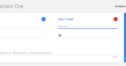
use it only to compare stats about two different topics over time
www.niemanlab.org
every individual picks their idea, we vet it ourselves and make sure the data’s there, that it’s interesting, and we just go off and do it... We specifically seek out stories that aren’t news related, because we don’t want to compete in that space
pudding.cool
The main advantage of starting with mobile first is that it forces you to pare down your experience to the nuts and bolts... Once you commmit to scrollytelling, you have two mobile choices: keep it scrolly, or stack it... preserve the scroll is if the transitions are truly meaningful, and not just something to make it pop. Seeing change over time…
policyviz.com

my view of the many different types of visualizations available to us when we encode and present data... We’ve plotted nearly 90 different graphics across five main categories: Distribution, Time, Comparing Categories, Geospatial, Part-to-Whole, and Relationships. The space does not include every type of graphic, nor does it display every link bet…
digiday.com

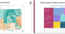
well-known for its data-visualizations — half of the 60 daily articles published contain charts — and on May 10, it officially took the wrapper off Atlas, so anyone can sign up and create their own graphs.
www.nytimes.com
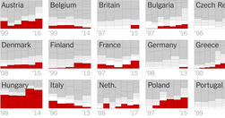
The candidate for the far-right Freedom Party in Austria lost the country’s cliffhanger presidential election on Monday by the slimmest of margins. Still, it was an example of the electoral gains made by right-wing parties in a growing number of European countries
medium.com
Search engines, social media and news aggregators are great at surfacing information close to our interests, but they are limited by the set of topics and people we choose to follow. Even if we read multiple news sources every day, what we discover is defined by the languages we are able to read, and the topics that our sources decide to cover. Ul…
www.theguardian.com
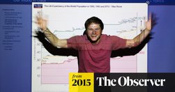
Things that happen in an instant are mostly bad ... this earthquake or that horrible murder. ... But once you turn to statistics it gets much harder to have a pessimistic story... The kind of maths that people are taught at school focuses on algebra and calculus, which they hardly ever use later in life... You use statistics all the time - T…
blog.apps.npr.org
The visuals team ... the product of merging two groups: the news applications team, who served as NPR’s graphics and data desks, and the multimedia team, who made and edited pictures and video... The multimedia crew wanted to make pictures and video that were truly web-native, which required web makers. And our news apps lacked empathy... Pictu…