Curated Resource ( ? )
The Graphic Continuum: A Poster Project for Your Office
Curated:
31/08/2016 from
policyviz.com/graphic-continuum/?utm_source=API+Need+to+Know+newsletter&utm_campaign=a7502f66f9-Need_to_Know_August_19_20168_19_2016&utm_medium=email&utm_term=0_e3bf78af04-a7502f66f9-45795445
my notes ( ? )
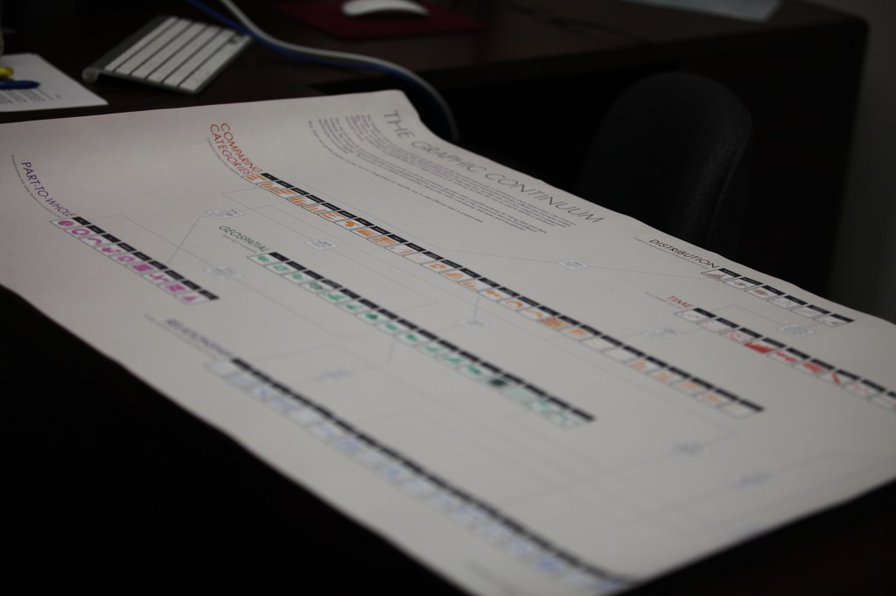
my view of the many different types of visualizations available to us when we encode and present data... We’ve plotted nearly 90 different graphics across five main categories: Distribution, Time, Comparing Categories, Geospatial, Part-to-Whole, and Relationships. The space does not include every type of graphic, nor does it display every link between visualizations, but we view it as a thought-starter. You can use the poster to develop ideas, consider different options, or simply as a piece of art.
Read the Full Post
The above notes were curated from the full post policyviz.com/graphic-continuum/?utm_source=API+Need+to+Know+newsletter&utm_campaign=a7502f66f9-Need_to_Know_August_19_20168_19_2016&utm_medium=email&utm_term=0_e3bf78af04-a7502f66f9-45795445.Related reading
More Stuff I Like
More Stuff tagged data visualisation
See also: Online Strategy , Communications Tactics