Curated Resource ( ? )
infectiousmatter interactive data visualisation
Curated:
05/05/2020 from
infectiousmatter.com/
my notes ( ? )
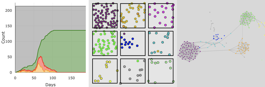
We don't have intuition for pandemics... What if you could watch virtual epidemics unfold directly in your web browser to build that intuition ... Imagine if new pandemic plans and policies came with an interactive simulation...hands-on learning is the best way to build intuition about complex topics ...
an Agent Based version of a traditional Susceptible, Exposed, Infectious, Recovered (SEIR) model...
Read the Full Post
The above notes were curated from the full post infectiousmatter.com/.Related reading
More Stuff I Like
More Stuff tagged data visualisation , science communication , covid19
See also: Online Strategy , Content Creation & Marketing , Communications Tactics , Science&Technology