Relevant Overviews
- Content Strategy
- Online Strategy
- Online Community Management
- Social Media Strategy
- Content Creation & Marketing
- Online Architecture
- Digital Transformation
- Thinking tools
- Innovation Strategy
- Communications Tactics
- Psychology
- Social Web
- Media
- Politics
- Communications Strategy
- Science&Technology
- Business
Overview: Content Strategy
Are you creating the content your audience actually wants to consume, or are you just talking about yourself?
What sort of content will your audience read, out of the endless supply at their fingertips? Formal news articles or blog posts from your staff and readers? An event calendar updated daily, or a longread every month? Static web pages, or a deeply granular database with faceted search?
And have you figured out how to get it to them, develop engagement around it, and translate that success into something concrete, fulfilling your mission? How many of the friends and organisations in your network amplify your message regularly?
Need answers? Get in touch.
More services: start with Communication strategy.
Relevant resources
blog.thefactual.com
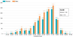
data on the U.S. media ecosystem suggests that women journalists make up a disproportionately high number of the most credible journalists... about Covid-19... dominate ... top 100 most credible journalists ... 19 of the top 25 journalists and 58 of the top 100algorithm analyzes individual articles for credibility based on the author’s topical exp…
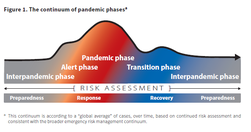
www.covidexitstrategy.org

Tracking states as they make progress towards a new normal
medium.com
There are about 175 known cognitive biases to date. I will share some of the ones that I think are the most significant for designers... It is important that we not learn about biases to simply point out errors in others... we [need] to spot errors in our own thinking ...confirmation bias ... conservatism bias ... [influence us] to select and use …
twitter.com
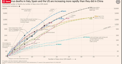
FT senior data-visualisation journalist ... explains the must-see daily graphs...See also Coronavirus tracked: the latest figures as the pandemic spreads | Free to read
www.ribbonfarm.com
The Four Horsemen of this emerging Textopia are... Roam attempts to implement a near-full conception of hypertext as originally conceived by visionaries... looks like a cross between a slightly weird wiki and ... Evernote. It’s not... block-level addressability, transclusion ... and bidirectional linking ... utterly transform the writing experienc…
Like
nlp,
blogging,
machine learning,
enewsletter,
data visualisation,
blogpocalypse,
myhub,
threadapalooza,
gatsby,
substack,
roamresearch,
machine text
medium.com
Our scientists are publishing sophisticated data visualisations for policymakers to use. But are policymakers using them? ... I interview Annie White and Nil Tuzcu of Harvard’s Growth Lab about their use of data visualisations for policymaking... summarise the resulting guidance we’re giving Knowledge4Policy publishers.
www.niemanlab.org
every individual picks their idea, we vet it ourselves and make sure the data’s there, that it’s interesting, and we just go off and do it... We specifically seek out stories that aren’t news related, because we don’t want to compete in that space
digiday.com

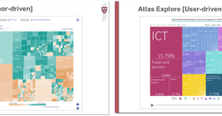
well-known for its data-visualizations — half of the 60 daily articles published contain charts — and on May 10, it officially took the wrapper off Atlas, so anyone can sign up and create their own graphs.
blog.apps.npr.org
The visuals team ... the product of merging two groups: the news applications team, who served as NPR’s graphics and data desks, and the multimedia team, who made and edited pictures and video... The multimedia crew wanted to make pictures and video that were truly web-native, which required web makers. And our news apps lacked empathy... Pictu…
www.theatlantic.com

Our interactive graphic offers a real-time snapshot of the race, using media attention to track the fortunes of the presidential hopefuls... explore the graphic and view a running picture of how the candidates are faring on television during the election season, or drill into the numbers by network using the explorer dashboard. - Media Cover…
qz.com
Atlas deepens our journalism by offering readers better access to the data and visualizations in so many of our stories. It also extends the reach of our journalism by letting you make use of our charts in new ways ... as we build out the platform, we are hoping to let anyone make charts in Atlas... Atlas gives each of our charts its own home, …
www.journalism.co.uk

Visualise your data and embed interactive, annotated graphs in your stories for free... At Journalism.co.uk we've been regularly using Datawrapper, Infogram and Google Sheets to name a few, and we have highlighted many others in our pieces. Plotly is perhaps one of the more complex resources, but it's free to use and enables its users to cre…
rt.com

"A new interactive documentary, “The Fallen of World War II,” ... 18-minute film is styled like an infographic and that helps viewers fathom the scale of casualties in a way that simple numbers cannot.... The base elements it uses are simple human-shaped icons. Each of those represents one thousand deaths – and at some points in the video they …
www.fastcodesign.com
Good analyses of where data visualisation is heading: "Today, a slew of new software has made it easier than ever to create data visualizations from scratch. The downside? It has led to more prescriptive design. Take D3. It's a JavaScript library that helps turn information into any number of visual frameworks...Beyond D3... Tableau is the crow…
www.journaliststoolbox.org

The Journalist's Toolbox
medium.com

"Charted automatically visualizes data. Give it the link to a data file and Charted returns a beautiful, shareable visualization of that data... open-sourced and available for anyone to use at charted.co... it adjusts to any screen, automatically updates itself" - Introducing Charted - Data Lab - Medium
www.journalism.co.uk

"Swarmize enables journalists to tell new, collaborative stories by making use of real-time data collection and visualisation" Just the tests they've already done are awesome. The code's on GitHub. Think to use in surveys, real-time social media monitoring, live blogs ... anything where real-time is useful and/or you might want a second bite at t…
mathewlowry.myhub.ai

The first – and possibly still the only – site on EUROPA to tap popular support (via sheer user traffic) for a new EU regulation.
Relevant Overviews
- Content Strategy
- Online Strategy
- Online Community Management
- Social Media Strategy
- Content Creation & Marketing
- Online Architecture
- Digital Transformation
- Thinking tools
- Innovation Strategy
- Communications Tactics
- Psychology
- Social Web
- Media
- Politics
- Communications Strategy
- Science&Technology
- Business