Overview: Digital Transformation
Digital transformation is an over-used, over-abused term. Here’s what it means to me.
From many strategies ...
In most organisations, the following strategies are barely on speaking turns, let alone fully integrated and mutually supportive:
- Internal communication: Every day, valuable ideas and information pour into your organisation as staff engage with stakeholders and discover useful knowledge online. But what happens then? If a piece of knowledge is valuable to them, it's probably also useful to their colleagues ... so why does so little of it circulate within your organisation?
- Internal collaboration: Are your staff still emailing documents to each other, and spending hours tracing the latest version and integrating changes?
- Knowledge management: Can your staff find the knowledge they need efficiently, share information effortlessly without flooding everyone’s Inboxes, and serendipitously discover relevant information around the digital equivalent of the office watercooler?
- External communication: There is no better advocate for any organsation than empowered staff and engaged audiences. Have you transformed your workforce into Social Ambassadors, and launched communities to engage your customers and stakeholders in co-defining the future?
- Training and employee engagement: Even if you have the tools, can your staff use them? Do they know why they should?
... to one strategy: build an internal innovation community
How can you integrate the above strategies, processes and tools? By treating them as different aspects of one, overarching goal: the creation of an internal innovation community throughout your organisation.
everyone is trained and motivated to share knowledge internally and externally, supported by efficient tools and processes
The idea is to frame the above strategies, processes and tools as interconnected tactics within an overall strategic framework. This aligns them to a shared set of goals: an organisation where everyone is trained and motivated to share knowledge internally and externally, supported by efficient tools and processes for knowledge management, internal and external communications.
From Strategy to Implementation
Having such a strategy is all very well, but noone will notice if you never implement it. You'll need to plan for unknowns, coordinate experts who have never worked together before, and integrate project and change management so that:
- change rolls out with the new features, tools and processes,
- these are developed with your staff, not foisted upon them.
I’ve specialised in the intersection of internal and external communications, collaboration and knowledge management since 1995. If you need help, get in touch.
More services: start with Communication strategy.
Relevant resources
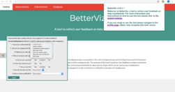
datajournalismhandbook.org

What is data journalism? What is it for? What might it do? What opportunities and limitations does it present? Who and what is involved in making and making sense of it?
medium.com

"Charted automatically visualizes data. Give it the link to a data file and Charted returns a beautiful, shareable visualization of that data... open-sourced and available for anyone to use at charted.co... it adjusts to any screen, automatically updates itself" - Introducing Charted - Data Lab - Medium
sonar.bottlenose.com
Sonar Solo allows you to search any topic to find trends and influencers about any subject, in real time. Sonar Solo visualizes what’s on people's minds right now, by combining data mining, trend intelligence and advanced sentiment analysis on the world's social media chatter.
style.org

A wonderful presentation from Jonathan Corum, science graphics editor at The New York Times, on creating infographics and data visualisations that truly add value: "Sometimes, I feel more like a translator than a designer. Trying to translate the point the scientist is trying to make to a wider audience, and removing all of the jargon. ... If I …
visualisingdata.com
At least 1 year's reading right here: " ... the main projects, events, new sites, trends, personalities and general observations that have struck me as being important to help further the development of this field." A well-timed survey, given the recent publication of the UpShot's opus on the US economy and other daa visualisation ventures. But t…
www.niemanlab.org
"Two of the biggest trends in news today: the rise of mobile and the rise of data visualization. The unfortunate reality is that they’re often in conflict. ... If you want to do better, check out MobileVis ... Ros also pulls out a set of best practices for doing visualizations for mobile. Data visualization is good. Data visualization that works …
www.fivethirtyeight.com

Looking forward to geeking out: Info architecture: Guessing some serious cardsorting went into this off the cuff remark: "the new FiveThirtyEight will provide coverage of five major subjects: politics, economics, sports, science, and lifestyle. By design, almost any topic in the news can potentially fit into one or more of these categories. " A…
knightlab.northwestern.edu

Not their star reporters. Not their politics coverage. An intern. Who never considered journalism as a career. But knew data visualisation. "On December 21 the quiz was posted and by the end of the year had become the site’s most popular piece of content for 2013." - Behind the dialect map interactive: How an intern created The New York Times’ m…
www.niemanlab.org
Data-driven storytelling, sharable journalism in a British skunkworks. What's not to like? From NiemanLab: "Data-driven storytelling and web-native, sharable journalism are two of the biggest trends in media at the moment. If you locked the two together in a room, Ampp3d might walk out the door ... As a news site, Ampp3d keeps its output fairly …
gigaom.com
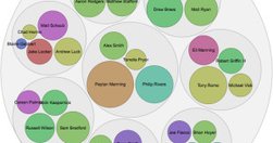
"The way it works is pretty simple: You paste data from a table (this can be a spreadsheet or even a web page), choose from a handful of visualization types (Raw explains what each one is best for) and then drag the variables you want to analyze into the predefined mapping categories (as you can see below, it’s really self-explanatory). Then you d…
think.withgoogle.com

"The Databoard lets you explore insights from Google research studies, share them with others, and create your own custom infographics." via @chandlertwilson