Others have written on the return of the enewsletter, but I don't think anyone saw it as the home page: "Yes, the homepage is still dead, which is why our new front door is quite different from most. ... we are offering an efficient briefing on global business news, ... intended to be read straight through, like a well written memo from a trusted…
"The Guardian released a beta version of its new website to get reader feedback as it continues to tweak its design.... Content discovery is a major focus ... “container model” allows the paper to implement a responsive design while also retaining a story hierarchy, user experience director... Each item contains a story, which are put together…

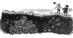
At last, someone else using gardening metaphors when discussing content strategy & information architecture: "The stream—that great glut of ideas, opinions, updates, and ephemera that pours through us every day—is the dominant way we organize content.... Problem is, the stream’s emphasis on the new above all else imposes a short lifespan on conte…

"what type of organisation gets a presence on GOV.UK - and what sort of presence they get. " Interestingly similar model to the E2G 'variable geometry' portal architecture developed around 12 years ago, albeit with additional features - notably Groups, recently made more flexible. - GOV.UK organisation types: a user guide (updated June 2014)…
More titbits from that internal NYT digital report: "There are about 14.7 million articles in the Times’ archives back to 1851 ... We can be both a daily newsletter and a library — offering news every day, as well as providing context, relevance and timeless works of journalism.” " - The leaked New York Times innovation report is one of the key d…

"The New York Times lost 80 million homepage visitors—half the traffic to the nytimes.com page—in two years.... this will make the news more about readers ...[because] homepages reflect the values of institutions, and Facebook and Twitter reflect the interest of individual readers [who] aren't interested in hard news, but rather entertainment, se…
Interesting approach to covering a story from a site known for long-form, no-click content: short-form, multi-click content: "Content is broken into small parts, and many of the main points are expandable ... This is mostly quick-hit aggregation ... a stream of posts that don’t require clicking to separate pages. " - Quartz launches Glass, a “no…

Deadtree media to do more with legacy content than paper birdcages! The latest high-profile move into explanatory journalism is New York Times' The Upshot: "offer a combination of data journalism and explanatory reporting ... head-to-head with Ezra Klein’s Vox and Nate Silver’s FiveThirtyEight ... a kind of internal aggregator and explainer for…

Great example of modern US longform content from Vox, where they use a specific style to link to one of their 'content cards'. Plus a killer quote on the 'blame Brussels' syndrome: "... banks that owned eurozone government debt were saved, and so were institutions around the world ... Meanwhile, politicians got to take credit for keeping their c…

And not just journalists. New generation news sites are redefining news and, by consequence, rethinking information architecture, content strategy and CMS. I only hope the results filter through to everyone else, and sooner rather than later. "... a moment when young talent began demanding superior technology as the key to producing superior jour…
A new generation of companies, like CIRCA, are redefining the structure of how information is treated, and building new CMS to support it. Their approach will inevitably feed into a new generation of CMS for whom the 'article' and 'page' are, if not meaningless, at least optional. And I for one can't wait. "what we’re really doing at Circa is a…

Damn, some of these ideas I implemented 12 years ago for the EC's thematic architecture. Nice to see them in a different context: First, the problem with current news journalism: "The column inches devoted to the new are column inches not given to the important... this stress on novelty is a holdover from when the cost of making and moving paper …
"we essentially write new content that we then throw away at the end of the day. Content shouldn’t die by design... topical contexualization... means guiding readers through large, convoluted news topics. ProPublica’s topic pages get us closer to contextualizing huge topics. For every major series that they cover over time, there’s a landing page…
One of the reasons I created this Tumblr was to use it as a 'first draft’ of a Content Hub (see post), an idea which crystallised after reading Sloan’s original content strategy piece on Stock and Flow.The Hub is basically my way of saying that there’s more to life than the Stream. Unsurprisingly, Alexis Madrigal’s piece in the Atlantic caught my …