Overview: Digital Transformation
Digital transformation is an over-used, over-abused term. Here’s what it means to me.
From many strategies ...
In most organisations, the following strategies are barely on speaking turns, let alone fully integrated and mutually supportive:
- Internal communication: Every day, valuable ideas and information pour into your organisation as staff engage with stakeholders and discover useful knowledge online. But what happens then? If a piece of knowledge is valuable to them, it's probably also useful to their colleagues ... so why does so little of it circulate within your organisation?
- Internal collaboration: Are your staff still emailing documents to each other, and spending hours tracing the latest version and integrating changes?
- Knowledge management: Can your staff find the knowledge they need efficiently, share information effortlessly without flooding everyone’s Inboxes, and serendipitously discover relevant information around the digital equivalent of the office watercooler?
- External communication: There is no better advocate for any organsation than empowered staff and engaged audiences. Have you transformed your workforce into Social Ambassadors, and launched communities to engage your customers and stakeholders in co-defining the future?
- Training and employee engagement: Even if you have the tools, can your staff use them? Do they know why they should?
... to one strategy: build an internal innovation community
How can you integrate the above strategies, processes and tools? By treating them as different aspects of one, overarching goal: the creation of an internal innovation community throughout your organisation.
everyone is trained and motivated to share knowledge internally and externally, supported by efficient tools and processes
The idea is to frame the above strategies, processes and tools as interconnected tactics within an overall strategic framework. This aligns them to a shared set of goals: an organisation where everyone is trained and motivated to share knowledge internally and externally, supported by efficient tools and processes for knowledge management, internal and external communications.
From Strategy to Implementation
Having such a strategy is all very well, but noone will notice if you never implement it. You'll need to plan for unknowns, coordinate experts who have never worked together before, and integrate project and change management so that:
- change rolls out with the new features, tools and processes,
- these are developed with your staff, not foisted upon them.
I’ve specialised in the intersection of internal and external communications, collaboration and knowledge management since 1995. If you need help, get in touch.
More services: start with Communication strategy.
Relevant resources
www.youtube.com
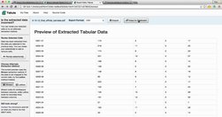
- OpenElections: Using Tabula for Extracting Data from PDFs - YouTube
gijn.org
"Newsrooms don't need large budgets for analyzing data--they can easily access basic data tools that are free or inexpensive." - Drilling Down: A Quick Guide to Free and Inexpensive Data Tools | Global Investigative Journalism Network
medium.com

"Charted automatically visualizes data. Give it the link to a data file and Charted returns a beautiful, shareable visualization of that data... open-sourced and available for anyone to use at charted.co... it adjusts to any screen, automatically updates itself" - Introducing Charted - Data Lab - Medium
www.journalism.co.uk

"Swarmize enables journalists to tell new, collaborative stories by making use of real-time data collection and visualisation" Just the tests they've already done are awesome. The code's on GitHub. Think to use in surveys, real-time social media monitoring, live blogs ... anything where real-time is useful and/or you might want a second bite at t…
www.fastcolabs.com

"Chartist is noteworthy because it doesn't just make existing charts smaller or bigger, it changes the the way the data is displayed so that it makes sense on whichever size screen it's being viewed on. A chart showing each of the 12 months along its x axis when displayed in a full-width browser window, for example, will change to show only six m…
openrefine.org
"...is a powerful tool for working with messy data: cleaning it; transforming it from one format into another; extending it with web services; and linking it to databases like Freebase."
gigaom.com
"The way it works is pretty simple: You paste data from a table (this can be a spreadsheet or even a web page), choose from a handful of visualization types (Raw explains what each one is best for) and then drag the variables you want to analyze into the predefined mapping categories (as you can see below, it’s really self-explanatory). Then you d…