Curated Resource ( ? )
How to (Cleverly) Distort a Visualization to Support Your Biased Narrative
Curated:
05/05/2020 from
medium.com/swlh/how-to-cleverly-distort-a-visualization-to-support-your-biased-narrative-41da2e826f95
my notes ( ? )
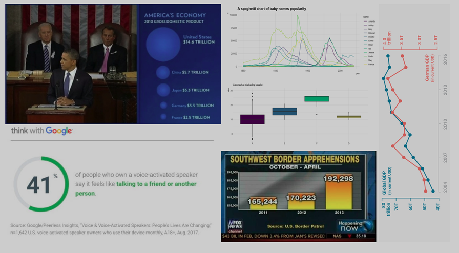
eight charts that demonstrate the ability to bias the data towards your narrative... Tweaking the y-axis zero base line and the scale is the equivalent of changing the data itself
Read the Full Post
The above notes were curated from the full post medium.com/swlh/how-to-cleverly-distort-a-visualization-to-support-your-biased-narrative-41da2e826f95.Related reading
More Stuff I Like
More Stuff tagged data visualisation , narratives
See also: Online Strategy , Communications Tactics