Curated Resource ( ? )
Visualizing the Global Digital Divide By Mapping Internet And Population — vis4.net
Curated:
05/01/2012 from
vis4.net/blog/posts/mapping-internet-and-population/?piwik_campaign=rss&piwik_kwd=2927
my notes ( ? )
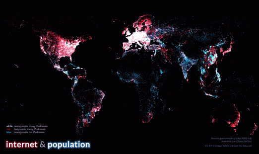
"shows more than 80,000 populated places in blue and about 350,000 locations of IP addresses in red. White dots indicate places where many people live and many IP addresses are available."
Read the Full Post
The above notes were curated from the full post vis4.net/blog/posts/mapping-internet-and-population/?piwik_campaign=rss&piwik_kwd=2927.Related reading
More Stuff I Like