
Curated Resource ( ? )
Atlas: a living map of what Bluesky is talking about
my notes ( ? )
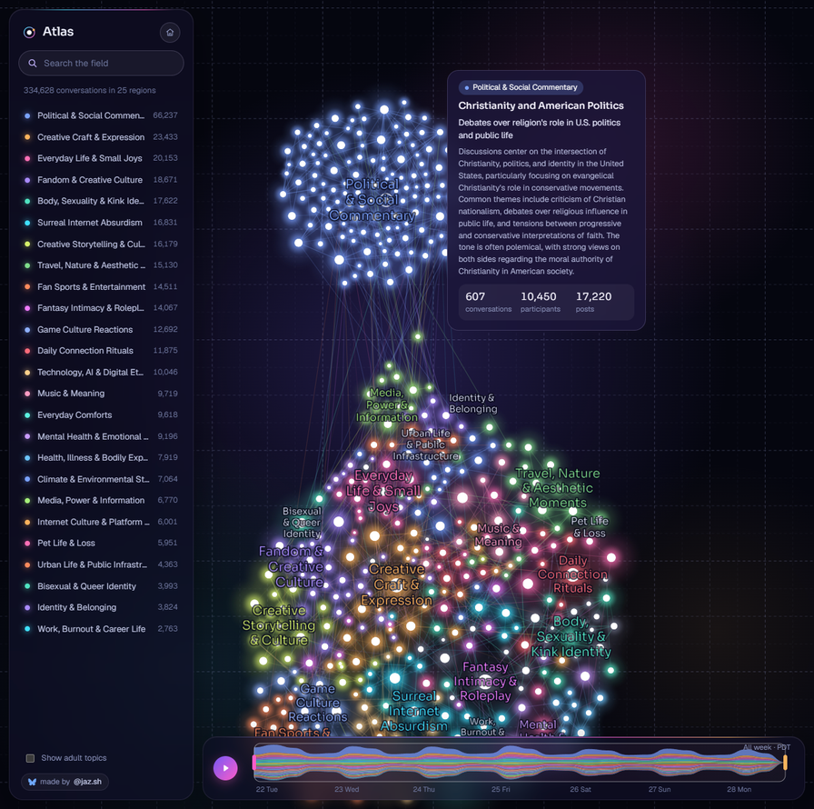
This "living map of what Bluesky is talking about: the past week's conversations, grouped into topics and regions and rebuilt every six hours" is a total rabbithole.
There's not a lot of background information, but it looks like this site reads the entire Bluesky firehose, classifies it, organizes it, synthesizes it, and presents it as a data visualization every 6 hours.
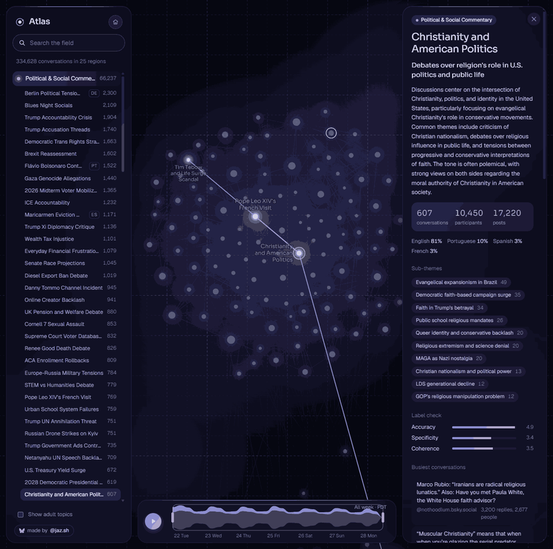
Clicking on a node produces a sidebar, presenting a synthesis, subthemes, busiest conversations and data:
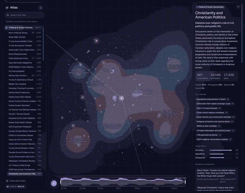
Clicking a subtheme drills deeper into the visualisation, obviously - although the sidebar doesn't change:
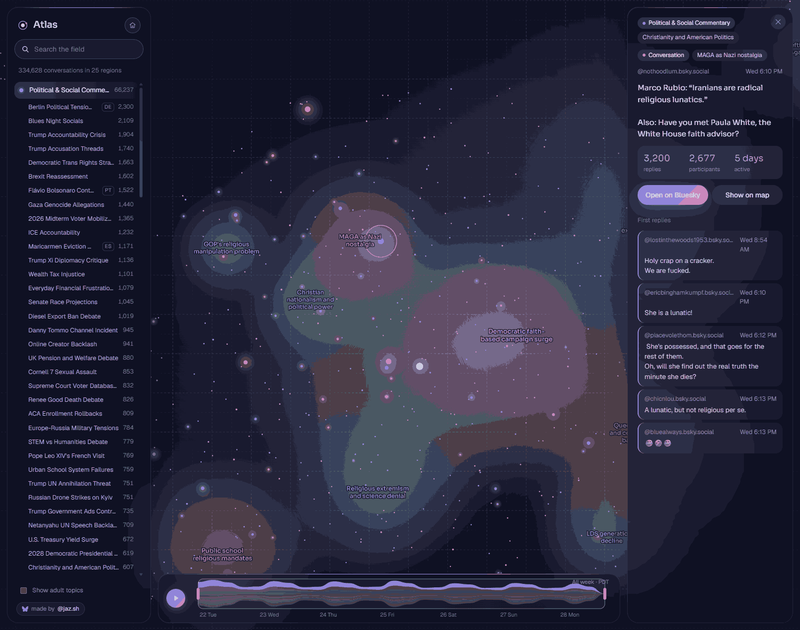
Clicking a conversation (eg in reaction to a post from Marco Rubio) doesn't take you to the conversation on Bluesky - the sidebar shows the first replies, while the visualisation drills deeper ("MAGA as Nazi nostalgia"):
Finally, the timebar at the bottom gives you a sense of where the activity was over the past 6 hours.
Read the Full Post
The above notes were curated from the full post atlas.jazco.dev/.Related reading
More Stuff I Like
More Stuff tagged unfinished