Relevant Overviews
tannerchristensen.com

there are many straightforward methods and strategies for measuring design impact. Two areas I recently combined while exploring the design impact at Gem—where we're building the source of truth for top-of-funnel recruiting—are top tasks and PURE (Pragmatic Usability Ratings by Experts). Here's how I did it.
jonyablonski.com

This article explores a few cognitive biases I’ve experienced first-hand as well as strategies for mitigating their influence.
gerrymcgovern.com
As designers, as creators and managers of websites and apps, we can start by focusing on two principles: Do not track Delete
www.nngroup.com
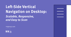
Vertical navigation is a good fit for broad or growing IAs, but takes up more space than horizontal navigation. Ensure that it is left-aligned, keyword front-loaded, and visible.
Like
ux,
web design,
information architecture,
user experience,
clear menu,
clear navigation,
visual design
boagworld.com

Probably my biggest frustrations ... is the utter contempt they seem to hold content in. ... they won’t hire a professional copywriter to work on the content ... never teach content creators how to create appropriate web content.
Do
ux,
web design,
content,
web writing,
content creation,
web architecture,
user experience,
content management,
copywriting
www.nngroup.com
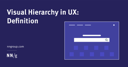
A clear visual hierarchy guides the eye to the most important elements on the page. It can be created through variations in color and contrast, scale, and grouping.
Like
ux,
web design,
content,
user experience,
visual communication,
visual content,
visual hierarchy
lawsofsimplicity.com
Law 1 / Reduce - The simplest way to achieve simplicity is through thoughtful reduction.Law 2 / Organize - Organization makes a system of many appear fewer.Law 3 / Time - Savings in time feel like simplicity.Law 4 / Learn - Knowledge makes everything simpler.Law 5 / Differences - Simplicity and complexity need each other.Law 6 / Context - What lie…
Like
ux,
web design,
design,
content creation,
content structure,
user experience,
content management,
user behaviour
boagworld.com

"Designers love it, website owners want to fill it. Whitespace seems to be one of the most controversial aspects of design. Why then is it so important and how can we ensure it is maintained?"
www.nngroup.com
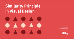
Summary: Design elements that appear similar in some way — sharing the same color, shape, or size — are perceived as related, while elements that appear dissimilar are perceived as belonging to separate groups.
www.nngroup.com
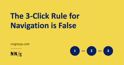
"While it is important to keep key information easily accessible, the 3-click rule is an arbitrary rule of thumb that is not backed by data."
www.nngroup.com
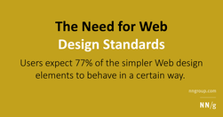
Good evidence why coming up with ever new, more "beautiful", "attractive" and trendy designs that "pop" is not always a good thing.
gerrymcgovern.com
"A link is a promise. A menu is a selection of promises. Without the link there is no Web."