mailchi.mp
To prevent failure and make our designs more resilient, we need to explore edge cases and exceptions already during the design process. Let’s take a closer look at what to watch out for.
www.interaction-design.org
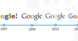
People get easily bored with trends, and every few years, the pendulum swings from one way to another. We have all seen the rise and fall of iconic fashion pieces or art movements. The same thing happens in User Interface (UI) design.
www.interaction-design.org

In a distracted environment, the best form of smartphone interaction is a high-speed, easy-to-use one. Luke calls the typical mobile usage a "one thumb, one eyeball" experience, since the highly distracted environment causes most mobile users to engage in one-handed use with short spans of partial attention.
Like
ux,
design,
ui,
user experience,
user interface,
user interface design,
design for mobile,
mobile design
www.adhamdannaway.com
User interface design is hard. With so many options to choose from regarding layout, spacing, typography, and colour, making design decisions can be overwhelming. When you add usability, accessibility, and psychology to the mix, it gets even harder. Luckily, UI design doesn’t have to be so hard.
uxdesign.cc

The choices are so many that the decision to pick one (the optimal), becomes unmanageably hard. And even when a choice is made, second thoughts and doubts about whether it was the best, linger in the background, slowly consuming brain energy and peace of mind.
uxdesign.cc
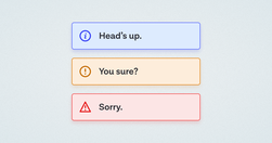
A while back, in the early days of our design system, we had a ticket for a component sitting in our backlog, with the title “Alert.” My initial reaction was “Oh yeah, a colored box with a little icon to the left of it and some text, easy.” Oh dear reader, how naive I was…
www.nngroup.com
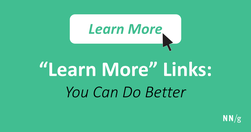
The phrase ‘Learn More’ is increasingly used as a crutch for link labels. But the text has poor information scent and is bad for accessibility. With a little effort, transform this filler copy into descriptive labels that help users confidently predict what the next page will be.
www.uxdesigninstitute.com
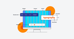
If you want to work in UI (or work with a UI designer), you need to speak the language. In our UI glossary, we’ve compiled (and explained) 100 terms, phrases and resources all designers should know.