Relevant Overviews
- Communication Strategy
- Content Strategy
- Online Strategy
- Online Community Management
- Social Media Strategy
- Content Creation & Marketing
- Online Architecture
- Digital Transformation
- Innovation Strategy
- Communications Tactics
- Psychology
- Productivity
- Social Web
- Media
- Politics
- Communications Strategy
- Science&Technology
- Business
Overview: Content Strategy
Are you creating the content your audience actually wants to consume, or are you just talking about yourself?
What sort of content will your audience read, out of the endless supply at their fingertips? Formal news articles or blog posts from your staff and readers? An event calendar updated daily, or a longread every month? Static web pages, or a deeply granular database with faceted search?
And have you figured out how to get it to them, develop engagement around it, and translate that success into something concrete, fulfilling your mission? How many of the friends and organisations in your network amplify your message regularly?
Need answers? Get in touch.
More services: start with Communication strategy.
Relevant resources
datajournalismhandbook.org

What is data journalism? What is it for? What might it do? What opportunities and limitations does it present? Who and what is involved in making and making sense of it?
www.strategicstructures.com

the Knowledge Pyramid... DIKW pyramid, it features data as the basis and shows how information is built on it, then knowledge, and finally wisdom.... implies that the higher you go the better things get... What’s not to like? Well, just about everything.
hbr.org

I was particularly ashamed of the way that the AAA ratings, which were in some sense a mathematical promise of safety, had been actually just lies, mathematical lies... like a weaponized mathematics ... actually people don’t want to know what their actual risk ... mathematics ... was being used ... so that people could go on doing essentially corr…
medium.com

Seven years ago I started working full time at the Guardian in the glamorous role of SEO editorial executive. ... very like being in the Matrix but with less kung fu and more Polly Toynbee and Nigel Farage... here are a few of the things I’ve learned…
www.fastcompany.com

To understand what makes BuzzFeed tick, you need to know how Dao Nguyen thinks about data... As the value of content approaches zero, "Having technology, data science, and being able to know how to manage, optimize and coordinate your publishing is the thing that gives you a competitive advantage"... One myth is data scientists are telling report…
qz.com
Atlas deepens our journalism by offering readers better access to the data and visualizations in so many of our stories. It also extends the reach of our journalism by letting you make use of our charts in new ways ... as we build out the platform, we are hoping to let anyone make charts in Atlas... Atlas gives each of our charts its own home, …
www.vox.com

"While we've always loved a good chart and map at Vox, appreciating a chart or map does not data journalism make. Data journalism is not just data visualization... ... the explosion in data sources readily available on the web... can both aid in telling important and necessary stories, but can also be easily misunderstood and potentially manipula…
gigaom.com

"Machine learning can help by finding those hidden patterns you probably didn’t even know existed, so you can tune your marketing campaigns accordingly.... DataPop relies on semantic search and natural-language processing to infer connections between what consumers enter into the search window and what they really want, and then on machine learn…
medium.com

"Charted automatically visualizes data. Give it the link to a data file and Charted returns a beautiful, shareable visualization of that data... open-sourced and available for anyone to use at charted.co... it adjusts to any screen, automatically updates itself" - Introducing Charted - Data Lab - Medium
www.journalism.co.uk

"Swarmize enables journalists to tell new, collaborative stories by making use of real-time data collection and visualisation" Just the tests they've already done are awesome. The code's on GitHub. Think to use in surveys, real-time social media monitoring, live blogs ... anything where real-time is useful and/or you might want a second bite at t…
blogs.hbr.org

"Displaying data can be a tricky proposition, because different rules apply in different contexts. A sales director presenting financial projections to a group of field reps wouldn’t visualize her data the same way that a design consultant would in a written proposal to a potential client. So how do you make the right choices for your situation? …
www.fastcolabs.com

"Chartist is noteworthy because it doesn't just make existing charts smaller or bigger, it changes the the way the data is displayed so that it makes sense on whichever size screen it's being viewed on. A chart showing each of the 12 months along its x axis when displayed in a full-width browser window, for example, will change to show only six m…
sonar.bottlenose.com
Sonar Solo allows you to search any topic to find trends and influencers about any subject, in real time. Sonar Solo visualizes what’s on people's minds right now, by combining data mining, trend intelligence and advanced sentiment analysis on the world's social media chatter.
style.org

A wonderful presentation from Jonathan Corum, science graphics editor at The New York Times, on creating infographics and data visualisations that truly add value: "Sometimes, I feel more like a translator than a designer. Trying to translate the point the scientist is trying to make to a wider audience, and removing all of the jargon. ... If I …
visualisingdata.com
At least 1 year's reading right here: " ... the main projects, events, new sites, trends, personalities and general observations that have struck me as being important to help further the development of this field." A well-timed survey, given the recent publication of the UpShot's opus on the US economy and other daa visualisation ventures. But t…
www.niemanlab.org
"Two of the biggest trends in news today: the rise of mobile and the rise of data visualization. The unfortunate reality is that they’re often in conflict. ... If you want to do better, check out MobileVis ... Ros also pulls out a set of best practices for doing visualizations for mobile. Data visualization is good. Data visualization that works …
www.niemanlab.org
New report ”examines the current state of data journalism... calling for more transparency on how data is collected and used in journalism, anticipating an explosion in news apps as a way of producing information, and ways newsrooms can address security around their data and reporting. " In particular, I love this: "...the advice that newsroom le…
gigaom.com

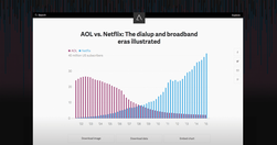
Deadtree media to do more with legacy content than paper birdcages! The latest high-profile move into explanatory journalism is New York Times' The Upshot: "offer a combination of data journalism and explanatory reporting ... head-to-head with Ezra Klein’s Vox and Nate Silver’s FiveThirtyEight ... a kind of internal aggregator and explainer for…
Like
media,
journalism,
data journalism,
data,
content strategy,
information,
nytimes,
online architecture,
explanatory
www.niemanlab.org
"“Fished out of the shadows, old news coverage in China’s media can provide clues to the family connections of government officials as reporters investigate their financial dealings.”"
www.fivethirtyeight.com

Looking forward to geeking out: Info architecture: Guessing some serious cardsorting went into this off the cuff remark: "the new FiveThirtyEight will provide coverage of five major subjects: politics, economics, sports, science, and lifestyle. By design, almost any topic in the news can potentially fit into one or more of these categories. " A…
knightlab.northwestern.edu

Not their star reporters. Not their politics coverage. An intern. Who never considered journalism as a career. But knew data visualisation. "On December 21 the quiz was posted and by the end of the year had become the site’s most popular piece of content for 2013." - Behind the dialect map interactive: How an intern created The New York Times’ m…
simplymeasured.com

"I still catch myself thinking I know better than the wealth of data at my fingertips. That’s not to say your intuition and savvy as a marketer aren’t valuable. You need both. ... take a holistic look back at what worked well, what didn’t, and what you can double down on in the year to come." - Year End Analysis: How to Plan Your Content Based o…
www.niemanlab.org
Data-driven storytelling, sharable journalism in a British skunkworks. What's not to like? From NiemanLab: "Data-driven storytelling and web-native, sharable journalism are two of the biggest trends in media at the moment. If you locked the two together in a room, Ampp3d might walk out the door ... As a news site, Ampp3d keeps its output fairly …
gigaom.com
"The way it works is pretty simple: You paste data from a table (this can be a spreadsheet or even a web page), choose from a handful of visualization types (Raw explains what each one is best for) and then drag the variables you want to analyze into the predefined mapping categories (as you can see below, it’s really self-explanatory). Then you d…
think.withgoogle.com

"The Databoard lets you explore insights from Google research studies, share them with others, and create your own custom infographics." via @chandlertwilson
paidcontent.org
A great article on preventing the data tail wagging the editorial dog. " It turns out that what loyal audiences care about is what good editorial teams care about too: great articles that capture time and attention."
Relevant Overviews
- Communication Strategy
- Content Strategy
- Online Strategy
- Online Community Management
- Social Media Strategy
- Content Creation & Marketing
- Online Architecture
- Digital Transformation
- Innovation Strategy
- Communications Tactics
- Psychology
- Productivity
- Social Web
- Media
- Politics
- Communications Strategy
- Science&Technology
- Business