Relevant Overviews
Overview: Communications Tactics
Relevant resources
www.fastcompany.com

to investigate ... notion that websites are starting to look the same ... data mining ... scrutinized nearly 200,000 images across 10,000 websites... of the Russell 1000, the top U.S. businesses by market capitalization ... Alexa’s 500 most trafficked sites... sites nominated for Webby Awards ... how many pixel-by-pixel edits ... to transform colo…
www.princeton.edu

free online ratings are less trustworthy than those that have some cost to them... In ecology, costly signaling theory argues that displays that “cost” more — like elaborate peacock tails, or strenuous displays of hunger from baby birds — are more likely to reflect reality... making rating goods or services as easy as possible... is counterproduct…
medium.com

the primary battle many Content Strategists fight every day... While the boarding pass was the single most important thing to the passenger... it seemed to be the least important thing to the airline. The passenger became more frustrated with the airline with each passing offer and informational screen thrust in their way... We need to shift our …
designsystem.gov.au

The Australian Government Design System provides a framework and a set of tools to help designers and developers build government products and services more easily.
uxplanet.org

The curse of knowledge is a cognitive bias that occurs when an individual, communicating with other individuals, unknowingly assumes that the others have the background to understand... seen at all levels of a company... if you already know the answer... tend to underestimate the difficulty of the question or the problem... become so immersed in t…
boagworld.com

Is it a bad thing that many websites are looking the same? Or are we seeing a maturing of our design patterns and improving of the user experience... Imagine ... you are perusing the fiction in your local bookstore. You pick up a novel only to discover ... the lines run across an entire double page spread. Confused you put the book down
stories.platformdesigntoolkit.com

time to deliberately focus on design for interconnectedness and relationships ... customer (user) centric design created a narrative of isolation: the customer is ... someone that is provided with a solution ... to get the job done... [but] research ... explained that customers (users) may often look to engage more deeply with products... relat…
hackernoon.com

the more expensive the service a B2B company provides, the more incomprehensible its website... Do they have nothing of value to provide, and hide behind flowery marketing babble that’s as empty as their offering? ... tell people who you are, what you do, and maybe even why they should be interested. ... not look to dazzle with style over substan…
medium.com

It is only once a site goes live that you can learn how users will behave. Unfortunately, this is the very same moment that the resources disappear... rejecting website redesigns in favour of incremental improvements. Doing so provides significant advantages.... the question then becomes; “how do we successfully replace periodic website redesign …
blog.prototypr.io

Mobile First should not be taken as an opportunity to over-simplify and, by the same token, Desktop First should not be taken as an opportunity to pile on complexity.
blog.juntoo.co
The Jobs-to-be-done methodology helps you focus on the job that the user wants done rather than who and how... First, we take the Persona out of the picture and instead add context. Then we focus on the motivation (i.e, answering the why). It gives us clarity to the whole situation and helps us be more creative in designing a solution.
conversionxl.com

What’s the difference between customization and personalization? - Customization: The visitor deliberately chooses between options designed to make the user experience more personal.- Personalization: The visitor is automatically shown personalized pages based on anticipated needs / wants.
www.youtube.com
Design triumphs over content: The CAPS15 conference really looks interesting … if only I could read the programme!
mathewlowry.myhub.ai
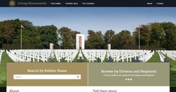
One of those projects you feel privileged to work on. It’s not often you get to experiment with crowdsourcing, augmented reality, faceted search and commemorating US war dead in one project.
app.abtasty.com
"AB Tasty, the French A/B testing specialist, has published this guide for the benefit of those who are implementing A/B testing and would like to know how to conduct truly effective tests."
digiday.com
"Politico has redesigned its website for the first time in its seven year history, and The Guardian's U.S. recent refresh marks the first time it's redesigned almost entirely in public, with its readers' input. Here's a look at the thinking behind the redesigns, and what the publishers were able to pull off." - Politico, HBR, The Guardian: W…
www.fastcolabs.com

"Chartist is noteworthy because it doesn't just make existing charts smaller or bigger, it changes the the way the data is displayed so that it makes sense on whichever size screen it's being viewed on. A chart showing each of the 12 months along its x axis when displayed in a full-width browser window, for example, will change to show only six m…
www.niemanlab.org
"The Guardian released a beta version of its new website to get reader feedback as it continues to tweak its design.... Content discovery is a major focus ... “container model” allows the paper to implement a responsive design while also retaining a story hierarchy, user experience director... Each item contains a story, which are put together…
Like
web design,
science,
linkedin,
information,
audience research,
optimisation,
online architecture,
responsive,
survey
avc.com
a neat service that A/B tests headlines for WordPress posts and helps you figure out the one that will bring the most traffic. It’s called BayesianWitch. - Feature Friday: A/B Testing Headlines On WordPress – AVC
www.dtelepathy.com
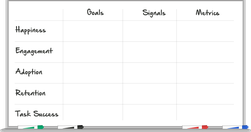
A beautiful, HTML5 exploration of the HEART methodology: Happiness, Engagement, Adoption, Retention, Task Success. " different members of your team have different ideas about the goals of your project. This process provides an opportunity to build consensus about where you're headed." - How to Choose the Right UX Metrics for Your Product
www.quicksprout.com
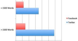
"The original converted 7.6% better than the new variation... The leads from the long form version of the page were better in quality ... in most cases long form copy doesn't just boost your conversions, but it also increases your rankings too." Indepth and (inevitably) long analysis. Huge feedback. - How Content Length Affects Rankings and…
blog.kissmetrics.com
Great case study of how shallow A/B testing can send you in the wrong direction: "...there are a few things to watch out for. The first is statistical significance ... Another is the common mistake of assigning a goal that measures the short-term effect of a test rather than the long-term effect on your business. We made this mistake at Segment.i…
www.niemanlab.org
"Two of the biggest trends in news today: the rise of mobile and the rise of data visualization. The unfortunate reality is that they’re often in conflict. ... If you want to do better, check out MobileVis ... Ros also pulls out a set of best practices for doing visualizations for mobile. Data visualization is good. Data visualization that works …
www.poynter.org
You've probably seen "articles that seamlessly transition to new content, without requiring readers to click or tap headlines and then wait for new pages to load." Time seems to be using it to bait-and-switch - bring in users using social-optimised content, and then present the 'serious' news that they 'should' be reading: "World news typically …
www.journalism.co.uk

The implications for CMS and responsive design of these "three key points to consider for adaptive storytelling" are potentially huge. - Advice for 'adaptive storytelling' from the Washington Post | Media news
www.niemanlab.org
A study by Guardian, but applicable, I suspect, to just about every site out there: "trying to make theguardian.com load a lot faster in its new, responsive design, and there are a lot of ideas in here ready to be stolen by other news site developers. ... of 17 key product drivers, the speed of the site ranked No. 2, behind only whether content w…
moz.com

"There's no such thing as "perfectly optimized", but I took a stab at drawing up the mythical beast anyway: "... I first saw the "perfectly optimised page" infographic on Twitter, but discovered a much richer, larger article on Moz. In itself, this is a great use of infographics and data visualisation - the infographic stands on its and has bee…
liquidapsive.com
Excellent tool for explaining "the difference between Adaptive, Responsive, Static and Liquid sites ..." - Liquidapsive (Liqui-dap-sive)
medium.com
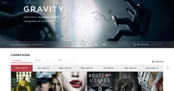
Particularly liked the approach to Search: "We wanted the search page to display in overlay on the page and that, every time we start typing something, the live search bar would return on-the-go results clustered in groups." - Redesigning IMDB — Creative, Product Design, Design Idea — Medium