Relevant Overviews
- Communication Strategy
- Content Strategy
- Online Strategy
- Online Community Management
- Social Media Strategy
- Content Creation & Marketing
- Online Architecture
- Digital Transformation
- Innovation Strategy
- Communications Tactics
- Productivity
- Social Web
- Media
- Politics
- Communications Strategy
- Science&Technology
- Business
Overview: Communications Tactics
Relevant resources
opportunityinsights.org
our team of researchers and policy analysts work together to analyze new data and create a platform for local stakeholders to make more informed decisions.... We arm local policy-makers with customized and data-driven insights so they can craft tailored, hyperlocal solutions.
qz.com

we’ve conflated data with truth. And this has dangerous implications for our ability to understand, explain, and improve the things we care about... data is not a perfect representation of reality: It’s a fundamentally human construct... subject to biases, limitations, and other imperfections... Data doesn’t say anything. Humans say things.... Dat…
datajournalismhandbook.org

What is data journalism? What is it for? What might it do? What opportunities and limitations does it present? Who and what is involved in making and making sense of it?
www.strategicstructures.com

the Knowledge Pyramid... DIKW pyramid, it features data as the basis and shows how information is built on it, then knowledge, and finally wisdom.... implies that the higher you go the better things get... What’s not to like? Well, just about everything.
hbr.org

I was particularly ashamed of the way that the AAA ratings, which were in some sense a mathematical promise of safety, had been actually just lies, mathematical lies... like a weaponized mathematics ... actually people don’t want to know what their actual risk ... mathematics ... was being used ... so that people could go on doing essentially corr…
backchannel.com
Fernando Pereira, who leads Google’s projects in natural language understanding, is less excited about his company’s shiny new devices than he is about what will happen when people use them... how can a machine truly understand phrases... machine learning; specifically... neural networks... use sophisticated algorithms and tons of data to train t…
digiday.com

Betts ... became the first data head to join the publisher’s board, recognizing data’s importance in growing its subscriptions and audience. Today, he heads up a 30-person team focused on customer analytics and research. Here are lessons from Betts on data maturity and driving audience engagement... While subscriptions are critical ... it’s not t…
www.theguardian.com

Things that happen in an instant are mostly bad ... this earthquake or that horrible murder. ... But once you turn to statistics it gets much harder to have a pessimistic story... The kind of maths that people are taught at school focuses on algebra and calculus, which they hardly ever use later in life... You use statistics all the time - T…
qz.com
Atlas deepens our journalism by offering readers better access to the data and visualizations in so many of our stories. It also extends the reach of our journalism by letting you make use of our charts in new ways ... as we build out the platform, we are hoping to let anyone make charts in Atlas... Atlas gives each of our charts its own home, …
gijn.org
"Newsrooms don't need large budgets for analyzing data--they can easily access basic data tools that are free or inexpensive." - Drilling Down: A Quick Guide to Free and Inexpensive Data Tools | Global Investigative Journalism Network
www.vox.com

"While we've always loved a good chart and map at Vox, appreciating a chart or map does not data journalism make. Data journalism is not just data visualization... ... the explosion in data sources readily available on the web... can both aid in telling important and necessary stories, but can also be easily misunderstood and potentially manipula…
medium.com

"Charted automatically visualizes data. Give it the link to a data file and Charted returns a beautiful, shareable visualization of that data... open-sourced and available for anyone to use at charted.co... it adjusts to any screen, automatically updates itself" - Introducing Charted - Data Lab - Medium
www.journalism.co.uk

"Swarmize enables journalists to tell new, collaborative stories by making use of real-time data collection and visualisation" Just the tests they've already done are awesome. The code's on GitHub. Think to use in surveys, real-time social media monitoring, live blogs ... anything where real-time is useful and/or you might want a second bite at t…
blogs.hbr.org

"Displaying data can be a tricky proposition, because different rules apply in different contexts. A sales director presenting financial projections to a group of field reps wouldn’t visualize her data the same way that a design consultant would in a written proposal to a potential client. So how do you make the right choices for your situation? …
www.fastcolabs.com

"Chartist is noteworthy because it doesn't just make existing charts smaller or bigger, it changes the the way the data is displayed so that it makes sense on whichever size screen it's being viewed on. A chart showing each of the 12 months along its x axis when displayed in a full-width browser window, for example, will change to show only six m…
sonar.bottlenose.com
Sonar Solo allows you to search any topic to find trends and influencers about any subject, in real time. Sonar Solo visualizes what’s on people's minds right now, by combining data mining, trend intelligence and advanced sentiment analysis on the world's social media chatter.
style.org

A wonderful presentation from Jonathan Corum, science graphics editor at The New York Times, on creating infographics and data visualisations that truly add value: "Sometimes, I feel more like a translator than a designer. Trying to translate the point the scientist is trying to make to a wider audience, and removing all of the jargon. ... If I …
visualisingdata.com
At least 1 year's reading right here: " ... the main projects, events, new sites, trends, personalities and general observations that have struck me as being important to help further the development of this field." A well-timed survey, given the recent publication of the UpShot's opus on the US economy and other daa visualisation ventures. But t…
www.niemanlab.org
"Two of the biggest trends in news today: the rise of mobile and the rise of data visualization. The unfortunate reality is that they’re often in conflict. ... If you want to do better, check out MobileVis ... Ros also pulls out a set of best practices for doing visualizations for mobile. Data visualization is good. Data visualization that works …
www.niemanlab.org
New report ”examines the current state of data journalism... calling for more transparency on how data is collected and used in journalism, anticipating an explosion in news apps as a way of producing information, and ways newsrooms can address security around their data and reporting. " In particular, I love this: "...the advice that newsroom le…
gigaom.com

Deadtree media to do more with legacy content than paper birdcages! The latest high-profile move into explanatory journalism is New York Times' The Upshot: "offer a combination of data journalism and explanatory reporting ... head-to-head with Ezra Klein’s Vox and Nate Silver’s FiveThirtyEight ... a kind of internal aggregator and explainer for…
Like
media,
journalism,
data journalism,
data,
content strategy,
information,
nytimes,
online architecture,
explanatory
www.niemanlab.org
"“Fished out of the shadows, old news coverage in China’s media can provide clues to the family connections of government officials as reporters investigate their financial dealings.”"
www.fivethirtyeight.com

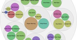
Looking forward to geeking out: Info architecture: Guessing some serious cardsorting went into this off the cuff remark: "the new FiveThirtyEight will provide coverage of five major subjects: politics, economics, sports, science, and lifestyle. By design, almost any topic in the news can potentially fit into one or more of these categories. " A…
knightlab.northwestern.edu

Not their star reporters. Not their politics coverage. An intern. Who never considered journalism as a career. But knew data visualisation. "On December 21 the quiz was posted and by the end of the year had become the site’s most popular piece of content for 2013." - Behind the dialect map interactive: How an intern created The New York Times’ m…
simplymeasured.com

"I still catch myself thinking I know better than the wealth of data at my fingertips. That’s not to say your intuition and savvy as a marketer aren’t valuable. You need both. ... take a holistic look back at what worked well, what didn’t, and what you can double down on in the year to come." - Year End Analysis: How to Plan Your Content Based o…
tim.webanalyticsdemystified.com
Great advice for web data analysis everywhere: "We don’t live in a perfect world. Vague requests are going to get floated. ... that doesn’t mean we shouldn’t recognize and strive to minimize how often that happens. Here’s how: - Condition yourself to go to full alert whenever the word “interesting” is used ... - probe for clarification as much …
www.niemanlab.org
Data-driven storytelling, sharable journalism in a British skunkworks. What's not to like? From NiemanLab: "Data-driven storytelling and web-native, sharable journalism are two of the biggest trends in media at the moment. If you locked the two together in a room, Ampp3d might walk out the door ... As a news site, Ampp3d keeps its output fairly …
gigaom.com
"The way it works is pretty simple: You paste data from a table (this can be a spreadsheet or even a web page), choose from a handful of visualization types (Raw explains what each one is best for) and then drag the variables you want to analyze into the predefined mapping categories (as you can see below, it’s really self-explanatory). Then you d…
think.withgoogle.com

"The Databoard lets you explore insights from Google research studies, share them with others, and create your own custom infographics." via @chandlertwilson
blogs.hbr.org

"The entwined rise of Big Data and predictive analytics virtually guarantees that — just as structured and semi-structured data are being fused — informal gossip and formal ratings systems will be collected, correlated, and converted into business rules designed to make badly-behaved customers pay more or go away." Interesting insight into an upc…
Relevant Overviews
- Communication Strategy
- Content Strategy
- Online Strategy
- Online Community Management
- Social Media Strategy
- Content Creation & Marketing
- Online Architecture
- Digital Transformation
- Innovation Strategy
- Communications Tactics
- Productivity
- Social Web
- Media
- Politics
- Communications Strategy
- Science&Technology
- Business