Relevant Overviews
- Communication Strategy
- Content Strategy
- Online Strategy
- Online Community Management
- Social Media Strategy
- Content Creation & Marketing
- Online Architecture
- Digital Transformation
- Change & Project Management
- Fediverse
- Innovation Strategy
- Communications Tactics
- Psychology
- Social Web
- Media
- Politics
- Communications Strategy
- Science&Technology
- Business
Overview: Communications Strategy
Relevant resources
scott.mn
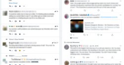
4 ways Mastodon doesn't optimise for enragement.On Mastodon’s "home timeline... posts don’t have metrics ... you have to click through ... makes you judge a post first by its content, rather than the score attached to it... the whole dynamic [being "ratioed"] doesn’t exist... leads to more thoughtful engagement rather than ... …
canonicaldebatelab.com
Via FotL I discover "Canonical Debate Lab (CDL)... researchers, developers, and system thinkers who have independently been working on collective intelligence systems for several years... goal is to aggregate contributions of diverse stakeholders into a unified information space, which can be accessed through multiple views... tailored to a s…
Like
k4p,
design,
community,
information architecture,
collective intelligence,
fotl,
canonical debate lab
newpublic.org
New Public "spent two years reviewing the literature and talked to over 100 experts from disciplines ranging from social psychology to urban planning about the qualities of flourishing public, or semi-public, spaces" for their Building better digital public spaces report. The goal: "to support engineers, designers and builders who w…
jerrymichalski.medium.com

Systems with Design from Trust: assume most (not all) people have good intent."initially feel counterintuitive, even risky...social: they rely on human relationships. appealing: once you wrap your head around them, you want more."The discomfort is a symptom of how today's default setting is mistrust: "we’ve internalized the ass…
www.sachinrekhi.com
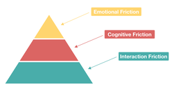
"User friction ... prevents a user from accomplishing a goal in your product... three levels: interaction friction, cognitive friction, and emotional friction"Interaction friction: do usability testing."When cognitive load is high ... there is significant cognitive friction ... encompasses all aspects of the experience that result …
jtbd.info
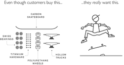
Jobs to be Done is a theory of consumer action. It describes the mechanisms that cause a consumer to adopt an innovation... a process: it starts, it runs, and it ends... a JTBD describes how a customer changes or wishes to change...: the process a consumer goes through whenever she aims to change her existing life-situation into a preferred one, b…
uxplanet.org
This article is not a UX Research manual, it ... provides a general idea of how and when UX Research is conducted ... why designers should care about it...~ Understanding brings us closer to what we are already so familiar with. And that is the inception of UX Research... user research tackles the demographical data about a product’s existing and…
medium.com

The most important nine words in behaviour design...“Put hot triggers in the path of motivated people.”... upfront deliveries of dopamine bond users to products...Instagram lets you try 12 different filters... transaction is emotional... you get to feel like an artist... “Make people feel successful... Give them superpowers!”... the triggers ar…
stories.platformdesigntoolkit.com

time to deliberately focus on design for interconnectedness and relationships ... customer (user) centric design created a narrative of isolation: the customer is ... someone that is provided with a solution ... to get the job done... [but] research ... explained that customers (users) may often look to engage more deeply with products... relat…
medium.com
Be wary of using expert judgement as your only source of data... by all means apply your expertise to make judgments about a design, but be sure to validate these judgements with data... Hick’s Law ... states that the time taken to make a decision increases as the number of choices is expanded... Fitts’ law... the time required to rapidly move to…
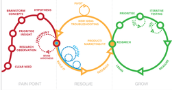
platformdesigntoolkit.com
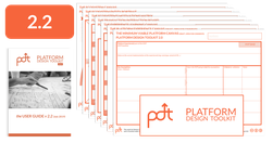
New tools are needed to help organizations leverage on the power of ecosystems and enable participation of external entities in the business process. That’s what the Platform Design Toolkit is for: design systems that create much more value than they capture and motivate everybody to join.
medium.com

Every time you open your phone or your computer, your brain is walking onto a battleground... Your captive attention is worth billions ... This has actually changed how you see the world... walls of code have turned you into a predictable asset — a user that can be mined for attention... by focusing on one over-simplified metric, one that suppor…
medium.com

If we define design as the decisions that determine how something works ... then Design Thinking is simply the process to make more thoughtful decisions.... We can only knit together what we already know in new ways to get to the something that’s never existed before.... Design Thinking offers — a way to get where you’re going when you don’t kno…
mathewlowry.myhub.ai
In this week’s edition, a months’ reading - some 30 posts - on social media, digital transformation, content/system design and EuroPCom2015. But first some news from me
www.youtube.com
Masterclass time. From the Google Blog: we’ve taken the Google logo and branding, which were originally built for a single desktop browser page, and updated them for a world of seamless computing across an endless number of devices and different kinds of inputs (such as tap, type and talk).
www.evolutionoftheweb.com
So many memories…
medium.com
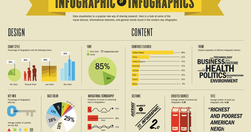
"... infographics are often taken at face value... And it is hard to fact check infographics... Fast Company republished 10 facts from Buffer. Fact checking one of the facts in that list went like this: The fact quoted an infographic -> that quoted a blog post at Huffington Post -> which in turn quoted another infographic -> which quoted a blog…
alistapart.com
" Top tasks are the small set of tasks ... that matter most to your customers. Make these tasks work well, and you’ll be on the right track. Get them wrong, and chances are you’ll lose the customer. Top Tasks Management is a model that says: “Focus on what really matters (the top tasks) and defocus on what matters less (the tiny tasks).” Tiny ta…
medium.com

"some people have the sense that data somehow makes designers less powerful, that you’re basing decisions based purely on mechanical measures rather than designer intuition and genius... data is what ... turns designers from artists into the most important decision makers in a company... prototypes can really only get you to local maxima ... the…
www.bbc.co.uk

With a very nice longform, multimedia html5 presentation to boot. "In this bustling environment, there is less news and more noise. ..." More news but even more noise, rather.
www.niemanlab.org
"Since Taylor launched an earlier version of the site at The Boston Globe in 2007, In Focus has known for longform photo storytelling, featuring huge, high-quality images.... If you’re pandering to social media, if you’re going for clickbait, it cuts away at any sort of storytelling." - Q&A: How Alan Taylor, online photography pioneer, is rethin…
medium.com

"We are currently witnessing a re-architecture of the web, away from pages and destinations, towards completely personalised experiences built on an aggregation of many individual pieces of content ... the result of the rise of mobile technologies... from many pages of content linked together, towards individual pieces of content aggregated togeth…
om.co

"An image is the gateway to your emotional memory... And on the visual web an image is the gateway to accessing almost all content and information... we are adapting to a different kind of a web, one that will be increasingly visual... [but] the only available methods to surface and categorize photos are beyond basic; we need something intuitive…
gigaom.com

How much more could Google News be? See "... a presentation that a German designer came up with that involved a wholesale redesign and re-thinking of what Google News is and does." Lots of good stuff here. Particularly like how 'smart personalisation' is used to help penetrate the filter bubble: "automatically suggest related stories on a news t…
app.abtasty.com
"AB Tasty, the French A/B testing specialist, has published this guide for the benefit of those who are implementing A/B testing and would like to know how to conduct truly effective tests."
digiday.com
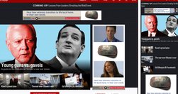
"Politico has redesigned its website for the first time in its seven year history, and The Guardian's U.S. recent refresh marks the first time it's redesigned almost entirely in public, with its readers' input. Here's a look at the thinking behind the redesigns, and what the publishers were able to pull off." - Politico, HBR, The Guardian: W…
blog.apps.npr.org
Good insights on combining editorial, programming and visual experts from NPR: "The multimedia crew wanted to make pictures and video that were truly web-native, which required web makers. And our news apps lacked empathy — something we’re so great at on the radio. It’s hard to make people care with a chart. Pictures were the obvious missing piec…
liquidapsive.com
Excellent tool for explaining "the difference between Adaptive, Responsive, Static and Liquid sites ..." - Liquidapsive (Liqui-dap-sive)
money.cnn.com
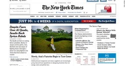
"whole new publishing and technology system ... continually iterate on the site and take advantage of new technology trends ... instead of seeing major redesigns in the future, users will see more incremental changes" Key question: are the native ads clearly ads? - New York Times redesign points to future of online publishing - Jan. 8, 2014
Relevant Overviews
- Communication Strategy
- Content Strategy
- Online Strategy
- Online Community Management
- Social Media Strategy
- Content Creation & Marketing
- Online Architecture
- Digital Transformation
- Change & Project Management
- Fediverse
- Innovation Strategy
- Communications Tactics
- Psychology
- Social Web
- Media
- Politics
- Communications Strategy
- Science&Technology
- Business