www.fastcompany.com
to investigate ... notion that websites are starting to look the same ... data mining ... scrutinized nearly 200,000 images across 10,000 websites... of the Russell 1000, the top U.S. businesses by market capitalization ... Alexa’s 500 most trafficked sites... sites nominated for Webby Awards ... how many pixel-by-pixel edits ... to transform colo…
www.princeton.edu

free online ratings are less trustworthy than those that have some cost to them... In ecology, costly signaling theory argues that displays that “cost” more — like elaborate peacock tails, or strenuous displays of hunger from baby birds — are more likely to reflect reality... making rating goods or services as easy as possible... is counterproduct…
designsystem.gov.au

The Australian Government Design System provides a framework and a set of tools to help designers and developers build government products and services more easily.
uxplanet.org

The curse of knowledge is a cognitive bias that occurs when an individual, communicating with other individuals, unknowingly assumes that the others have the background to understand... seen at all levels of a company... if you already know the answer... tend to underestimate the difficulty of the question or the problem... become so immersed in t…
stories.platformdesigntoolkit.com

time to deliberately focus on design for interconnectedness and relationships ... customer (user) centric design created a narrative of isolation: the customer is ... someone that is provided with a solution ... to get the job done... [but] research ... explained that customers (users) may often look to engage more deeply with products... relat…
conversionxl.com

What’s the difference between customization and personalization? - Customization: The visitor deliberately chooses between options designed to make the user experience more personal.- Personalization: The visitor is automatically shown personalized pages based on anticipated needs / wants.
www.dtelepathy.com
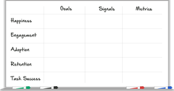
A beautiful, HTML5 exploration of the HEART methodology: Happiness, Engagement, Adoption, Retention, Task Success. " different members of your team have different ideas about the goals of your project. This process provides an opportunity to build consensus about where you're headed." - How to Choose the Right UX Metrics for Your Product
moz.com

"There's no such thing as "perfectly optimized", but I took a stab at drawing up the mythical beast anyway: "... I first saw the "perfectly optimised page" infographic on Twitter, but discovered a much richer, larger article on Moz. In itself, this is a great use of infographics and data visualisation - the infographic stands on its and has bee…