www.linkedin.com
blogs and Twitter drive two-thirds of content flow. Mainstream media has become a catalyst that blogs and Twitter drive. Responsive Experience Tops Responsive Design: ... preparing for 10 types of customers ... you know who they are via their search terms ... content changes to meet their needs. We must know who they are and start building…
medium.com

the notion of functionality lifting itself out of app silos and being made available as services.... pieces of micro-content and micro-functionality surfacing as cards... a constellation of screens, regardless of whether it’s a desktop, laptop, tablet, phone, watch, or whatever ... an app-based channel for cards... your conversations and the f…
aeon.co

Making ‘a net positive contribution to people’s lives’ doesn’t necessarily satisfy investors... it’s possible to imagine regulation that actually expands users’ choices. It doesn’t need to be especially invasive or dramatic, and it would be designed to give users more control over their experiences online... Here are three things we could do…
mathewlowry.myhub.ai
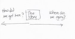
In this week’s edition, a months’ reading - some 30 posts - on social media, digital transformation, content/system design and EuroPCom2015. But first some news from me
medium.com

"The experience of users happens beyond the screen and in the gaps... between channels, devices and business silos." (and between government departments, and indeed governments) "You might be thinking this sounds more like customer service design than user experience design. You might be right." - User experience design is not what you th…
medium.com

information architecture has become ripe with myths... I want to take a few moments to dispel some of them.... People convince themselves that information architecture is about organising content in a logical way. It is not... people aren’t logical.... users need to be able to reach content in three clicks.... there is no evidence to support…
medium.com
Think of an interaction as a conversation between your product and your user... if the conversation is boring, your user will eventually leave ... Without interactions, there wouldn’t be any delight in the experience. - The 5 Pillars of Interaction Design — Medium
www.fastcodesign.com

as the internet of things surrounds us with devices that can hear our words, anticipate our needs, and sense our gestures, what does that mean for the future of design, especially as those screens go away?... It's all about getting away from the touchscreen, and interfacing with the devices around us in more natural ways: haptics, computer visi…
18f.gsa.gov

In trying to access the federal programs which will allow her to afford college, Joanne must navigate the websites of multiple agencies. She finds dozens of government websites which all seem relevant to what she’s looking for. Joanne is confused. Are these programs related to each other? Are they even all a part of the federal government? Are any…
blog.growth.supply
This software is a clever mix between Sketch, Keynote, Flash and After Effect (plus some bonus features specifically for interactive prototypes)... Easily creating tap transitions from one screen to another is, to me, the core of the software. - Principle : the prototyping tool you’ve got to try — STARTUPS + WANDERLUST + LIFE HACKING — Medium
medium.com

"Innovation is exploding in every direction. With all of these “smart” things — smart cars, smart phones, smart watches, smart glasses — it’s a designer’s job to figure out the best way to deliver content in such a vastly connected world. The projects you’re working on at this very moment will be interacted with on devices that didn’t exist wh…
medium.com
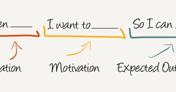
Job Stories are great because it makes you think about motivation and context and de-emphasizes adding any particular implementation. Often, because people are so focused on the who and how, they totally miss the why. When you start to understand the why, your mind is then open to think of creative and original ways to solve the problem. - Repl…
alistapart.com

" Top tasks are the small set of tasks ... that matter most to your customers. Make these tasks work well, and you’ll be on the right track. Get them wrong, and chances are you’ll lose the customer. Top Tasks Management is a model that says: “Focus on what really matters (the top tasks) and defocus on what matters less (the tiny tasks).” Tiny ta…
www.wired.com
"From the responsive layouts to the improved APIs ... we’ve reimagined every aspect of the WIRED experience... I want to walk you through our thinking on the new site—to tell you about the technology and design innovations that make this iteration of WIRED possible. We settled on a card-based motif for both its flexibility and configurability..…
medium.com

"some people have the sense that data somehow makes designers less powerful, that you’re basing decisions based purely on mechanical measures rather than designer intuition and genius... data is what ... turns designers from artists into the most important decision makers in a company... prototypes can really only get you to local maxima ... the…
medium.com
"By news homepage, I mean any way for a user to first encounter content. A push notification could very well be the new news homepage. ... An article or a newsletter ... Overcast or Soundcloud or iTunes may be your homepage.... Homepage, to me, is simply a shorthand version for any of these things. " Neat overview. Just remember, however you desi…
www.wired.com
"an inspiring design experiment... Earth: A Primer, a new interactive book for the iPad... instead of simply telling you about geological processes, it actually lets you control them. Each topic’s page pairs text and a simulation... Like a deity in training, you can sculpt mountains, summon rain storms, and move tectonic plates with your fingertip…
www.nngroup.com
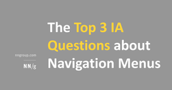
"But in our Information Architecture courses, we invariably get asked about a few persistent questions that many designers from a variety of backgrounds seem to struggle with. Like most design problems, these questions rarely have an absolute, black-and-white answer. But there are specific considerations that can help you answer these questions a…
intranetdiary.co.uk
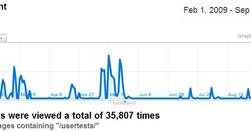
Great article on improving intranet UX, and useful inspiration for any website manager: "During the online cardsorting sessions I covered over 1000 content items and got nearly 36,000 individual responses. The first batch ... designed to elicit our main navigation labels. Subsequent tests then checked that the chosen names would suit all the intr…
www.enterprisestrategies.com
"we’ve applied econometric principles to the results of over 200 intranet surveys and… statistically pinpointed which intranet attributes most impact a user’s perception of their intranet. This first post... showing what employees prefer to look and find when they view their company’s intranet." Some surprising results, For example, although I'…
speckyboy.com
Great overview of product design and development documentation in a world of agile development: "Documentation is instrumental for concepting, designing, creating and measuring the performance of products. But ... there’s nothing about a thick stack of paperwork which resembles the experience of your real product. ... thick deliverables created …
gigaom.com

A useful look at how user-centricity has leapt out of the web department and into the business strategy: "... Quartz ... Gawker, BuzzFeed and Tumblr... are increasingly thinking about what they do as providing a service, not just as a business that generates content and then delivers it to people.... you have to experiment, and iterate rapidly, …
medium.com
"... you have two sides facing each other: the Social Login providers who say that it's a must to drive more conversions, and the cool outsiders who state that "it doesn't worth it, that it screws up your UX and that it's intrusive." The Social Login landscape is full of traps, let's see how to avoid them." - 7 Social Login Myths Debunked — Abou…
www.dtelepathy.com
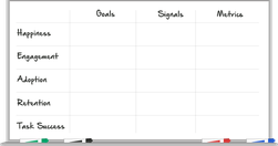
A beautiful, HTML5 exploration of the HEART methodology: Happiness, Engagement, Adoption, Retention, Task Success. " different members of your team have different ideas about the goals of your project. This process provides an opportunity to build consensus about where you're headed." - How to Choose the Right UX Metrics for Your Product
moz.com

"There's no such thing as "perfectly optimized", but I took a stab at drawing up the mythical beast anyway: "... I first saw the "perfectly optimised page" infographic on Twitter, but discovered a much richer, larger article on Moz. In itself, this is a great use of infographics and data visualisation - the infographic stands on its and has bee…