blog.prototypr.io

Mobile First should not be taken as an opportunity to over-simplify and, by the same token, Desktop First should not be taken as an opportunity to pile on complexity.
pudding.cool
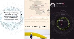
The main advantage of starting with mobile first is that it forces you to pare down your experience to the nuts and bolts... Once you commmit to scrollytelling, you have two mobile choices: keep it scrolly, or stack it... preserve the scroll is if the transitions are truly meaningful, and not just something to make it pop. Seeing change over time…
medium.com
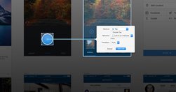
Silver is a combination of an iOS app, a Mac app, and a Sketch Plugin that seamlessly communicate with each other to make your mobile design process as smooth as possible - Introducing Silver : Lightweight Mobile Prototyping in Sketch 3 — Startups, Wanderlust, and Life Hacking — Medium
medium.com

"Innovation is exploding in every direction. With all of these “smart” things — smart cars, smart phones, smart watches, smart glasses — it’s a designer’s job to figure out the best way to deliver content in such a vastly connected world. The projects you’re working on at this very moment will be interacted with on devices that didn’t exist wh…
www.labnol.org
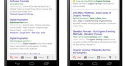
"Google is now clearly marking websites in mobile search results that it considers mobile friendly and if that tag isn’t getting displayed around your content, your website may see a drop in mobile traffic. Responsive design is definitely the way to go but will that be enough. How do you confirm if your web pages are considered mobile friendly by…
www.wired.com
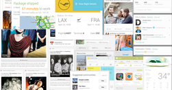
"From the responsive layouts to the improved APIs ... we’ve reimagined every aspect of the WIRED experience... I want to walk you through our thinking on the new site—to tell you about the technology and design innovations that make this iteration of WIRED possible. We settled on a card-based motif for both its flexibility and configurability..…
medium.com
"We are currently witnessing a re-architecture of the web, away from pages and destinations, towards completely personalised experiences built on an aggregation of many individual pieces of content ... the result of the rise of mobile technologies... from many pages of content linked together, towards individual pieces of content aggregated togeth…
source.opennews.org
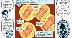
"How we made our first comics-journalism feature-and the tools for you to make one, too ... We thought we would walk through some of design process and also document some of the code tricks we learned along the way. The final products are a web viewer, Pulp, and the comic-maker interface, Pulp Press... released as a free and open source project…
mashable.com

"Here are seven great solutions to help you quickly and cost-effectively develop a mobile version of your site."