www.fastcompany.com
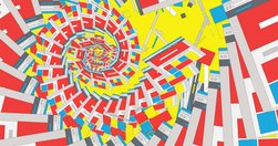
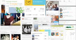
to investigate ... notion that websites are starting to look the same ... data mining ... scrutinized nearly 200,000 images across 10,000 websites... of the Russell 1000, the top U.S. businesses by market capitalization ... Alexa’s 500 most trafficked sites... sites nominated for Webby Awards ... how many pixel-by-pixel edits ... to transform colo…
blog.juntoo.co
The Jobs-to-be-done methodology helps you focus on the job that the user wants done rather than who and how... First, we take the Persona out of the picture and instead add context. Then we focus on the motivation (i.e, answering the why). It gives us clarity to the whole situation and helps us be more creative in designing a solution.
medium.com
Here’s a quick overview on the four different primary forms of design to help you understand what they mean.
thenextweb.com
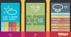
2015 is the Year of the Card. Screen-size cards are everywhere, from websites to native apps and are designed to look like their physical counterparts. It’s an easy way for you to shuffle through a series of digital containers with the flick of a thumb...cards are a style that seems just made for apps.
medium.com
"If you want to know where web design is heading, just look at where architecture has already gone." - The Future of Web Design is Hidden in the History of Architecture — Medium
medium.com

"If you want to know where web design is heading, just look at where architecture has already gone." - The Future of Web Design is Hidden in the History of Architecture — Medium
thenextweb.com

To be rolled out next time someone wants to "skip the analyses and wireframes - just give us the mockups": "An interface's visual hierarchy relies on the same principles of aesthetics used by the Renaissance masters, but on top of that (or rather beneath it) there's the subtext of secondary goals - promoting specific content, encouraging user…
alistapart.com
" Top tasks are the small set of tasks ... that matter most to your customers. Make these tasks work well, and you’ll be on the right track. Get them wrong, and chances are you’ll lose the customer. Top Tasks Management is a model that says: “Focus on what really matters (the top tasks) and defocus on what matters less (the tiny tasks).” Tiny ta…
medium.com
"By news homepage, I mean any way for a user to first encounter content. A push notification could very well be the new news homepage. ... An article or a newsletter ... Overcast or Soundcloud or iTunes may be your homepage.... Homepage, to me, is simply a shorthand version for any of these things. " Neat overview. Just remember, however you desi…
medium.com
"We are currently witnessing a re-architecture of the web, away from pages and destinations, towards completely personalised experiences built on an aggregation of many individual pieces of content ... the result of the rise of mobile technologies... from many pages of content linked together, towards individual pieces of content aggregated togeth…
www.enterprisestrategies.com
"With 95% confidence we conclude that an increase in ranking “the intranet search helps me find the information I need” results in a higher valuation of the respondents intranet as a whole. The impact for the same question related to menus was statistically insignificant." Not quite the deathknell for information architects and resellers of stic…
digiday.com
"Politico has redesigned its website for the first time in its seven year history, and The Guardian's U.S. recent refresh marks the first time it's redesigned almost entirely in public, with its readers' input. Here's a look at the thinking behind the redesigns, and what the publishers were able to pull off." - Politico, HBR, The Guardian: W…