environmentalevidencejournal.biomedcentral.com

Systematic mapping assesses the nature of an evidence base, answering how much evidence exists on a particular topic... an interactive database of studies and their meta-data, along with visualisations of this database... an R-based tool called EviAtlas, an Open Access ... Open Source ... tool for producing interactive, attractive tables and figur…
techcrunch.com
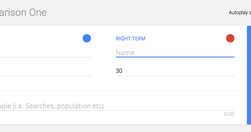
use it only to compare stats about two different topics over time
digiday.com

well-known for its data-visualizations — half of the 60 daily articles published contain charts — and on May 10, it officially took the wrapper off Atlas, so anyone can sign up and create their own graphs.
www.journalism.co.uk

Visualise your data and embed interactive, annotated graphs in your stories for free... At Journalism.co.uk we've been regularly using Datawrapper, Infogram and Google Sheets to name a few, and we have highlighted many others in our pieces. Plotly is perhaps one of the more complex resources, but it's free to use and enables its users to cre…
www.journaliststoolbox.org

The Journalist's Toolbox
gijn.org
"Newsrooms don't need large budgets for analyzing data--they can easily access basic data tools that are free or inexpensive." - Drilling Down: A Quick Guide to Free and Inexpensive Data Tools | Global Investigative Journalism Network
medium.com

"Charted automatically visualizes data. Give it the link to a data file and Charted returns a beautiful, shareable visualization of that data... open-sourced and available for anyone to use at charted.co... it adjusts to any screen, automatically updates itself" - Introducing Charted - Data Lab - Medium
www.journalism.co.uk

"Swarmize enables journalists to tell new, collaborative stories by making use of real-time data collection and visualisation" Just the tests they've already done are awesome. The code's on GitHub. Think to use in surveys, real-time social media monitoring, live blogs ... anything where real-time is useful and/or you might want a second bite at t…