www.covidexitstrategy.org
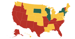
Tracking states as they make progress towards a new normal
twitter.com
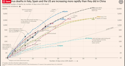
FT senior data-visualisation journalist ... explains the must-see daily graphs...See also Coronavirus tracked: the latest figures as the pandemic spreads | Free to read
www.niemanlab.org
every individual picks their idea, we vet it ourselves and make sure the data’s there, that it’s interesting, and we just go off and do it... We specifically seek out stories that aren’t news related, because we don’t want to compete in that space
digiday.com

well-known for its data-visualizations — half of the 60 daily articles published contain charts — and on May 10, it officially took the wrapper off Atlas, so anyone can sign up and create their own graphs.
www.theatlantic.com

Our interactive graphic offers a real-time snapshot of the race, using media attention to track the fortunes of the presidential hopefuls... explore the graphic and view a running picture of how the candidates are faring on television during the election season, or drill into the numbers by network using the explorer dashboard. - Media Cover…
qz.com
Atlas deepens our journalism by offering readers better access to the data and visualizations in so many of our stories. It also extends the reach of our journalism by letting you make use of our charts in new ways ... as we build out the platform, we are hoping to let anyone make charts in Atlas... Atlas gives each of our charts its own home, …
www.journalism.co.uk

Visualise your data and embed interactive, annotated graphs in your stories for free... At Journalism.co.uk we've been regularly using Datawrapper, Infogram and Google Sheets to name a few, and we have highlighted many others in our pieces. Plotly is perhaps one of the more complex resources, but it's free to use and enables its users to cre…
www.journaliststoolbox.org

The Journalist's Toolbox
www.journalism.co.uk

"Swarmize enables journalists to tell new, collaborative stories by making use of real-time data collection and visualisation" Just the tests they've already done are awesome. The code's on GitHub. Think to use in surveys, real-time social media monitoring, live blogs ... anything where real-time is useful and/or you might want a second bite at t…
mathewlowry.myhub.ai

The first – and possibly still the only – site on EUROPA to tap popular support (via sheer user traffic) for a new EU regulation.